


Copy link to clipboard
Copied
Hello, I am fairly new to Illustrator and I've run across a scary problem that I can't solve.
I am trying to update some of my company's old ai files right now, but the spot colors are not working right.
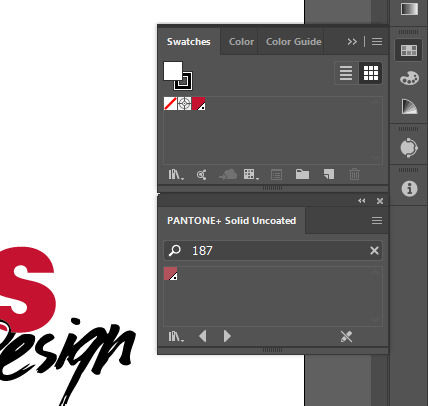
Here is a screen shot of the old ai file showing the color:

This red color is PANTONE+ 187 U that goes on the logo.
Now, when I drag this logo into a new ai file, the color gets muted. But the frustrating part is that Illustrator is still defining that muted red as PANTONE+ 187 U!
Here is a screen shot of the new ai file:

And what's even more confusing is that in the old ai file, the swatches panel shows that rich red, but when I open up the PANTONE+ Solid Uncoated color book, it shows the muted red (As shown here).
I've checked and both my documents are in CMYK, neither of them have overprint preview on, and they both have PANTONE+ color books. All of the other spot colors I've tested are the same hue in each document. The only thing I can think of that might be the cause is that the old file was made in CS5 vs my new document is CC 23.0.
Please help me, I am very lost! 
Thanks so much,
Fletcher


 1 Correct answer

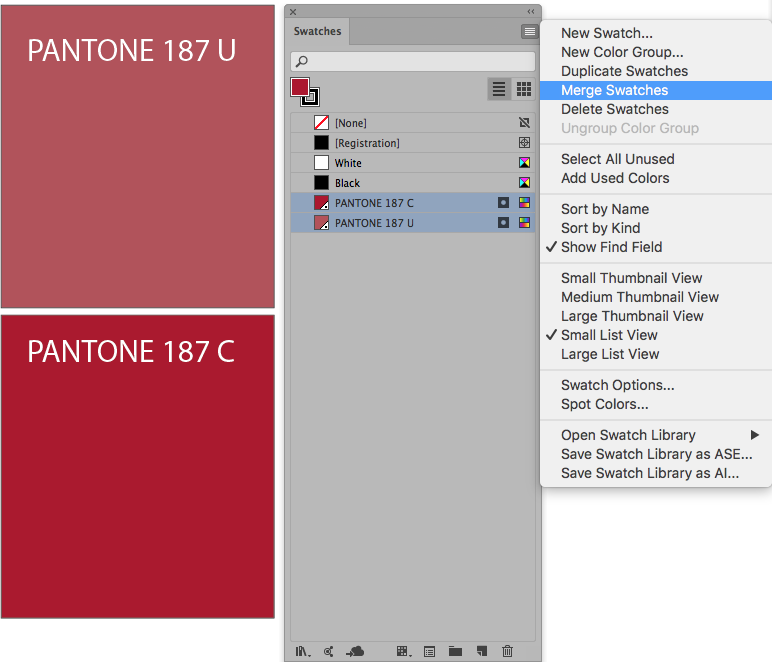
Why are you using pantone 187 U ? (U means uncoated) wich is mate.
You should use Pantone 187 C (C means coated) wich is bright
Try this
1. Open your swatches libraries and load the Pantone Coated swatch, find 187 C and add it to your swatches panel
2. In the swatches panel, drag the pantone 187 C on top of the Pantone 187 U, nothing must be selected
3. then select both and merrge swatches as you can see in the picture attached
4. Done
Explore related tutorials & articles
 10
Replies
10
10
Replies
10

Copy link to clipboard
Copied
What color spaces are you using in the documents?
Copy link to clipboard
Copied
I'm not for sure what you mean... I'm using CMYK mode for both files.
I looked up what color spaces are, but I'm still a little fuzzy.

Copy link to clipboard
Copied
Color Space is either RGB or CMYK. Color Settings are...

Neither are your issue ( I could be wrong, but I might not be ). Whoever created the CS5 version could have chosen a different Pantone color and renamed it 187U. Obviously something is not right.
Copy link to clipboard
Copied
Yeah, I think my best solution will be to just start fresh with a new document and search for a new standard Pantone spot color to use for our logos in the future. It might take a little bit to update everything, but it will save a lot of hassle and confusion in the future.
Thank you all for your help and input! This has been helpful.
Also still willing to hear more suggestions 
Copy link to clipboard
Copied
I just checked one of my Pantone swatch books and that 187U is a rusty red like what is shown in your "faded" reference screens. The previous swatch from CS5 looks inaccurate.
Copy link to clipboard
Copied
Why are you using pantone 187 U ? (U means uncoated) wich is mate.
You should use Pantone 187 C (C means coated) wich is bright
Try this
1. Open your swatches libraries and load the Pantone Coated swatch, find 187 C and add it to your swatches panel
2. In the swatches panel, drag the pantone 187 C on top of the Pantone 187 U, nothing must be selected
3. then select both and merrge swatches as you can see in the picture attached
4. Done

Copy link to clipboard
Copied
I am using uncoated because we are going to have someone print our logo on uncoated paper. So I'm using uncoated to in order to best represent the outcome of the print job.
Isn't that why there are coated and uncoated Pantone libraries? Maybe I'm missing something.
Copy link to clipboard
Copied
Fletch45 wrote
I am using uncoated because we are going to have someone print our logo on uncoated paper. So I'm using uncoated to in order to best represent the outcome of the print job.
Isn't that why there are coated and uncoated Pantone libraries? Maybe I'm missing something.
You are not missing anything
So if you are going to print onto an uncoated paper, it is ok you use the Uncoated Pantone Book, cause that is the way your print will look, muted and you get a better representation in your screen.

Copy link to clipboard
Copied
Fletch45 wrote
Isn't that why there are coated and uncoated Pantone libraries? Maybe I'm missing something.
It's important to remember that the Pantone swatches, both on-screen and physical, are representations of an ink formulation, as it can be expected to appear when applied to a given substrate. C and U are not different colors; just respective depictions of expected results of applying the same color (formulation) to those types of substrates. You'll get the same result printing on uncoated paper regardless of whether your design specifies the C or the U version of the swatch. C and U are provided in Illustrator to facilitate accurate simulation of printed result.

Copy link to clipboard
Copied
If you are updating your files going forward, my main advice is to go with the "new normal", and use the latest Pantone color books, but also, make separate files for use in Spot and Process applications, using the "C" Coated for the former, and the Color Bridge CMYK for the latter. As has been mentioned before, the difference between the C and the U (oh, and historically there used to be an "M" for matte coated) is how they look on the screen to approximate how the 187 ink appears on different types of paper.
There used to be a need in some big corporations for their particular "corprate colour" to match closer across the different paper stocks by actually choosing different Pantones for each use and make THAT their graphic standard, e.g "Use 187 for coated stocks, but use 485 for uncoated stocks". This doesn't sound like your issue, so avoid using "U" going forward.

Find more inspiration, events, and resources on the new Adobe Community
Explore Now
 AdChoices