- Home
- InDesign
- Discussions
- Tab order in pdf doesn't work (no fields or forms,...
- Tab order in pdf doesn't work (no fields or forms,...
Copy link to clipboard
Copied
I've seen more threads about this subject, but haven't found a satisfying answer yet...
I'm trying to create an accessible pdf-file from an InDesign file (a flyer with a lot of small text blocks; no threading). I followed all the steps in this (excellent!) description: https://helpx.adobe.com/indesign/using/creating-accessible-pdfs.html, (among other things) setting the (desired) order in the Articles panel. I thought that would determine the reading order in my pdf. After exporting, the reading order as shown in Acrobat's accessibility tool is just totally random (and not at all the order I put in the Articles panel). (I can't post any screenshots cause my client's information is confidential)
I read some posts where people said 'Acrobat doesn't show the right order, but in practice it does have the right order' but how can I check this? I tried the VoiceOver function on my Mac, but I guess I need more training to be able to use that properly (besides: it shouldn't be necessary - though it is a great user's test).
Can somebody please enlighten me and help me solve my problem?
 2 Correct answers
Thanks, @Dave Creamer of IDEAS for the reference.
@YvonS, I not sure what you're finding wrong with your PDF. You seem to have done all the right tasks, but something isn't working for one or more reading orders.
So let's review, first. Apologies for this long, detailed reply, but the answer is not short and quick.
There are 4 reading orders in a PDF.
- Tag RO
- Architectural RO
- TAB RO
- Form Field RO, which we can ignore in your project.
More details are at this blog: https://www.pubcom.com/blog/2020_08-18_ReadingOrder/reading-orders.shtml
...Don't drag that order in Acrobat, it is like dragging text below frames in InDesign (top/bottom)!
The Article panel ONLY sets the Tag order; the Layer panel sets the Reading/Z/Logical (whatever you want to name it) order, and that one is from bottom to top! So go back, open the Layers panel and there place them in the order you want: bottom ('1') and then stack up. So a bit 'reversed' in what you see in the tags-tree (Article panel).
Copy link to clipboard
Copied
You should thread the text bloxks in the right order. If not, InDesign follows the order when these text rame were created.
I wonder why you use different text frames? In my experience most, near to all, layouts can be done in a single text frame. This will guarantee the right reading order.
Copy link to clipboard
Copied
Thank you, @Willi Adelberger for your reply.
I didn't use threads because there's no need for it; text blocks are standing on their own and I don't want text to flow into another block. It's more of an infographic/schematic visualisation, so I need to be able to position all the blocks very precisely.
But I guess threading might be a workaround...
Still hoping somebody can help me find a better method (like the one Adobe provides - but then with a better result)...
Copy link to clipboard
Copied
Copy link to clipboard
Copied
Are you referring to "tab" order or "reading" order? Your title and text refer to different things.
Copy link to clipboard
Copied
In human terms, it's the reading order: how the information should be read.
In Adobe terms I guess it's the tab order: the order in which a screen reader should be guided through the document in a logical way (either by tab or buttons/inputs).
Copy link to clipboard
Copied
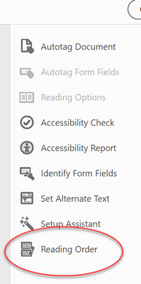
No--two different things. Reading Order is what you want. Did you check your Acrobat Pro Accessibility tools for the reading order?
Copy link to clipboard
Copied
Copy link to clipboard
Copied
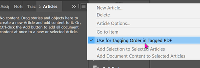
Did you select Use for Tagging Order in Tagged PDF?
Copy link to clipboard
Copied
Yes, I did!
In your experience: does it normally work as expected (that is: follow the order you set in the Articles panel)...?
(Thank you @Dave Creamer of IDEAS for trying to help!)
Copy link to clipboard
Copied
Depends upon which screen reader or assistive technology you're using. It's NOT the TAB key on your keyboard, but rather any key or action that is programmed to advance the content.
"TAB order" is an out-of-date term, a holdover from decades ago when the actual TAB key was used by screen reader users to move through the content. But the name hasn't changed to keep up with our newer technologies and protocols.
If your A T is PDF/UA-1 compliant, then it should respect the TAB key and move through the content. But so many technologies don't use the TAB order, or ignore it entirely.
Most of our screen reader testers remind us that they DON'T TAB through a document. They use other mechanisms for navigation.
| PubCom | Classes & Books for Accessible InDesign, PDFs & MS Office |
Copy link to clipboard
Copied
Thanks, I've read all the other posts on this subject, so I knew this. I don't mind which input people use; I just want to deliver a document that is 'accessible' for people that need it. I followed Adobe's guidelines (as mentioned in my post) and that didn't seem to work; so I'm looking for 1. What I did wrong or 2. another practical solution...
Copy link to clipboard
Copied
Here is a good read that might help (from Bevi, naturally...):
Jump to the correct answer.
Copy link to clipboard
Copied
Thanks, @Dave Creamer of IDEAS for the reference.
@YvonS, I not sure what you're finding wrong with your PDF. You seem to have done all the right tasks, but something isn't working for one or more reading orders.
So let's review, first. Apologies for this long, detailed reply, but the answer is not short and quick.
There are 4 reading orders in a PDF.
- Tag RO
- Architectural RO
- TAB RO
- Form Field RO, which we can ignore in your project.
More details are at this blog: https://www.pubcom.com/blog/2020_08-18_ReadingOrder/reading-orders.shtml
Different assistive technologies (AT) tap into one or more of these reading orders.
- Those technologies that are PDF/UA-1 compliant process #1, #3, and #4 because they are required by the PDF/UA-1 accessibility standard. These are the full-featured screen readers like JAWS and NVDA, and other AT for other disabilities.
- #2, the Architectural RO which you can see in Acrobat as "THE Order" panel, is the original reading order before tags and accessibility were added to PDFs. It's name "The Order Panel" is a misnomer; obviously, it's not the only reading order in a PDF, and it actually is not even required per the PDF/UA-1 accessibility standard. It's used by a smaller, but significant percentage of AT — and these AT are not considered PDF/UA compliant. An example is Acrobat's built in Read Out Loud utility. These mainly are lower-cost or free AT, or were created before tags were added to PDFs and haven't been updated in 20 years. (It takes R&D money to create an AT that will be fully compliant.)
Our accessibility firm recommends this plan of action:
- Concentrate on the Tag RO first. It forms the basis of accessibility for most AT, and it's required by the PDF/UA-1 accessibility standard. Test it by "walkking down the tag tree" with your cursor/arrow key. The standard's requirement is that this RO be presented in a logical order. YOU decide what a "logical" order is for your document.
- Set the TAB order next. Quick to do in Acrobat from the Pages Panel. From the Panel's options menu, select Page Properties and set it to use the Tag tree RO and you're done. Or from your export settings in InDesign, check the option to set the TAB order there. But if your Tag tree is correct, then the TAB order should also be correct. You can't fully test it with the TAB key on your keyboard because that's not how it works.
- Then correct the Architectural RO (in the Order Panel). It, too, should be logical. You can correct it in Acrobat, but in InDesign it's controlled mainly by a combination of the Articles Panel and the Layers Panel (stacking order). The Articles Panel sets the order from top-down, and the Layers Panel sets it from bottom-up.
Question: which reading order is having problems?
And did any of this correct the problem?
| PubCom | Classes & Books for Accessible InDesign, PDFs & MS Office |
Copy link to clipboard
Copied
Thanks so much @Dave Creamer of IDEAS and @Bevi Chagnon - PubCom.com for your help so far! The blog is very useful, as is your plan of action [recommende reading!].
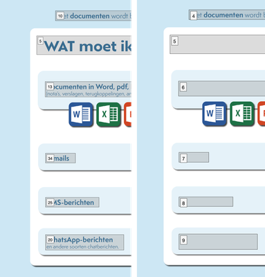
Tag RO and Tab RO are all set in my document, but it gets messy when I try to fix the architectural RO… This order is totally messed up in the first place; probably follows too much of the order in the Layers panel? And that just doesn't make sense to me at all - why would they use the stacking order of my visual elements to dictate a reading order…? I tried to fix this, but here arises the next problem: when I do, my tekst disappears - looks like it ends up behind one of the white/blue blocks (as shown in screenshot: left: original order in the order panel; left: what happens when I try to correct it…)
Copy link to clipboard
Copied
Bonus question (it was in my initial post): how can I check my document's accessibility myself? Acrobat's check is not very trustworthy, I guess. And it tells me to check the reading order myself - which is exactly the problem 😐 (see above).
I read about PAC 2021 - which is only available for Windows 😞 (I'm a Mac user)
Copy link to clipboard
Copied
Use Acrobat/Preflight/PDF standards/ run the one under PDF/UA, that checks more items; there is also a fix up there.
May I advice you to follow a training course? As it is complicated indeed. If you are Dutch: I'm doing a two days online training beginning September 27th in the Netherlands, drop me a PM if you are interested 😉
Copy link to clipboard
Copied
Frans is great. Take advantage of his coures if you can.
| PubCom | Classes & Books for Accessible InDesign, PDFs & MS Office |
Copy link to clipboard
Copied
There is no software checker that can thoroughly check your PDFs.
It's something you'll always need to check on your own, as well as using a checker.
It's Apple that prevents accessibility tools on the Mac, not Adobe or Microsoft. So it will be a while before we get something acceptable for Mac designers.
In the meantime, either run Parallels software on your Mac and installed Windows under it, or buy an inexpensive Windows laptop or computer and outfit it with checker and screen reader testing software.
| PubCom | Classes & Books for Accessible InDesign, PDFs & MS Office |
Copy link to clipboard
Copied
Don't drag that order in Acrobat, it is like dragging text below frames in InDesign (top/bottom)!
The Article panel ONLY sets the Tag order; the Layer panel sets the Reading/Z/Logical (whatever you want to name it) order, and that one is from bottom to top! So go back, open the Layers panel and there place them in the order you want: bottom ('1') and then stack up. So a bit 'reversed' in what you see in the tags-tree (Article panel).
Copy link to clipboard
Copied
It appears in your sample that each blue block with text has 2 elements: a text frame holding the text, and a blue box behind the text.
When you rearrange the elements to correct the RO, then the text is falling behind the blue box. There are 2 solutions in InDesign:
- When you slide the text frame up/down the layers panel, also slide its matching blue box.
- Create this effect with just one frame that has a blue fill, rounded corners, and the text. It will now come out perfect.
Always strive to simplify your layout in terms of the number of frames on the page. The more frames you have, the greater likelihood of accessibility problems.
| PubCom | Classes & Books for Accessible InDesign, PDFs & MS Office |
Copy link to clipboard
Copied
No client before me has asked for accessibility, so I'm new on the subject and definitely learning a lot!
I had my reasons for designing it this way and will definitely take it into account for my next projects.
Though I still don't understand why Adobe makes it so hard for us and uses the Layer panel to dictate a reading order (wouldn't it be great if they would just use the Articles panel for all orders? And why it's so difficult to test your designs. I plea for making accessibility accessible for everyone 😉 . It shouldn't be just for the pros/specialists in the field.
Thanks to all contributors!
Copy link to clipboard
Copied
I like simplicity, but unfortunately, that doesn't work in more complex lay-outs, like the one below (I had to blur the contents for confidentiality reasons). Textblocks and colorblocks have to be disconnected, because reading order and layering (visual) order are not the same 😞 .
It's just an example, but this is what information designers encounter in daily life... Do you see a way to make this simpler?
Copy link to clipboard
Copied
Thanks for the detailed screen shot, @YvonS. It explains what you're trying to create.
Examining this from an accessibility viewpoint, you have a table of information that should be arranged in a spreadsheet matrix of columns and rows — there's the WAT column, and the HOE column that is further broken down into 2 sub-columns.
It really shouldn't be individual text blocks that you then have to wrangle into a correct Tag reading order and Architectural reading order.
A table structure is required because the user must be able to read down the first column and choose either Documents, E-mails, SMS, or WhatsApp, and then read across the row to find the screenshots or video instructions. This is exactly the correct functionality that a table structure gives end users. Plus, your reading orders are set perfectly!
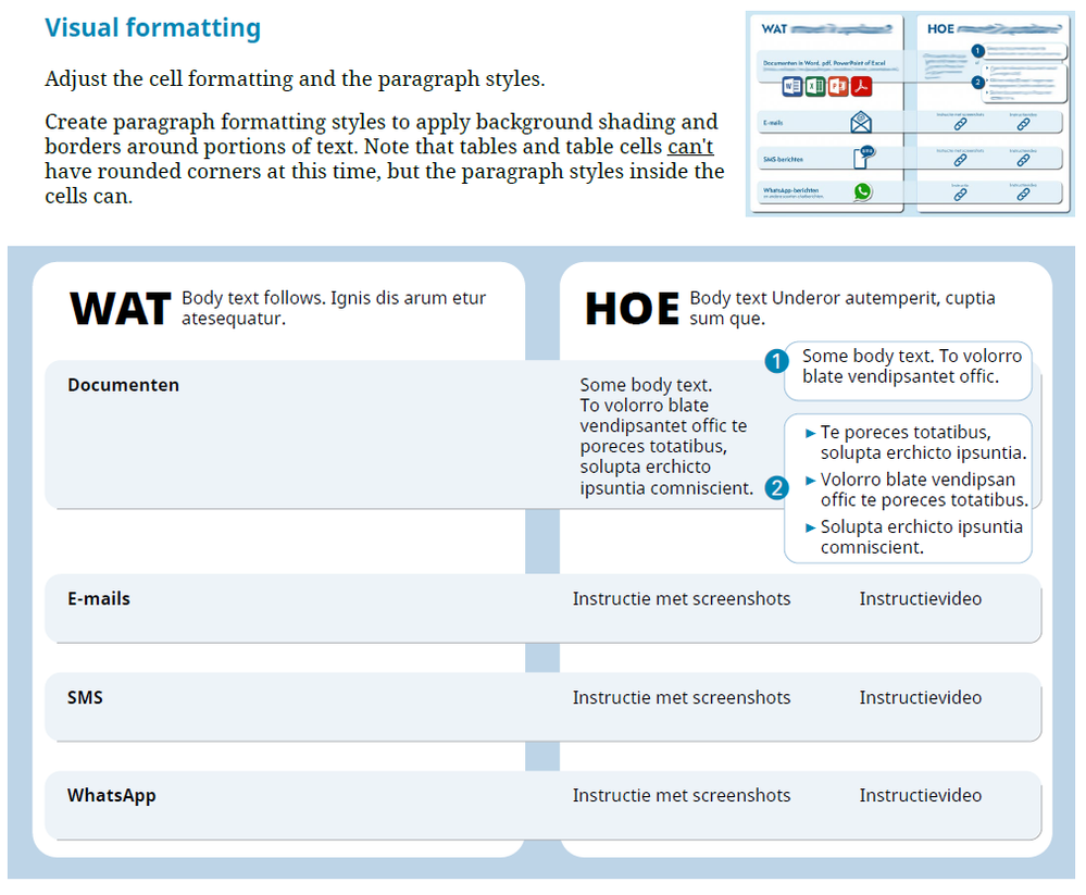
I quickly created this sample that mimics your design (both the InDesign and PDF files are attached).
The key is that I created a table that sets the correct accessible structure for the content. And then I created Paragraph Styles to format the heck out of it. I heavily used the new Paragraph Shading and Borders settings in paragraph styles to create your design of the blue "hotdog" boxes.
By using Paragraph Styles to do the visual formatting, most of the text boxes are eliminated and your reading orders are left in tact. I did nothing to the PDF, other than to do the usual minor corrections to table span settings, which took all of 1 minute.
... Do you see a way to make this simpler?
By @YvonS
Yes.
- Minimize the number of frames in the design. Use background shading on paragraph styles where you can to create faux boxes that look like frames but aren't. Example, eliminating the 2 white "column" boxes and use cell formatting instead to make the 2 sides clearly visible. The blue hotdogs could also be replaced by simple cell formatting, too.
- Simplify the design. The design instrustry has been moving to a cleaner "flat" design aesthetic that uses flat color blocks, fewer rules/borders, and simplier designs. As a creative director of a small cadre of designers, I like this movement!
As Mies van der Rohe said, "Less is more."
And as Bevi Chagnon says, "Not only is 'less' more, 'less' is more accessible." <grin> (I have a degree in architecture and studied the philosophy of Mies and the Bauhaus movemement. Their theories have greatly affected my graphic design career ever since.)
| PubCom | Classes & Books for Accessible InDesign, PDFs & MS Office |
Copy link to clipboard
Copied
-
- 1
- 2


