Demystifying video export ..?
Copy link to clipboard
Copied
Can anybody tell me why this Youtube upload looks/plays so crummy, and what's the best way to fix this problem.. thanks!!
-The video is 60fps, but looks more like 30fps on Youtube
-The audio on the Youtube upload is late by ~5 frames
-I am using CC 2017, the exported video looks/plays fine in VLC, and I've tried a number of different export settings with the same crummy results on Youtube..


Copy link to clipboard
Copied
What happens if you export the media as GoPro CineForm or Apple ProRes and upload that file directly to YouTube?
Copy link to clipboard
Copied
Could you tell me where to find those settings? thanks!
Copy link to clipboard
Copied
Could you tell me where to find those settings? thanks!
Here you go:
Copy link to clipboard
Copied
Alright I tried both those and it yielded the same yucky result unfortunately :$ ..
Copy link to clipboard
Copied
Do you only see this issue with the uploads you do, or are all videos you watch in that browser out of sync?
And, if you click the Settings icon on YouTube, is it set to 1080p60? I have seen myself that it sometimes one must manually change that from 1080p to 1080p60.
Copy link to clipboard
Copied
Yes I've only noticed the (slight) sync issue on my videos, and it's indeed set to 1080p60..
Copy link to clipboard
Copied
Yes I've only noticed the (slight) sync issue on my videos
But what about other peoples videos?
Copy link to clipboard
Copied
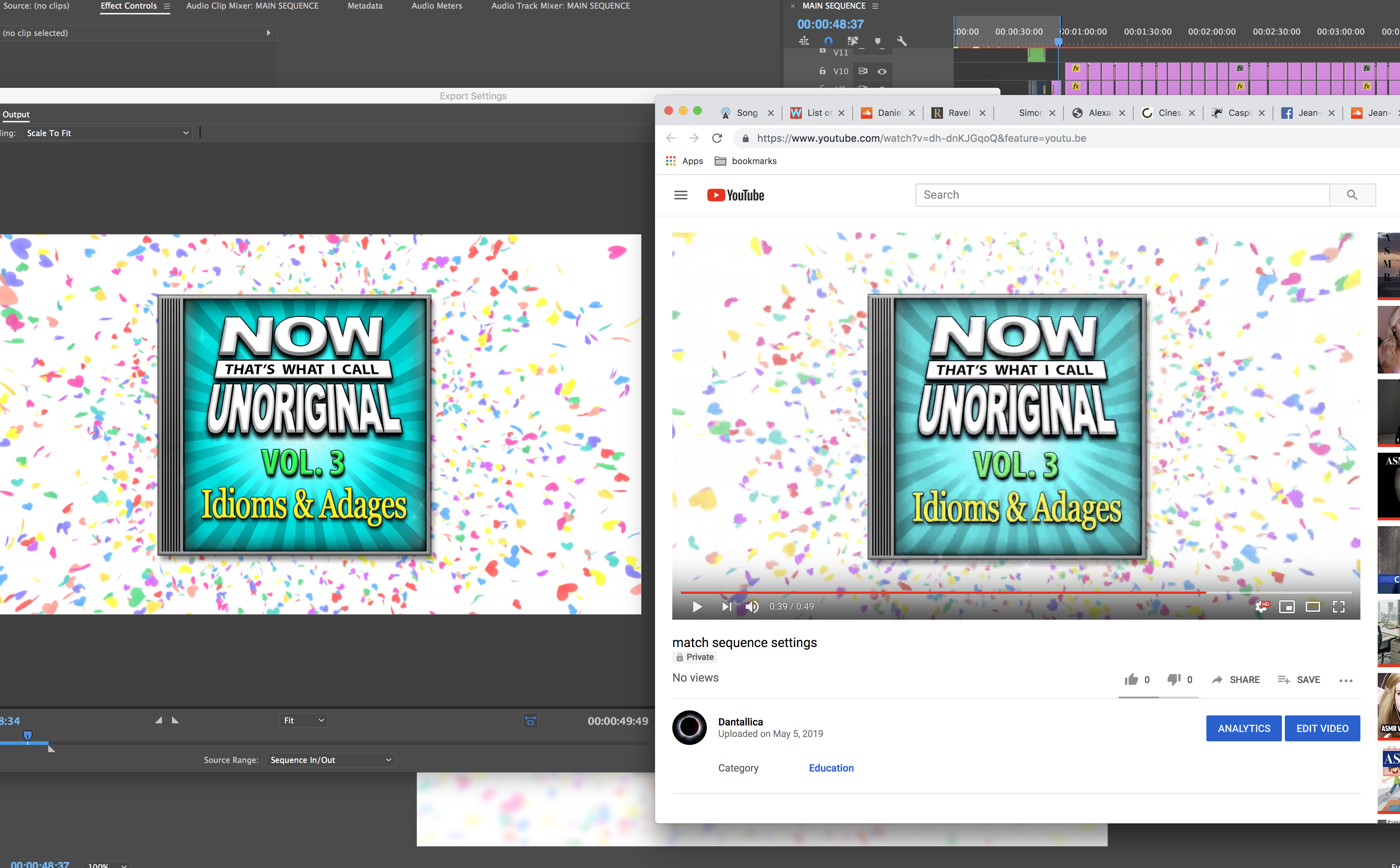
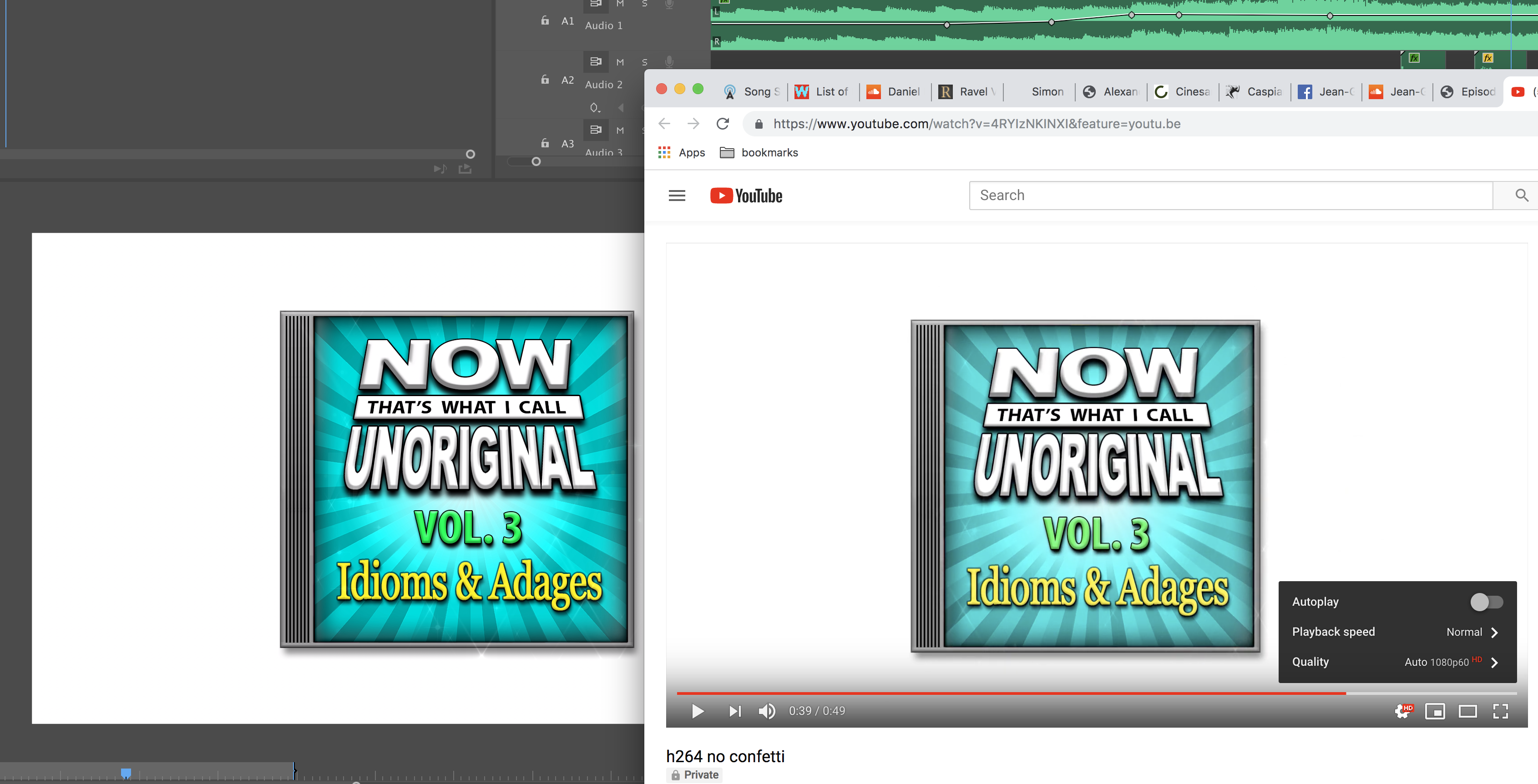
I haven't noticed sync issues on other peoples videos. I tested removing the confetti from the background (see image), and while that removed much of the distortion, it still doesn't explain why the contrast/saturation looks so washed out.. (I also noticed that the 60fps playback looks much smoother in Safari vs Chrome, thought the washed-out look is the same)

Copy link to clipboard
Copied
Sounds like a question for the YouTube support team.
Copy link to clipboard
Copied
Sounds like a question for the YouTube support team.
Yes, i agree on that as well.
Copy link to clipboard
Copied
It looks hardly washed out.
Left has a black frame, right is all white around; adds to the optical illusion.
Copy link to clipboard
Copied
Hmm.. maybe "washed out" is not the correct technical term, but to my eye these look significantly different..
I'm just wondering how professional YouTubers address issues like these..

Copy link to clipboard
Copied
Load them up in Ps and sample the color.
Copy link to clipboard
Copied
the grey is perfect, but the yellow is messed up.
you have a non-linear chroma issue going on.
is color management setup in chrome?
Google Chrome shows wrong colors after update
- Step 1: Open the Chrome Browser settings. Enter the URL: chrome://flags/ in the address bar of your Chrome Browser.
- Step 2: Change the Color profile. Scroll down the page until the point "Force Color Profile". In my case, I had to change the value from "Default" to "sRGB".
if that doesn't work, Please upload a color chart and I'll make a 3D lut in LAB mode for that.
Copy link to clipboard
Copied
Ok, here's what I've gathered so far:
-60fps confetti on Youtube looks bad
-30fps confetti on YouTube looks a bit better
-If I add the "gamma correction lut" to the Premiere export, and change my iMac Pro's color display setting from default ("iMac") to "Rec.709 Gamma 2.4," the video I see in Chrome changes to match what I see in Premiere (as best I can tell)..
Is there anything else I should be doing; Is this the right solution, or am I just setting myself up for more problems? thnx
Copy link to clipboard
Copied
glad to hear it worked. technically speaking there is no right or wrong answer. it depends on what you're grading towards and how you're viewing it. if you want everyone to see the same you do, they also have to change their color display settings. And, since not everyone has an imac, that is also impossible. So, welcome to the un-managed universe.
Copy link to clipboard
Copied
I should prolly mention, I'm still a bit unsure as how to proceed.. After switching my iMac to "Rec.709 Gamma 2.4", some things look a little on the unnatural side (On YouTube, John Oliver looks normal-ish, Colbert looks quite red, and Seth Meyers looks downright radioactive orange).. I've also noticed things like some app icons look saturated/vibrant to the point that it's nearly painful on the eyes..
Here is a quote from the other thread regarding newer iMacs: "Without any conversion, your Rec709 colors will be displayed as if they were P3 and will appear much more saturated than intended. Display color management is designed to fix this."
In Premiere CC 2017, "display color management" doesn't seem to be available, and in CC 2019, it's 'greyed out.' ..
Copy link to clipboard
Copied
One of the links from earlier in the thread goes to SpectraCal. If actually doing broadcast work, I'd invest in one of their calibration solutions.
If doing web work, you could opt to go with sRGB instead of Rec709Gamma2.4; however, I'm not sure what issues, if any, that created on the newest model iMac displays.
Display Color Management can be enabled if you have a project open with the Renderer set to Metal or OpenCL.
-Warren
Copy link to clipboard
Copied
You have to first understand the the new Mac P3-Display color space is completely unique to the newer Macs, and no one on the planet without a recent Mac has anything like your computer's color space/profile.
The P3 color space is 20-25% "larger" than video sRGB in general, but almost all of that extra hue area is in the green to orange area, it isn't just a general expansion. So plopping an sRGB image into it without an aware controller gets an improper "translation".
As does taking an image created in P3 into sRGB.
But along with that, Apple chose the white point of sRGB rather than that used in either of the two current P3 video standards.
Then chose a gamma that isn't used in either Rec.709 or professional video P3. And the gamma is also odd because it is listed as "sRGB" rather than a fixed number.
Technically sRGB uses a curves transformation calculation as there are basically three different gamma curve shapes involved depending upon the very low, mid-low, and higher value tones. And it "roughly" but nowhere near exactly is similar to gamma 2.2.
But the gamma formulas to get from sRGB/Rec.709/2.4 into a Mac OS/P3 screen correctly and back to sRGB/Rec.709/2.4 require using calculations for a 1.96 gamma.
And with most proper calibration/profile work you also need a max brightness figure. sRGB/Rec.709 is 100 nits. HDR can of course vary dramatically. But it's only the "over-range" area that is different m, the main body of tones is fairly similar. And that is giving colorists and production teams plenty of challenges.
Didn't make it easier, did I?
Well ... Apple chose to boldly go their own course again. So ... their decision follby your decision to buy that gear ... left you with the choices you have.
That's just the reality of the situation.
Neil
Copy link to clipboard
Copied
What's the difference between a "color space" and a "color profile"? And when you say "newer Macs," how new do you mean? Do you know if the "Apple P3 color space" is consistant across Apple's newer phones and tablets? Is there a way to change the color profile on a phone/tablet? Do you think future color spaces are going to continue to expand? And is the 20-25% green/orange increase an increase in "saturation/vibrance"? And what exactly is meant by "broadcast work?" Since I'm mainly just working with uploads to YouTube/Vimeo, is it necessary for me ultimately to reference anything other than my phone and tablet? Thnx!
Copy link to clipboard
Copied
This article is slanted toward web graphics, but it provides good samples of wide color images and their sRGB counterparts along with a reference image that shows where you should be seeing the difference in the two:
Copy link to clipboard
Copied
Ha there's so many variables I'm trying to balance in my head ... "iMac" display profile vs. "Rec.709 Gamma 2.4" display profile vs. YouTube (iOS app vs. within-browser) vs. Vimeo vs. Chrome vs. Safari vs. older Apple tablets vs. newer Apple tablets vs. "broadcast" vs. non-broadcast vs. older Apple phones vs. newer Apple phones. vs. Quicktime vs. VLC vs. "display color management" vs. Premiere vs. Photoshop vs. older iMacs vs. newer iMacs vs. luts (which lut to use and for what application -- the "QT Gamma Compensation.cube" lut from the linked thread looks good on my desktop, but bad on my tablet/phone) ... Not gonna lie, my head is kind of spinning ![]() ... But I'm thinking maybe the first thing I should do is update my tablet (2013 iPad air) and phone (2014 iPhone 6) to more current models..
... But I'm thinking maybe the first thing I should do is update my tablet (2013 iPad air) and phone (2014 iPhone 6) to more current models..
Copy link to clipboard
Copied
two issues, playback peformance and color
if chrome is slower, is it slower for all videos? if not, then try using an audio .wav not VBR variable bitrate but CBR video and audio
2. try using adobe's 1.96 gamma to 2.4 lut
"Why does my footage look darker in Premiere?" Color Q&A
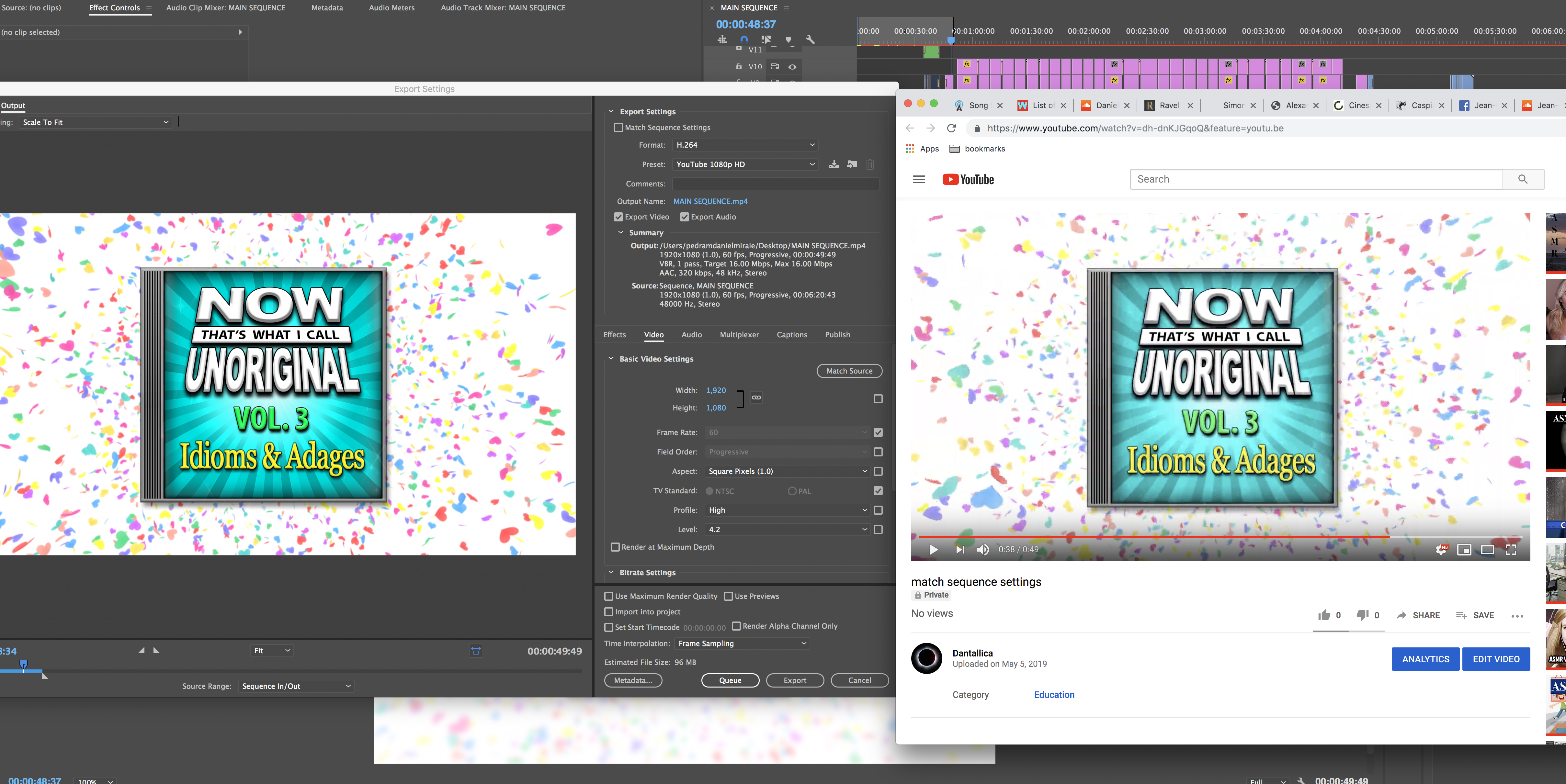
if that doesn't work, check sequence settings, export settings, and post a mediainfo screenshot from vlc or mediainfo.
if that doesn't work, try uploading something that already works(to isolate the variable of that one video)
is it getting uploaded manually or directly to youtube through adobe media encoder? try the other way.
if the adobe lut doesn't work, upload a color chart to youtube and see what it does.
Copy link to clipboard
Copied
*****What's the difference between a "color space" and a "color profile"?
Color Space is the monitor setting and Color Profile is the file setting.
*****And when you say "newer Macs," how new do you mean?
• 2015 and 2017 iMacs
• 2016 and newer MacBook Pro, MacBook, MacBook Air
• Thunderbolt Display
• iPhone 7 and up
• All the current iPads (but first introduced with the 1st generation iPad Pro)
If you go to the product web page, you’ll see “wide color”.
*****Do you know if the "Apple P3 color space" is consistant across Apple's newer phones and tablets?
All if the current models, yes.
*****Is there a way to change the color profile on a phone/tablet?
With macOS, yes. If you can do it with iOS, it’s deeply hidden or via a 3rd party app. Apple recommends that developers create wide color graphics for newer devices and sRGB for older.
*****Do you think future color spaces are going to continue to expand?
Definitely.
*****And is the 20-25% green/orange increase an increase in "saturation/vibrance"?
It’s across the entire color spectrum.
*****And what exactly is meant by "broadcast work?"
You’re content is going out to broadcast channels, cable channels or on demand and must conform to ATSC standard.
*****Since I'm mainly just working with uploads to YouTube/Vimeo, is it necessary for me ultimately to reference anything other than my phone and tablet?
Probably wouldn’t hurt to check what it’s looks like anywhere YouTube can be watched (desktop computers, mobile devices, network appliances that can receive video - like AppleTV, Amazon Fire, Roku).
-
- 1
- 2
