

- Home
- Premiere Pro
- Discussions
- Re: How can I eliminate/control the undesired boos...
- Re: How can I eliminate/control the undesired boos...
How can I eliminate/control the undesired boost in color/saturation/depth that occurs when I import footage into Premiere Pro? This boost disappears in export and results in a washed out film.

Copy link to clipboard
Copied
For the past year I've been pulling my hair out trying to figure out this apparently age old dilemma: when I import into Premiere, my footage gets a boost in color/saturation/depth, and when I export from Premiere, my beautifully color graded film is stripped of this in-app boost and reverts back to being washed out. Blacks aren't as black, whites are blown out, and overall color is just generally desaturated and lacking depth. I seem to lose quality in export, as the washed-out-ness makes my once sharp film look super muddy or fuzzy. I try to overcompensate with colors and shadows within Premiere so that when I export the colors might turn out semi-normal, but it makes me nervous to do that as I don't know how each varying device will interpret my overly color graded film. I refer to this issue I experience within Premiere as the dreaded "Premiere Boost" that I never asked for but can't make go away.
I've done days and days of research on why this happens over the months. This is what I know and what I experience.
- When I import my flat footage into Premiere, Premiere automatically seems to add a boost of color and sharpness before I even make any edits to it. When I export the color graded film from Premiere, it loses that extra punch and goes back to a desaturated, super sad, super ugly film, and I subsequently cry. If I were to reimport that newly exported film back into Premiere, it would automatically boost color and brighten up again. I understand that the issue is not with my footage or with the player, but rather Premiere offering a wider color range than all other platforms.
- I completely understand that if I were to watch the finished exported film in VLC, the colors would display properly because Premiere and VLC use the same color range. HOWEVER, about 99.9% of my clients are going to open this file up in Quicktime, YouTube, Vimeo, Facebook, or Instagram, not VLC, and ALL of those players and platforms play the film super washed out. Opening the film in VLC instead of QuickTime doesn't solve the problem, it just applies the "mask" that Premiere seems to add within the editing software.
- I've tried using Creative Cow's "Fix My YouTube" LUT, and unfortunately it doesn't solve my problem in the least. I so, so wish it did.
- I have a SpyderPro Color Calibrator and recalibrate my 2017 iMac every month. I understand that every device will interpret footage/color a little bit different, HOWEVER the loss in color and depth in my films is extremely radical no matter which device/platform/player I run the color graded film on. These differences are not minute, they are massive, and it's evident on every device/platform/player though, yes, I will agree that every device seems to have its own take on color interpretation. (Example: My films look more orange when played on my Motorola Moto E4, but more green on an iPhone. This is not the color issue I am concerned with; I'm concerned with a severe loss in color, depth, saturation that happens between Premiere and all other platforms. Refer to the screenshots!) I also understand that the only way to experience the "true color" of a graded film is to evaluate it externally on fancy equipment that I forget the name of through a fancy monitor/tv that I forget the name of with a fancy cord that I forget the name of. However, again, my clients will never be viewing their films from me on a professional TV/monitor or with the appropriate equipment. They're watching this on their phones, iPads, laptops, etc. I not concerned with being able to see the "professional trueness" of color as my clients won't have the resources to view that; I am concerned with eliminating/controlling the boost in color/saturation/depth that automatically applies itself when you import a video into Premiere.
- I edit in Premiere Pro over Apple-native Final Cut because I initially learned the Adobe Suite as a graphic design major in college, and I simply knew the layout and lingo best. I've tried attempting Final Cut and it's like a whole new language to me. Should Apple users ONLY be using Final Cut? If I want to use Premiere, should I build a PC?
- I have tried adjusting my iMac's Display Profile Color setting (the original iMac setting, Apple RGB, Rec 709, etc) and they never effect the color within Premiere, only the colors surrounding it (i.e. my desktop, my QuickTime videos, etc. Somehow the colors within Premiere still remain the same.)
- It was my understanding that Premiere 2019 was going to allow for more color management in the update. I have checked the "Enable Display Color Management" box checked in "Preferences > General", but this only seems to further darken and add depth to my Premiere image, making the washed out export even more drastic of a difference. I'm not sure whether or not I should be using this feature, but other Premiere experts seems to believe this would help with in-app Color Management. Should I be doing this? How can I know if my computer handles GPU Acceleration?
- I've noticed if I overcompensate with color grading, it washes out in export, but if I've overcompensated with the colors enough it will still look relatively okay for the internet. If I burn a DVD with the same file, the DVD actually takes on the in-Premiere color interpretation and will show all of my over compensation, as for whatever reason the DVD interprets the colors the same as Premiere does. Now I find myself making a "Premiere happy" version to burn DVDs, and an overly saturated version for the internet so that after the "Premiere boost" is stripped in export it still looks relatively colorful and deep.
- I've read other forums that say people in the professional film industry experience this. How in the world do they work around it? Surely they are not blindly color editing and waiting to see what comes out in the export. I feel so helpless and like I have no control over my own film
- Is this an issue of a poor graphics card? I know non-Mac users seem to mostly have Nvidia graphics card, and I have Radeon Pro as that's Apples default.
- No other videographers I have talked to have experienced this issue themselves. I see lots of people discussing it on the internet, but in my day to day life all the videographers I am in contact with are completely baffled when I share this issue as none of them have ever experienced it before. I am so confused as to why I'm the only one who wrestles with this (minus all you fine folks who share about it on the internet).
My question is, for those of you who experience this drastic shift in color with Premiere and wrestle with it, what is your work around? Is there a way to adjust the color management within Premiere so that my footage doesn't get a color boost when I import it, and therefore a mandatory desaturation when I export it? Is it a fluke combination of Adobe Premiere + 2017 Apple + Sony that creates this drastic color shift within Premiere? I have other friends who shoot Sony and edit in Premiere on a Mac and don't experience this issue, but their Mac's aren't as new as mine. I know Sony is notorious for having some color issues in post. Would it make a difference if I shot Canon or Panasonic? Surely not because the color shift happens only within Premiere. I just want to know how to be able to "turn this color shift off" in Premiere so that I can see the true colors I am editing and not be blindly overcompensating and then completely surprised during export.
I appreciate any and all help. I know that some of my post came off a little sassy or frustrated; I've been experiencing this issue since September of 2017 and have not been able to come to any kind of compromise or solution. It makes me dread color grading because I know it's all for naught and my film will look yucky when I export it. Please, for those who have wrestled with this and found a valid solution, offer any advice you may have. I'm at my wit's end.
- - - - - - -
My Set-Up:
I edit on a 2017 iMac Retina 5K, 27-inch.
4.2 GHz Intel Core i7 Processor
64 GB RAM, 2400 MHz DDR4
Radeon Pro 580 8192 MB Graphics Card
I edit in Premiere Pro CC 2019 v 13.0 (Build 225)
I edit in Premiere Pro over Apple-native Final Cut because I initially learned the Adobe Suite as a graphic design major in college, and I simply knew the layout and lingo best. I've tried attempting Final Cut and it's like a whole new language to me. Should Apple users ONLY be using Final Cut? If I want to use Premiere, should I build a PC?
My Camera/Settings:
I shoot Sony, both the A6300 and the A7siii.
I typically shoot on a flat profile (Matt Johnson's "Flat Matt"): PP8 , Black Level 0, Gamma Cine4, Color Mode S-Gamut3.Cine, Saturation 0, Detail -7.
Example Screenshots:
This isn't my proudest footage as I was shooting a lot of 120fps on a Sony Four-Thirds A6300 with an f/4 lens, which I realize is a recipe for quality disaster. Forgive the fact that the footage is lacking top-notch image clarity and more grainy than I would like
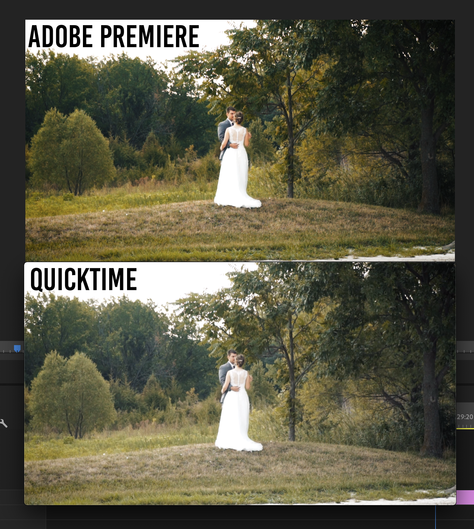
^ When the "Premiere Boost" is removed in export, I lose all detail in the grass and experience great color loss. Shadows are lightened and the exported product essentially looks unedited. ^
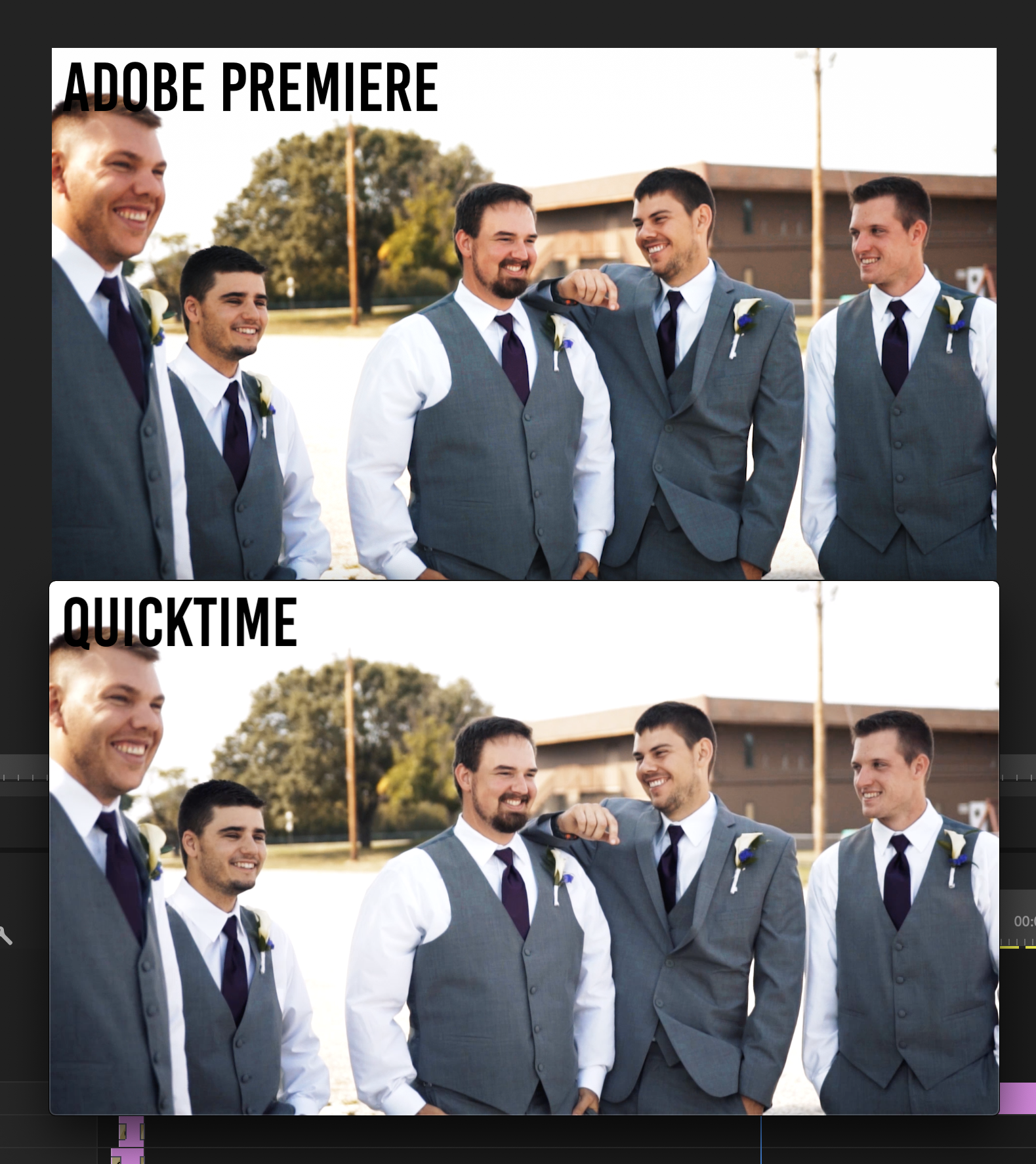
^ When the "Premiere Boost" is removed in export, I've lost the depth in the shadows and skin tones. If I try and overcompensate with Premiere for a satisfying final product in Quicktime, I usually end up yucking up the colors and making the film look super amateur. ^
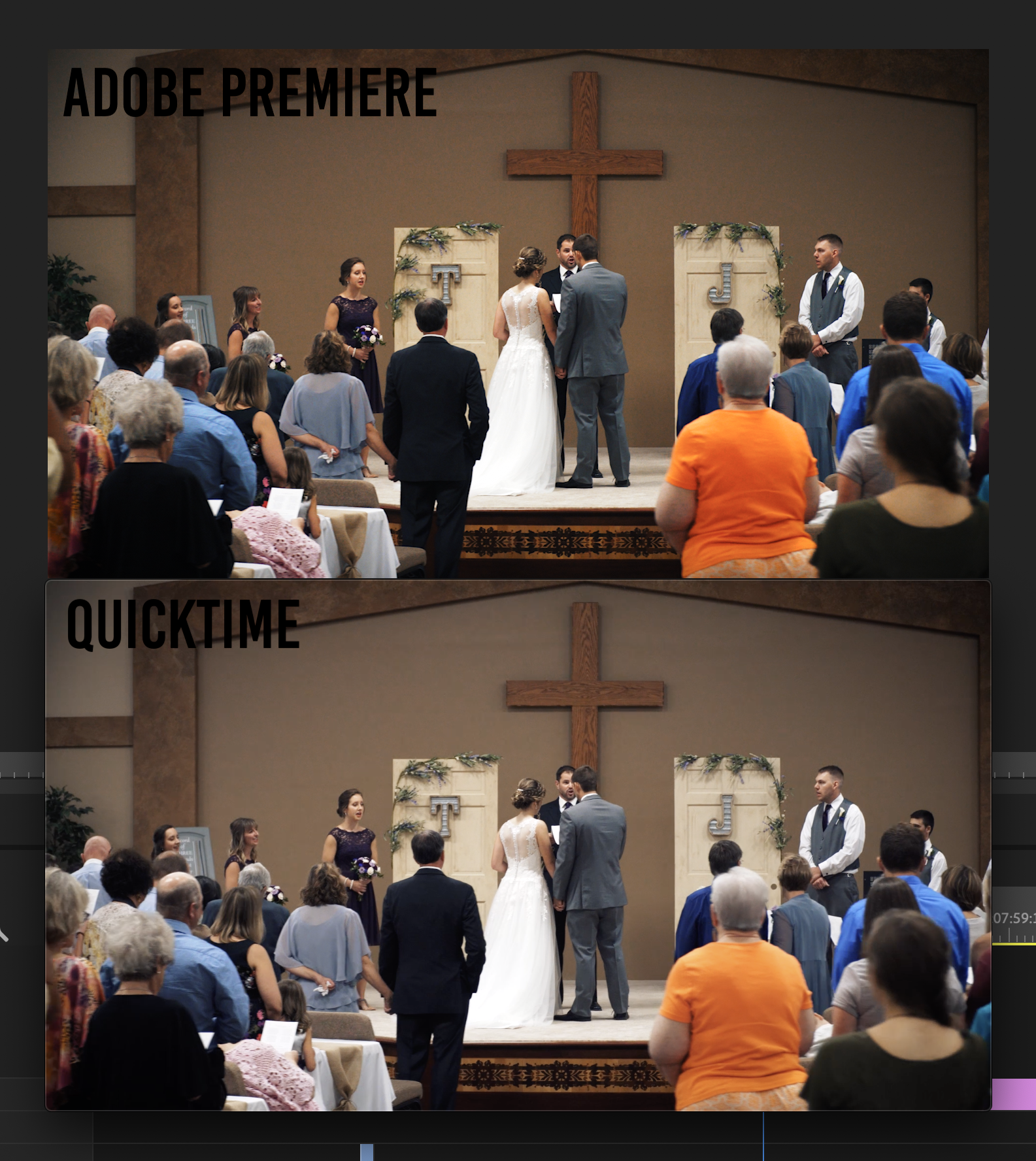
^ Flatness and loss of deep shadows in the cross and the groom's suit. Saturation has taken a dive in the women's orange shirt. ^
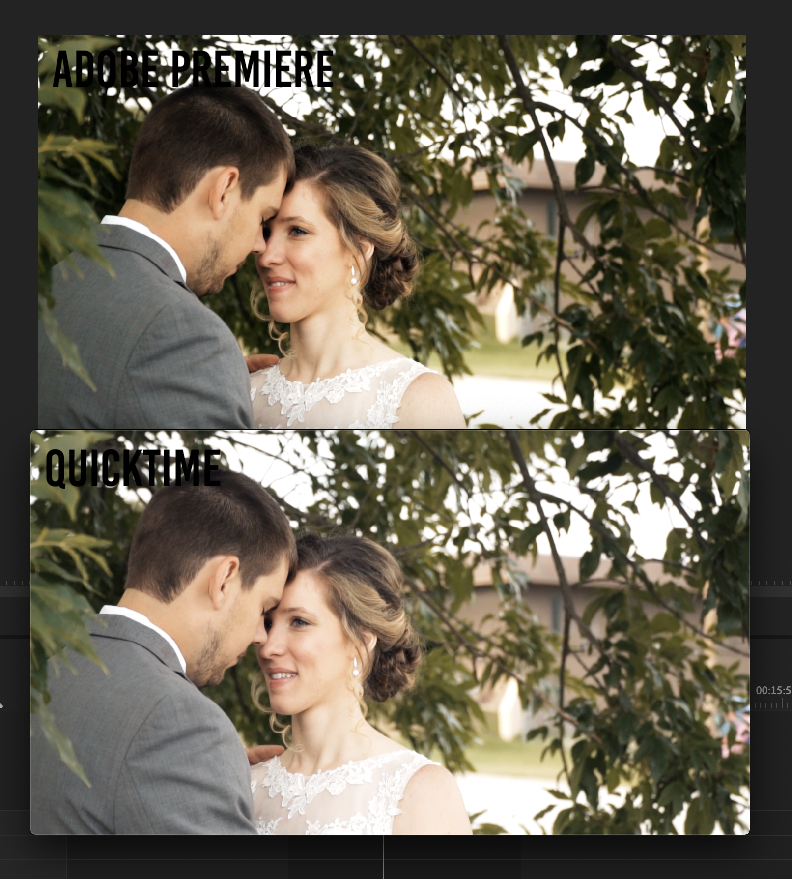
^ I'm just so weary. Whyyyyyyy does Premiere do this? ^
This differences may seem minute within the screenshots, but when this loss in color and depth is effecting the ENTIRETY of the film you really notice. Thoughts?


 11
Replies
11
11
Replies
11

Copy link to clipboard
Copied
QuickTime is not the player for judging colour balance. I assume someone will correct me if I am wrong, but QuickTime will show a colour range of 16-235 whereas PPro shows 0-255. Check your video on something like VLC.
Also, QuickTime as I understand is a 32 bit player; colour and quality will not look as it should.
Also helps if you have properly calibrated monitors.
Copy link to clipboard
Copied
I see. The problem is all of my work goes straight to Facebook, Instagram, YouTube, or Vimeo. The video looks the same from QuickTime to those platforms, so if those platforms are my end destination I really need to be assured that I can land on a good compromise between QuickTime and Premiere. To me my footage has always looked the same from Premiere to VLC, so I've never felt like checking the final film against VLC was very necessary. I just want too be assured my videos will look sharp and colorful to the common platforms, which apparently all interpret my videos on QuickTime's smaller color range. 😕

Copy link to clipboard
Copied
What I'm trying to get across is it isn't how they look in QuickTime on your machine to worry about.
It's how they look on other machines *compared to how other pro materials look like on that machine.*
If you can have your material checked on a pro level and setup rig, and it's "good" or pretty close, you're doing fine. It will ... comparatively ... look good on other machines.
Neil
Copy link to clipboard
Copied
Gotcha! Sorry, that response was supposed to be for cvid01! I guess I haven't mastered the art of "mentioning" or "quoting" yet.
My question R Neil Haugen is, as long as this color difference is an issue, how am I supposed to edit within Premiere? Are there recommended work arounds that help you get a satisfying final product? I've tried Creative Cow's LUT and it didn't pan out for me; I saw no difference. I overcompensate within Premiere, but then I get so used to what I'm seeing in Premiere that I'm never satisfied with the export--the export always looks so much less curated than what I see in Premiere. Once I compensate to attempt to correct the loss of color/depth after export, I then get used to the image I'm seeing in Premiere and am constantly dissatisfied because I'm always seeing how much better it could be (if that makes any sense?).
Do you experience this issue? What are your tips for being able to better color correct/grade when the image you're looking at in Premiere is actually unrealistic?

Copy link to clipboard
Copied
hello there. the cc premiere 2019 color management will use your OS's P3 color management and translate it into its native color engine Srgb 2.2 then add an additional bt1886 gamma transform. Firefox and VLC will look similar to premiere once premiere exports it but not in premiere's program window. If you want Premiere's program window to match VLC for grading for the web, you will need a lut transform from Srgb to BT1886 in lumetri as an adjustment layer while color management is enabled. Chrome isn't color managed very well(you can change its internal default color profile chrome://flags in address bar) and youtube often needs you to click re-touch vid after uploading. quicktime player does another layer of 16-235 or something plus weird gamma tags so I'd avoid it and use VLC instead with openGL in its video output options.
Please try this lut. one will darken for FCPX and one will lighten for web. bt1886 to srgb premiere 2019. Don't export with it on though, only for viewing in window for grading. I haven't heard anything negative about so I hope it helps.
https://drive.google.com/file/d/1HHxxaOWifI3TEhBwEyGSl139x2jRM9dO/view
Copy link to clipboard
Copied
First, I'm a small shop that does work for studio clients and some web, I've not done any b-cast. I push buttons for the fascination of learning what ... and how ... they work. My brain is kind of a one-trick pony, and sees everything as data acquisition for analysis.
I push the buttons around pretty hard as I want to learn. I research things, I pump those who know more than me unmercifully at times. And I've been where most people complaining of this difficulty come from. My color sucked and I didn't know why. I had to learn.
My setup is using an sRGB confidence monitor calibrated with an i1 puck/software to 100 nits and video sRGB. I read up on many monitors to choose the one that I could get the missus to spring for that was closest to my needs.
I'm in a darkened room (not totally dark though) with a difference light behind the monitor lighting the 18% gray wall behind it to 10% of the white light of the confidence monitor.
My UI monitor is calibrated the same, but appears to be slightly less saturated and contrasty than the confidence monitor. Yea, that's Life.
It's not quite as guaranteed as the colorist's suites I know of, but ... when checked elsewhere ... my values have been pretty good. You can go to my rneilphotog.com website and see stills from my posts, and a link to a couple online YouTube vids.
Like many personal-delivery/web-delivery folks, I cannot justify the cost of a Flanders Scientific monitor no matter how much I want one. So i had to learn and work at setting up until i got it to just work.
On my system VLC and Potplayer show pretty darn tight to PrPro. As actually does QuickTime as the Nvidia card is set to command that player's settings. Any of them on my UI monitor are that bit less contrasty/saturated, on the Confidence monitor the same as PrPro.
I'm one of the lucky ones in that YouTube and Vimeo always seem to do a proper encoding on my uploads. I do know how to get past that however if they screw up like they do for so many.
But the big thing is for you to learn how to get proper settings within PrPro to get exports that are correct on very highly controlled systems. Use your scopes ... make sure blacks are appropriate for the scene, very rarely do you need many values below 5 on that left side 0-100 scale. White points, well ... that can vary. A bright outdoor scene may have values up to 90 with pegged spikes for reflective highlights from chrome and glass, many other scenes may top at 70 or so.
Saturation must be within the bounding box in the Vectorscope YUV, actually many scenes don't have but a few spikes going halfway. A way to learn scope "placement" is to download or upload good quality media, and import that into PrPro. Watch the RGB Parade, Waveform, and Vectorscope YUV.
Make a test project, export a minute or so of a few different types of clips/scenes. Get that to a TV station or full colorist for a quick check.
If it flies, then ... that's all you can do. If it doesn't, try again. Once you get that down, keep up the regimen. And realize that you cannot possibly produce anything that is out-guessing the screens and viewing conditions of others. Period.
Neither can any full colorist on the planet. Again, if your material is correctly produced to standards it will look correct on other machines relative to how other pro material looks on those machines.
That is *all* you can do or control.
Neil
Copy link to clipboard
Copied
R Neil Haugen
So is there any combination of computer/software that doesn't experience this issue? Will colors remain the same from footage>import>export with Final Cut do this on a Mac? Will Premiere still do this "color boost" on a PC? Is there anyway I can avoid this issue? I'm needing to get a new laptop for my job and am wanting to get whatever alleviates or avoids this issue so I can get a more accurate editing window that reflects what the export will look like.
Copy link to clipboard
Copied
There isn't any way around the user needing to set up for appropriate color management ... sorry, there isn't any magic bullet.
You need to get your head around what actually happens with color first. There is no "perfectly accurate" color that can be seen by all systems/screens/apps to begin with and simply appear the same everywhere.
Every monitor, even the same model from the same manufacturer with all settings the same, on the same system ... will vary. Some models/makes more than others, but all will vary. For example, one common participant here tested the various Mac P3 monitors, and found that to make a single compensation LUT to match one thing within/without PrPro on Macs, it couldn't be done. Without making a different LUT for each monitor size, because the different sized Mac P3 monitors have quite a different response from each other.
That's the same "type" of monitor from the same maker on the most restrictive OS/gear setup out there.
Then you get to the OS, and how that handles color internally and what options it gives the user. BIG differences there, and not just between say Apple/MS, but between different dot releases of either OS's OS.
Then to the video cards ... they handle things different, and depending on other factors may have different settings 'here' than 'there'.
Then to the actual apps ... which do have variances including how much use-control they allow. Resolve allows the most user-control, including very good working selections for Rec2020 and P3 spaces/profiles. And finally we have at least one toggle-switch for color management of displays within PrPro that helps in some cases, more typically on Macs than PCs. I keep pushing for more, and assume eventually we'll get more. We certainly need them!
PrPro assumes pro broadcast standards, including both the camera transform function of the original Bt (Rec) 709 standard, and the Bt.1886 display-transform function that was added to Rec.709 when CRT TV's/Monitors joined the dinosaurs. That last bit is not universally respected. There's one color guru that feels that if the display transform is used during grading, on a very small subset of older monitors/screens ... the blacks may appear crushed when viewing. Even though the resultant image is better on the vast majority of current screens if the Bt.1886 display transform function is followed.
Apple seems to not use Bt.1886 in their newest OS releases nor in FCPx. Resolve doesn't have any on/off control for Bt.1886 that I can find, and as as my exports from PrPro match perfectly with the view as imported into Resolve, I assume Resolve uses Bt.1886 under the hood. Further, the LUTs RED provides for their IPP2 color system all work include Rec709/Bt.1886, and many of the colorists I most respect for practical technical advice and training simply state that unless you're running an OLED monitor with the true black of that, on any Plasma/LED monitor one should be using the full Rec.709/Bt.1886 broadcast standard for setting up your system.
As does Alexis Van Hurkman, one of the biggies of the colorist teaching profession.
Past the pro level questions, you have color unaware apps like QuickTime Player and the browsers of Chrome & Safari. No way to control those at all.
And then, color-aware players like VLC and PotPlayer, and Firefox browser, who try to follow header tags/flags for color.
What is a content producer to do?
IF you want your output to "look professionally produced" on the widest array of screens out there, you have to produce it to the same standards that professionally produced material is created in ... and set up your system as close as possible to that, given budget constraints & such.
Does this mean that on other screens your output will look like it does on yours, no matter which player/app you view it in?
Of course not ... no one, not even the most highly skilled colorist, has any control whatever of how the material looks outside their own suite in "absolute" terms. The only thing anyone can do is produce under the best controlled circumstances you can, as close to b-cast standards as possible, and then realize your material will look relatively the same to other professionally produced content on most any screen it's viewed on. Which has nothing whatever to do with looking like it did on your screen, sad to say.
Use the highest grade monitor you can afford, profiled/calibrated to the video form of the sRGB for Rec.709/Bt.1886 (drop the Bt.1886 if grading on OLED), using a puck/software system for that profile, in subdued lighting with neutral walls/surfaces behind the monitor. If possible, get an external LUT-holding box to go between your computer and the monitor, which begins to give you a pro-level ability to profile that monitor. And gets the OS out of the mix.
Also, find someone such as a colorist or a local TV station who's willing to look over a minute or two long video file you've graded/exported to test on their system. A colorist can tell you how you fit in their scopes within/exceeded standards. A TV station with the hardware QC checker can quickly run it through and give you an answer as to whether you meet b-cast standards for black/white levels and max saturation excursions.
Then you'll have more confidence in what you're putting out.
Neil
Copy link to clipboard
Copied
Frustrating, eh? Yea.
Color in video is not "optimal" now, and I fear is only going to become more bizarre as we start having more wide-gamut & HDR work and screens to put it on. Already, as you note, even supposedly simple 'standard' dynamic range video can be wildly different from screen to screen.
What ends up mattering is the way your work looks relative to other professional material on those screens, and not at all dependent on how it looks between PrPro and any other app on your screen.
You've done a lot of work to try and get things right. I'm assuming you are trying to calibrate to video sRGB, not stills sRGB. With a monitor and OS setup that can work in sRGB. Unfortunately that's really the 'game' right now, and the newer Macs and their P3 monitors with that gloriously wide gamut can be a bit of an issue to work with at times. As you've noted, that "enable display management" option isn't any cure-all. It helps with some situations, and doesn't with others ... like yours.
What I would suggest is that you see if you can find a TV station where they will actually put some test material of yours through their QC machine. That would tell you right off the bat if your stuff is within the b-cast "norms". If it is, then ... that's the best you can do, really.
Either that, or find a colorist with a good pro level suite, and have them do a quick look over a bars/tone and a few short clips of various scenes. Maybe a minute or less of timeline, but just some quick examples they can check on their scopes & confidence monitor.
If your material looks relatively the same as other pro material on other people's screens, then ... you've succeeded. If not, you haven't.
And getting say a colorist's quick review/comments on you blacks/whites, you main gamma, and general color as seen on his gear can tell you more than about anything else, really.
Neil

Copy link to clipboard
Copied
Hey, same thing is heppening to me. Laste Premiere Pro and a very powrful Imac Pro (2019).
Did you find away around this?
thx.
Copy link to clipboard
Copied
When your system is set up so that it does not follow established color management processes, the user then has to step in and take over. Which is what you face.
There's a lot of information up above ... and it takes some work on your part to get your system working properly. We have to do this with PCs also, of course. But it does involve some differences on the Mac.
The Display Color Management option in Preferences does mean that Premeire will be able to probably display a near-correct Rec.709 image on the monitors within Premiere. It doesn't help outside of Premiere at all, of course. That is something you need to fix.
If Apple chose to have the ColorSync color management utility abide by proper color management for Rec.709 video media, it would be massively simpler for you. As it is, Apple sets your system to work improperly and that's a bit of work to get around. I do wish I had easier answers for you.
Neil

Find more inspiration, events, and resources on the new Adobe Community
Explore Now
 AdChoices