Copy link to clipboard
Copied
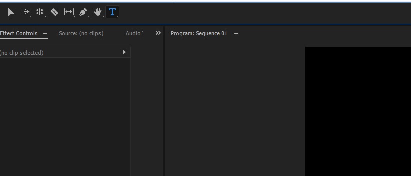
I recently upgraded to Premiere Pro CC2017, and I'm growing increasingly frustrated by the condensed tools panel with the missing/hidden buttons.

I want to expand the tools panel so that I don't have to use keyboard shortcuts or click and hold to switch tools. I noticed that a lynda course instructor was using the CC2017 version with an expanded tool bar:

Please help! I can't find this anywhere in the preferences or panel settings!
 1 Correct answer
Hi BHiser,
I want to expand the tools panel so that I don't have to use keyboard shortcuts or click and hold to switch tools.
I am sorry but you cannot expand the tools panel. (This is how it has been designed.)
The Latest (and Greatest!) for Premiere Pro CC and Media Encoder | Creative Cloud blog by Adobe
I noticed that a lynda course instructor was using the CC2017 version with an expanded tool bar:
The tools panel has been redesigned in the latest version of CC2017. I am sure that you are followi
...Copy link to clipboard
Copied
Hi BHiser,
I want to expand the tools panel so that I don't have to use keyboard shortcuts or click and hold to switch tools.
I am sorry but you cannot expand the tools panel. (This is how it has been designed.)
The Latest (and Greatest!) for Premiere Pro CC and Media Encoder | Creative Cloud blog by Adobe
I noticed that a lynda course instructor was using the CC2017 version with an expanded tool bar:
The tools panel has been redesigned in the latest version of CC2017. I am sure that you are following a tutorial from a previous version of CC2017.
Please share your valuable feedback here.
Thanks,
Kulpreet Singh
Copy link to clipboard
Copied
I am sorry but you cannot expand the tools panel. (This is how it has been designed.)
Lets add some steps and hoops for the editors to work with, ...dumb and pointless by design!
Copy link to clipboard
Copied
More signs that adobe is being run by idiots. This is a seriously idiotic design change. Why don't these idiots give editors the options of using t hings the way they are used to. The new crappy version of the tool panel could easily been an option in the preference. I just lost an hour trying to figure out where the freaking ripple edit tool went when I tried a project in 2k18 because it the features I needed to use were too buggy in earlier versions.
Copy link to clipboard
Copied
Who asked for this? What problem did this solve? Don't fix what aint broke!!
Copy link to clipboard
Copied
I totally agree with the original poster that this is terribly annoying. At least make this customization so we can turn this grouping on and off.
Sorry this is a fail.
Copy link to clipboard
Copied
Which lesson would that be?
This incorrect one cannot extend the toolbar.
edit: screendump in top post shows original tool bar before Adobe change it into PS like toolbar.
Copy link to clipboard
Copied
lovely Ann!
How does one expand the tools in the manner you have shown?
Copy link to clipboard
Copied
Sorry that was my own design.
Copy link to clipboard
Copied
aww too bad. I wish they would rectify this. It is not a good idea to add additional layers to a user interface that is already bogged down by too many clicks. The Premiere interface is terribly clumsy compared to the superior Avid editing interface.
Copy link to clipboard
Copied
New Tools were added to PrPro 2017.1, specifically:
- Type
- Vertical Type
- Rectangle
- Ellipse
- Pen (as a free shape tool, though it was already there as a keyframe tool for the timeline, which still works)
Keeping all the tools inline would have made it too long too see everything in most views. Making it two columns wide would have used up UI real estate that you may want to use for other panels like the Program Monitor or Effect Controls. So we borrowed from Photoshop, After Effects, Illustrator and other apps, and grouped similar tools into wells. Please note that your assigned shortcuts will still summon tools which are not at the top of their wells.
Copy link to clipboard
Copied
jstrawn,
thank you for your reply. permit me to be blunt. Premiere is a video editing program. It is not a photo retouching tool. I think it is unwise to bury functions behind a "well" because photo retouching programs do the same.
Why? Video editors perform thousands of operations every day usually in an effort to meet a deadline. Don't make us click or search needlessly for critical tools.
I have been a professional editor for over 25 years. In that time I have used and mastered Avid, dabbled with Final Cut and I have used Premiere solidly for seven years.
In my opinion, while Premiere is excellent in a number of regards, the interface lags behind. Of the tools presented in the timeline tools palette, the rolling edit is the one I use the most. Aside from rolling edit, selection and razor, the rest of the tools seem illogical and useless. Because I favor the rolling edit you can see why it is annoying that it is buried behind a tool I never use.
I really wish Premiere's user interface was up to par with Avid, I really do. I wish the Trim mode made sense so that I could rely on it for thousands of trims. Unfortunately I almost never use it. Same goes with any semblance of a slip tool. Your timeline editing tools are sorely lacking and you would be wise to let go of your photoshop analogies and look at a system that has mastered those tools and incorporate some of that logic into premiere.
Copy link to clipboard
Copied
bitethehand wrote
thank you for your reply. permit me to be blunt. Premiere is a video editing program. It is not a photo retouching tool. I think it is unwise to bury functions behind a "well" because photo retouching programs do the same.
Why? Video editors perform thousands of operations every day usually in an effort to meet a deadline. Don't make us click or search needlessly for critical tools.
After Effects and Audition both have tool wells too, but bluntness is fine and your point is taken.
So the best thing to do is to make sure that your request gets submitted. Thanks in advance for your feedback there.
For now, Hotkeys and Key Combos should save you clicks, which you can customize as needed in the Keyboard Shortcuts dialog. For example, you can press N and Rolling Edit will come to the top and stay there until you switch to a different tool or close the project/app.
Copy link to clipboard
Copied
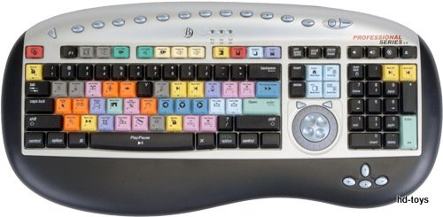
You've been a professional editor for over 25 years? Surely you have one of these then, as you should well know that most editors only use shortcuts.

Copy link to clipboard
Copied
Yes I have about nine keyboards like this. I have edited myself and managed edit teams for more than two decades - large projects, shared media, multiple rooms, high profile projects in tight deadlines. I could tell you down to the hour how many man-hours was lost per week editing on FCP vs Avid. We all use keyboard shortcuts but make no mistake there are many "fast" editors who incorporate the mouse into their workflow - who can blow the doors off "mouseless" editors in a speed test. At any rate whether it is faster or slower it is not an excuse for burying important tools into wells.
Copy link to clipboard
Copied
I very much doubt that anyone using a mouse to go through menus etc to get a tool is faster than me clicking a point on the timeline with my mouse and pressing a key.
Copy link to clipboard
Copied
oh so you do use a mouse...
Copy link to clipboard
Copied
Yeah to scrub through my timeline, that's about it, i use shortcuts for everything else.
Copy link to clipboard
Copied
Ehhh most video editors don't even use a mouse,
This is my layout ![]()

Copy link to clipboard
Copied
Here's a feature request I made recently, and it would help solve this frustration as well as give more efficient use of screen space. I don't use the tools panel but if I could do this then I would leave it open regardless because sometimes I forget the key I've set for less-used tools like rate stretch. If anyone else agrees please request it!
Allow us to put the tools panel next to the workspaces, where there is also more than enough room to fully expand the main tools:

And even better, give us more screen space, by moving the whole thing down to that bar right below the timeline which sits empty all day:

Copy link to clipboard
Copied
yes i think more options to customize or make use of wasted space would be ideal. there should be some kind of button system that you could program your favored buttons at least.
Copy link to clipboard
Copied
I absolutely hate this change and I'd love to hear Adobe's reason for making the change and "compressing" all the icons into a few icons. Any way you rearrange the Tools Panel there's more than enough room to stuff all the icons in that panel.
I use keyboard shortcuts as well, but I despise that Adobe is once again just messing around with stuff simply to I guess, make it look like their 2017 version is "different" than the previous versions.
What is the reason for the change, Adobe?
Copy link to clipboard
Copied
Doubtful any "Adobe" will be on here to answer, this is primarily a user-to-user board with overview from Product Support staff (who are not in the same chain as product development).
That said, some months back the product team did note this change as part of I guess cleaning up and simplifying the visual appearance of the program. In some statement or other. Maybe a roll-out statement for NAB or something.
Some like it, some are irritated. Didn't seem a huge thing that needed work, though ...
Neil
Copy link to clipboard
Copied
I was having the same issue and found a bit of a workaround. I wanted to create a custom toolbar like you can for Illustrator and found this.
https://helpx.adobe.com/photoshop/using/tools.html
I basically ungrouped all the tools I no longer wanted grouping and they are now basically a 'custom' toolset. Hope this helps!
Copy link to clipboard
Copied
Idiotic changes like these have firmed my Resolve to move to another program for editing. Davinci didn't have to worry about some idiot coming in and rearranging or hiding his tool from him like this.There are better programs with better prices that don't rely on the subscription scam.
-
- 1
- 2
Find more inspiration, events, and resources on the new Adobe Community
Explore Now