

- Home
- Premiere Pro
- Discussions
- Re: Label colours appear to have inverted in Premi...
- Re: Label colours appear to have inverted in Premi...

Copy link to clipboard
Copied
I have opened Premiere Pro today to find all the label colours in my timeline appear to be inverted. The lighter colour is now the main body of the clip and the darker colour is now the waveform. I have tried to go through all the different label group styles. I have also tried uninstalling and reinstalling the application. Does anyone know how to get this back to the default colours.
I have attached an image of what it should look like and what it looks like now.


 1 Correct answer

First, I want to thank you all again for your feedback and comments. We are actively listening and working to address the issues you've raised. I'd like to provide an overview of some of the concerns we've heard so far, to clarify what constitutes a bug and what does not.
Color Text Labels Inverted: Indeed, we've encountered a bug regarding the inversion of color text labels in this latest release. Our team is working diligently to address this issue promptly. In past releases, when a user picke
 329
Replies
329
329
Replies
329

Copy link to clipboard
Copied
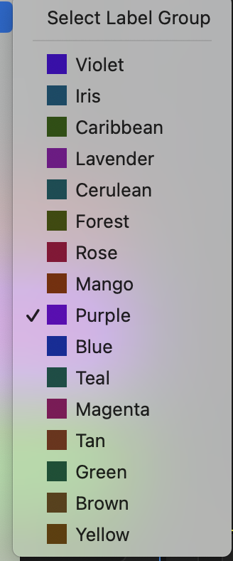
You can pretty quickly set it to get back yourself, as noted here and elsewhere. Including simply selecting the 'Default' option in the Preferences/Labels panel.

Copy link to clipboard
Copied
Sometimes you guys fix things that aren't broken. Please add old colors back as an option. I've gone back to older PPro version until this is fixed. Thanks.

Copy link to clipboard
Copied
"The new colors offer improved contrast, enhancing intelligibility and making waveform analysis easier ( faster identification of clicks or other audio artifacts)."
I fully understand the intention and would appreciate the update if this were the case; but the reality is, the colors do not reduce eye strain or improve contrast. On my setup (Mac Pro, Pro Monitors, etc.), the new labels are muddy and barely differentiated from one another. 😞
Also, the new effects labels on the timeline clips are difficult to see at a glance. At least the yellow ones were instantly recognizable.
Copy link to clipboard
Copied
Hi @RandBass we just adjusted all the brown colors, and we have log the suggestion for the classic colors without the waveform inversion. Thanks again for your feedback.


Copy link to clipboard
Copied
To add my voice to the chorus, I would prefer the old version for displaying waveform/clip background. I've set this back to classic, but the current look and contrast is still unwelcome. The older version was more legible.


Copy link to clipboard
Copied
Will someone from Adobe please, urgently update us when we are going to be able to revert to the original label color / waveform color scheme? The change is making it extremely difficult to work. It's unfathomable that Adobe would make this update without a user being able to stick to the original setting.

Copy link to clipboard
Copied
Hello!
I'm wondering how you're able to get your waveforms in a light color palette? Mine are really dark and it's making it really difficult to edit, and especially see the muted clips from the unmuted ones. Ex: A3 Green on the left is muted, but on the right is unmuted.
If anyone knows a work around this, would be super helpful, thank you!

Copy link to clipboard
Copied
It looks like you may have "Rectified Audio Waveforms" unchecked in your timeline hamburger menu. The waveforms might be easier to understand if you check that option.
Copy link to clipboard
Copied
Hey Myer Pj!
Thanks for replying so quickly, I tried your suggestion but that actually doesn't bother me! It's really how dark the waveform is that is bothersome. Adolfo H. from adobe mentioned above that they changed the colours to lighter but I cant seem to figure out how to toggle that on.
Copy link to clipboard
Copied
I just played around with the beta and 24.5. In Prefrence->Label, you can set the audio track color to a 'dark' color, most of them work to show the waveform in the bright color. For instance set that to 'dark red', just try a bunch of different ones till you see the one you like.

Copy link to clipboard
Copied
It's a crime not to add an actual option to go back to the original colors (without the inverted waveform colors)

Copy link to clipboard
Copied
Вместо того, чтобы оставить в программе ХОТЯ БЫ возможность вернуть цветовую гамму ВСЕГО в один-два клика, вы рассказываете нам всякую хрень о своих ошибках и о том, что мы можем подкорректировать сами. НУЖНО РАБОТАТЬ, А НЕ ДЕЛАТЬ ЦВЕТОВЫЕ НАСТРОЙКИ, КОТОРЫЕ УСТРОИЛИ БЫ БОЛЬШЕ ВСЕГО. За что вам платят? Неужели мы должны вернуть все на круги своя? Кто за нас решил, как теперь должно быть? Что за идиоты совершают такие кардинальные перемены, не оставляя возможности вернуться к тому, что было? * Кто этот идиот, который изменил весь интерфейс на темный цвет для всей темы? Где вариант использовать цвет предыдущей темы, а не эту серую хрень, которая находится между белой и черной темами? Кто одобряет все эти идиотские перемены?
Copy link to clipboard
Copied
I wasn't a fan of the color schema change either. But I know many users who loved the new controls and options.
So, please, as another user, show some respect for the many others that do not think like you do!
We are all different ... I love going to NAB/Vegas every year as the aisle discussions are fascinating. There are a billion ways to do anything, and wow, everyone does work differently. Even those in the same shop, all trained by the senior editor of that shop. And we laughed about it.
So have some respect for the sensibilities and wishes of others ... AS ... you request the option to have the on/off toggle on something. Which is a totally valid and useful request, feel free to make that and other requests!
On another forum I'm on, some of the other old curmudgeons were totally ticked by the color scheme thing ... and went to the 'vivid' option just to prove how incredibly awful it was.
But ... they ... liked it ... a lot. And suddenly, the new changes were wonderful to them ... it took me awhile, but after following a couple suggestions from folks I knew, I have a color scheme that I really like to use, that wouldn't have been possible before.
So I'm another one that over time changed their mind on that.
There are millions of daily users
Copy link to clipboard
Copied
I don't care who you know or who liked what. I have absolutely no intention of following the lead of some newly-minted small group of people. A huge number of people are unhappy with this idiotic color scheme. Let it be, but where did they put the old one? Where is the old color scheme? These idiotic settings for changing to the Classic color scheme ABSOLUTELY do not match it! Where is the dark theme that was there before? Who asked to remove it? Show me those who asked to remove this once and for all? There are no such idiots. Who asked to change the display of audio waveforms if you set the option to display file names on them? Why are waveforms now tiny? At the same time, the track zoom controls have become huge! Who is this idiot designer? They look inferior compared to the rest of the interface elements! Do programmers not know what DPI is and how it should change when changing the monitor screen resolution? They all need to be fired!
Copy link to clipboard
Copied
Again, you have several very valid points, if you jump around a bit.
But the valid points are best stated without the emotional bits, and come across as more sensible too.
The waveforms were easily the worst thing of the color change, totally ticked me off. But I made polite but firm comments about them. However ... after some other curmudgeons learned they could make them even better than before with the options in the settings, well ... that can be made nearly any way you want.
The font DPI thing? SO totally with you on that. And I've been after the devs on that in person for over a decade now. At NAB and when I've also TA'd at MAX. As have many others. The 'team' is well aware of the user angst and from the comments, I think somewhere in the next series (26.x will come out first day of Adobe MAX as always) ... we'll get the DPI changes they should have done years ago.
Best place for input on that is on the various threads on that in the Ideas section of this forum. Or any thread you see about it in the Public Beta forum, as the Devs do see everything posted their daily.
Program monitor changes to zoom the image rather than scrub the timeline ... yea, I'd still like to see the user option to simply scrub rather than zoom ... totally with you there.
There are threads in the Idea forum for items specifically, one item per thread. Search and upvote those.

Copy link to clipboard
Copied
It's not that deep man, its just minor interface changes. If you cannot adapt or compromise, then maybe you should learn to use another program.
Copy link to clipboard
Copied
Go and study another program yourself and keep your advice to yourself. I don't edit minute-long TIK-TOK videos like you, for whom these changes are not important! I edit complex multi-camera and multi-hour projects, in which every extra click costs my time and money! And not always only my money, but also my clients' money! And if you are not smart enough to understand that changing the interface for the sake of beauty does not limit convenience and productivity in work - then this is not my problem
Copy link to clipboard
Copied
I wouldn't be surprised if you registered here recently just to write your "smart" comment. I checked your profile.
Copy link to clipboard
Copied
You dont know anything about me buddy. Throughout any updates to premiere and other adobe programs over the last 15 years that have "affected" my productivity, I learn to deal with it and move on because I don't have time to whine and complain about it like you do. This thread is old and Im tired of seeing notifications from your exhausting behavior, please stop posting
Copy link to clipboard
Copied
Timothy D. - I can write here that I received an Oscar and have been using the program for 150 years. Paper will tolerate everything, as they say. Adobe, like Microsoft, is doing nonsense. One has not been able to make a dark theme in all interface elements in its OS since 2018, but teaches people how to live in their OS with a bunch of created problems, removes features from the interface, and then adds them back with an important look. Adobe has also been going down the same path for a long time. Once again - don't tell me that I am made like a 6-year-old child listens to his mother - to listen and accept stupid changes in the interface. I am not 6 years old anymore and they are not my mother. In addition, they do not provide their software for free so that I silently swallow their every idiotic trick under the guise of "innovation"
Copy link to clipboard
Copied


I won't be lazy and will send it here too. WAS (above) and BECAME (below)! Who is smart enough to explain why BECAME better than WAS? The same project on both screenshots. The same resolution and dimensions, the same files. WHAT IS THIS? WHO IS THIS FOOL OPTIMIZER? WHY DOES THE SCALING HAVE SUCH A LIGHT COLOR IN ADDITION TO THE THICKNESS? WHY DID THEY DISTORT THE WAVEFORMS?
Copy link to clipboard
Copied
FWIW: The last post on this thread before you dragged it out again, was Feb 15, over six month ago, so not a burning issue currently, (anymore?).
Also, at least show the same sequence at same magnification in both, otherwise, the two screenshots are not that helpful.
Copy link to clipboard
Copied

Here is the same sequence in the version as it was IN THE NORMAL INTERFACE PREVIOUSLY. With normal waveforms, with normal colors without idiotic inversion offered as a "classic" preset. Without these enlarged sliders, with normal file names without creating empty space, where every pixel is important in the working space and should be used with benefit. And why do you need a screenshot? A normal person will immediately understand from the previous screenshots what this is about, if he works in the program, and is not writing nonsense on the forums. But let it be your way, if you see it like this, you need this And now I will answer you regarding the post. You never know that the last message was on February 15. Do you think that everyone should run and save the latest version, and then write comments immediately after the release? I do not engage in @Nonism on each new version. I do my work. I previously installed a new version and deleted it immediately in the hope that after a while sensible people in the management will become interested, who will listen to user feedback. But I see that even the inversion bug has not been fixed yet. Instead, some ridiculous solutions are proposed, marked as a solved issue. These talentless people absolutely do not care what people write. They breed bugs and sometimes don't fix them for months, but there is time for unnecessary innovations. I wrote my comment today for the following reasons. 1 - I installed the latest version in Premiere today with the hope that there would be rollbacks or some options from the previous interface, but there is nothing. 2 - I saw new actions regarding the context menu in the beta version. All this made me furious, and I am not going to keep my mouth shut any longer, showing inappropriate tolerance. I am tired of this. I see silence being taken for consent. I see cultural expectation being taken for weakness. I see polite talk of rejection, but without insistence, being taken as a compromise in the gradual acceptance of all this idiocy. No, THAT IS NOT IT.
Copy link to clipboard
Copied
Thanks for the extra screen shot. Are you my brother 'Tom'? :-), you write a lot like he does.
I was hoping you'd post similar timelines from one version to the other. Instead you have one version showing 3 minutes of timeline and the other showing 4.5 hours. So, yeah, hard to compare.
Here's a comparison I did with Minor Tweaks on the thread: https://community.adobe.com/t5/premiere-pro-discussions/p-label-colours-appear-to-have-inverted-in-p...
And here is a post with default settings: https://community.adobe.com/t5/premiere-pro-discussions/p-label-colours-appear-to-have-inverted-in-p...
Copy link to clipboard
Copied
My screenshots are from versions 24.3 and 25.4. You see, the dark theme implies a dark background and light text. As well as a dark background of the waveform, on which the waveform itself is displayed light. This is logical, intuitive and understandable even at the level of the subconscious and adequate perception. What do we see on the screenshots that are NOT related to 24.3, but to the versions above? Even on your screenshot at the link, when looking at the waveform of the screenshot of version 24.4.1, dissonance arises.
Why did some decide to conduct an experiment on people, violating the logic of the color scheme Dark theme - Dark background - Information in colors lighter than the background?
[abuse removed by moderator]

Find more inspiration, events, and resources on the new Adobe Community
Explore Now
 AdChoices