 Adobe Community
- Home
- Premiere Pro
- Discussions
- Re: Premiere (and VLC) are overwriting whatever pr...
- Re: Premiere (and VLC) are overwriting whatever pr...
Premiere (and VLC) are overwriting whatever profile/calibration I set to display?!

Copy link to clipboard
Copied
HELP!!!
I posted a few days ago about how now I've got a new MacBook 2016 and LG ultra fine display (both p3 wide color gamut display) I've noticed more than ever that what I see In Premiere (and also VLC and FIREFOX Vimeo/youtube) all look very different to what I see on an iPhone, iPad, Quicktime, Vimeo/youtube in Safari/Chrome etc (which all look very similar to each other). Premiere/VLC/Firefox all are considerably more saturated than all the others. I appreciate quicktime is normally a bit lame in terms of draining colours on export, but it is still very similar to what I see on my phone, and Vimeo in chrome. At the end of the day, if I grade something on Premiere and it looks very drained on my iPhone, something is wrong...
I have come to the point where I started to wonder if the problem was actually something happening in Premiere/VLC/Firefox (which I assumed to be correct)...
I started messing around with the display profiles on the Macbook, and it seems there IS something wrong on that side. When I change the display profiles, with everything loaded up on their different browsers and programs, everything (as you might expect) responds, the background, icons, colours in the videos .... APART from the videos in Premiere/VLC/Firefox, which as I change the display profile.. briefly glitches for 1/2 second, then immediately returns to what it was. This even happens when I choose a ridiculous display profile such a DCI projector profile that makes absolutely everything on the screen midnight blue, APART from Premiere/VLC/Firefox, which stays the same....
This can't be right! This means that Premiere program monitor is not responding to any different display profiles ... and would explain why there is now such a huge difference (more than normal) between Premiere/VLC and Quicktime/IPhone etc. Can I turn this off?!
What also even more strange is that the video in Premiere/VLC DOES respond to manual calibration (white balance) in the display profile settings
Is there a setting somewhere? dodgy codec? dodgy graphics card?
I should also mention, on a couple of occasions VLC and Firefox have both crashed at the same time, as well as color sync utility. Not to mention my screen is quite yellow and finder/safari/notes all keep crashing


 11
Replies
11
11
Replies
11

Copy link to clipboard
Copied
You're coming to conclusions that to me seem 180* backwards from your testing.
"At the end of the day, if I grade something on Premiere and it looks very drained on my iPhone, something is wrong..."
Huh? You're assuming a consumer device has a better screen calibration concept than a pro NLE? Really? You are aware (I hope!) of how blasted far off "correct" most consumer TV's are coming out of the factory? Signal all "hopped-up" to stand out in a display area of 20 tv's, NOT for correct color/gamma/saturation.
PrPro uses a basic full-range 0-255 (for 8-bit material) display mode, period. If you've set up a manual calibration of your screens, PrPro will "accept" that, but ... if you choose one of several profiles that don't use 0-255 "standard" gamma, PrPro may not choose to follow along.
There are naturally a number of people that would like it if one could choose the base video profile used as in AfterEffects (and similar to Resolve, say), and I tend to agree. For that, feel free to put in a Feature request form ...
https://www.adobe.com/cfusion/mmform/index.cfm?name=wishform
And I would note that VLC is one of the better consumer video players out there ... so when that and PrPro agree, and others that are much dodgier do something different, you see that as proof that PrPro & VLC are wrong ... again, that seems 180* backwards.
Neil
Copy link to clipboard
Copied
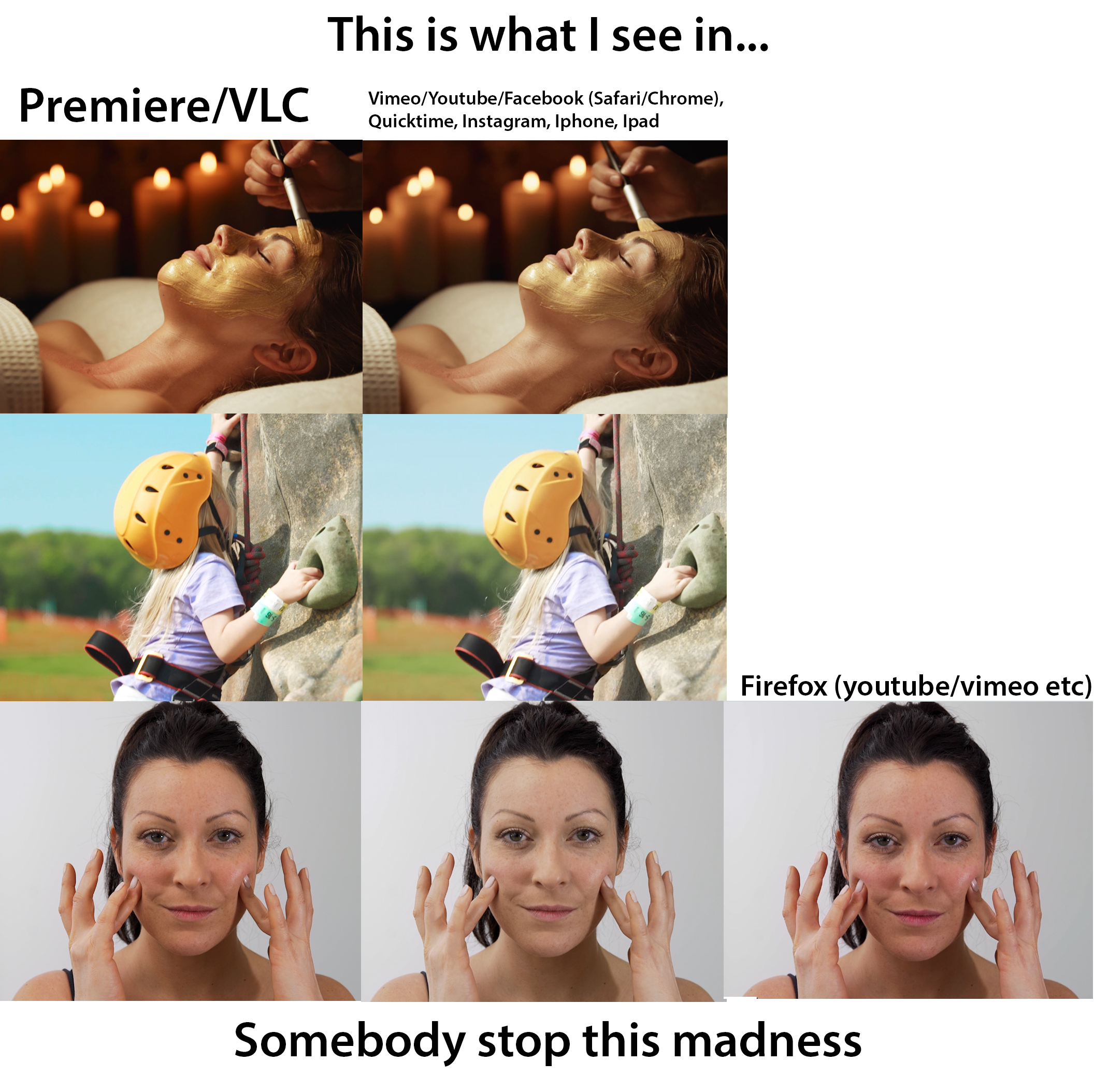
This issue here is that I wasn't getting this problem with my 2012 MacBook. I went back to it today and I tested videos with vlc/premiere etc and also with quicktime/safari/chrome etc. There were slight differences between the 2 groups, but my new display seems to exaggerate these differences, VLC and premiere seem MORE saturated even though every single other thing on screen is similar to the old MacBook. You asked about doing things backwards - 98% of my clients will watch my videos on one of Vimeo/youtube/facebook (through chrome and safari) iPhone, iPad, Instagram, even keynote(!) ... and they all manage to look the pretty much exactly the same as eachother, and look good, as well as what I see in Premiere/VLC also looking good (which is obviously where I start) for those same videos.
But 2 days ago I handed a video to a client I have worked with for a long time producing similar videos, and they commented how desaturated and lifeless it looked compared to usual. This has never ever happened before and the only thing that has changed is the display. Not the players or the editors. as usual I edited and graded in Premiere and watched back in VLC, it looked fine, but because the new monitor I have seems to completely over-saturate only in VLC and Premiere it left a very lifeless looking video for the client and potentially all the customers ... unsurprisingly, none of whom view the video in Premiere or VLC. Again, this was never a problem before as the was negligible differences between the VLC/Premiere bunch and the quicktime/iphone/safari bunch
To get a decent looking video which matched the look of previous videos I had done on the clients platform for viewing, I ended up having to completely over-saturate (at least thats how it looked, the vectorscopes will still ok) in premiere. Which makes editing very difficult now.
There is definitely something going on with these displays and the way they seem to
Copy link to clipboard
Copied
The video the client complained about was the one with the woman at the bottom. What you see here is a 'corrected' version. In premiere I'm slightly more saturated than I would like, but it resulted in something the client was more happy as they (all their customers will watch the video with the players from the middle column (which still looks a bit yellow and anaemic to me. As for Firefox vimeo, compared to chrome/safari Vimeo ... wow, just, wow...
Copy link to clipboard
Copied
Have you run a puck-based calibration system on the monitor? If not, well ... that's what you're going to get. NO monitor, whether laptop or separate "desktop" style, comes from the factory nor stays usably calibrated. Period.
What changed in your setup was your computer/display ... and as it doesn't sound like you calibrate, you were simply lucky with your old setup that it worked mostly sort of.
You have to calibrate a display. That's part of computer post-production Life. You can't blame the software if you don't set your gear up correctly.
I use the X-Rite puck & software ... it did cost several hundred but if you're delivering professionally it's a tool you must have or you'll have more episodes like what you're in now.
Here's a couple options from X-rite:
i1Display Pro Monitor Calibration; X-Rite
http://xritephoto.com/colormunki-display
There are others available. They will help quite a bit, though you still should check them off the computer (as Jim always says) via either an external box (AJA, Kona, BlackMagic) to a calibrated monitor, or to a b-cast setup/calibrated full monitor-built TV. Note ... all of these options, also calibrated.
Neil
Copy link to clipboard
Copied
After a little more research it seems that the problem is the fact that both displays are p3 wide gamut but apps like premiere, vlc, Firefox aren't colour managed.... I assumed that a wide colour gamut is just the same as srgb but better, but from what I understand if apps/browsers don't have colour management, an image/video made in sRGB gamut could end up looking weird and over saturated on a wide gamut monitor. Its explained much better here -
https://blog.conradchavez.com/2015/10/26/a-look-at-the-p3-color-gamut-of-the-imac-display-retina-lat... - "One of the challenges of wide gamut displays is that the colors in untagged objects (objects without a color profile) can appear oversaturated. This can happen when the color values of untagged objects are defined in a smaller color space such as sRGB, which is usually the case. When those untagged color values are displayed on a larger gamut display, if their gamut is simply scaled up to match the larger gamut the color values can end up further out than they should be in the larger color space, appearing oversaturated."
and here -
The New Apple iMac and the DCI P3 colour gamut - (under 'why p3 gamut is not a good idea")
I found these articles quite a relief as I thought I might be going crazy, but it appears to explain my suspicion that VLC and Premiere are exaggerating the saturation because of the p3 wide gamut, I will be sending back my apple display and getting an sRGB one
Copy link to clipboard
Copied
Nice you have an answer. And yes, there have been MANY posts about wishing that PrPro gave choices of color space to users, as say AfterEffects, Resolve, and many other pro-level apps.
Neil

Copy link to clipboard
Copied
Well, but that seems like a huge issue! Premier is unusable on any new mac with a p3 wide gamut display!!! I can confirm the issue on my new macbook pro 2017. Premier and vlc look over saturated and red compared to Final Cut and Quicktime player, editing same clip.
Its 2018, I was trying out the new Premier Pro 2018!!!
And you were suggesting to trust Premier and VLC!?!
Copy link to clipboard
Copied
With the exception of long-form movies that need DCI/P3, which is what, a very small proportion of professional work, maybe 10% ... the other 85%-90% of pro level work these days is still Rec709, which specifies sRGB and gamma of 2.2/2.4.
And while the following may seem harsh, do understand ... in some ways, I'm very sympathetic, and the final bit will kind of 'agree' with you. But there's stuff to deal with here first.
So, you bought a new computer and monitor that don't use the broadcast standard of sRGB/Rec709, which it's very clear and been public for a long time. And also quite clear neither the OS of that computer nor the monitor allows for broadcast standard work without a lot of futzing, preferably going to external LUT-controlled boxes to control the monitors.
Apparently, your intention was then to use an app that also clearly uses the broadcast standard of sRGB/Rec709.
Is there something there I've missed?
Oh ... you bought the computer from a company who's CEO has publicly said he's no idea why anyone would buy a desktop computer, and has relegated development of those to the slow train to Antarctica. (Which is a very slow train ... ahem.)
I'm having a great deal of trouble understanding your angst, actually. You made a series of choices that had rather obvious and expectable results, and now are unhappy about those results. I deal in real-world as much as possible, and that's the sort of thing one (to me) is supposed to figure out before running out and shelling thousands of dollars on gear.
Is this gear that works for my needs? I do a ton of research. I go to the Hardware forum and other places, including others I know, and ask questions of what is the best bits & pieces for PrPro as it exists. Look over cost/budget questions. Basic research.
That's what I do every time I look for a new build or even upgrades to my current computer. You ... don't seem to have here. I really don't understand, I just don't.
And you were suggesting to trust Premier and VLC!?!
Well, yes. You seem to think you should instead trust non-color aware (let alone color managed!) amateur-use apps. And an OS and monitor not designed for the work you're doing, that don't give you any options to GET to the work you're doing.
Which makes less sense to me.
Once upon a time, Apple had a grand relationship with all graphics pros. In our business, from when we started with computers back in ... sheesh, '89 or so? ... we couldn't afford a Mac, and were a bit envious of those that could.
But Apple is now totally devoted to devices. They have clearly left the pro graphics community in the dust. Those that need serious computing power for certain. Which is why so many of the major colorists I've come to know have left Macs for dual-boot PCs running Win10 & Linux. Far more power, far more customizability, choices everywhere ... at a lower cost. Or in the case of one who's a noted gearhead, he spent about the same but is so thrilled with all the extra things he got for that cash. (He also uses the full $30,000 Resolve panel ... )
Understand, I'm rather disappointed in Apple. Never having been a user, still ... that whole relationship with graphics pro's was beautiful. And now, you're just users willing to shell out for ... history?. Comfort with the OS? Something that means more to you than them, clearly. But they're happy to take your money, of course.
We PC folks are used to that ... so, sadly, many of my Apple friends are realizing they're now in the same boat really. Cupertino or Redmond ... they're just companies.
Right now, for pro work ... PrPro on a properly set up and managed OS and monitor setup is entirely 'trustable'. As are VLC, Potplayer, and Firefox.
Chrome, Safari, QuickTime player ... are not. Very simple.
And the only way you can really guarantee you're getting pro level work on that rig you've got is with an external monitor that is designed for pro-level work in sRGB/Rec709 and calibrated for it. Unless you're using a laptop for full-length movies, which ... isn't particularly common.
All that said, there are things coming in that will require more user choices in setting up an NLE for the media and output desired ... HDR is racing down on us. DolbyVision is only coming to a few select shops that can shell out the ton of cash, but ... many of the rest of us will have to get at least to low-level HDR capability over the next three years.
PrPro ain't currently setup to do that. The HDR setting options are very minimalist. So, although I do think your choices were rather suspect, in the end, we all do need to get user choices for color-space/gamut/gamma available in PrPro.
Resolve of course as a pro level grading app for colorists working both broadcast and movie work has always had to have color management settings for the user. Up to now, PrPro really hasn't had to have that.
Well ... times change. Apple's gone Redmond on you, and ... PrPro needs color settings.
So, rather than posting here further (which is user to user) ... go over to the UserVoice system and post a feature request "Idea" for color management user settings. Those reports go right to 1) the engineers in QC and 2) the senior management who determine budgets. Budgets, of course, determine everything.
And yes, I'm made my thoughts on this rather clear in the request thing. And in the discussions with the engineers at NAB. Along with a ton of other people.
Neil
Adobe Bug /Feature service: https://adobe-video.uservoice.com/forums/911233-premiere-pro

Copy link to clipboard
Copied
So, you are saying that the Premiere's not supporting color-management on a mac OS in 2019 is normal?! And you quote some old sRGB broadcast standards? Who cares? We are in the 21st century, we create for the internet, for Youtube, wide gamut home TVs, etc, etc. For 1 professional working with reference displays there are a hundred youtube bloggers who work from home on their macs! Screwing up colors on ALL modern Mac displays is certainly on of the BIGGEST gaffes of Adobe!
Copy link to clipboard
Copied
My ... well, you chose to apply an interesting, and I guess, emotional interpretation to my comments. Understand, those assumptions are your own and have nothing to do with me or my written comments. I deal in Reality. What is X? Why and how and when does it work? What's the data behind that? What is it useful for? And when does it break? (Remember, everything breaks at some point.)
Computers and operating systems and software are just tools. Period. Getting caught up in them is to me absurd.
So in your opinion, Adobe " ... screwed up colors on ALL modern Macs" ... and it is one of their biggest gaffes? You are perhaps not aware that P3 screens comprise what ... something around 2-4% of total screens in use? Anyway, a pretty small number overall. Hmm. And also that Apple went way off from every other screen on the planet in their design for this? And you blame Adobe that Apple's design and apps don't play well with everything else on the planet? Right.
Let's actually look at the reality.
There has been a color standard for video material ... for nearly all video material ... for many years now. It is STILL the primary standard that over 85% of pro-colorist material is delivered for. The only broadcast use in the world not done in video sRGB/Rec.709/gamma-2.4/100nits production requirements for acceptance is done in HDR.
Premiere is built to follow that standard. And that says nothing good or ill about it ... it is just what it is. A standard so material produced and distributed has at least a flipping chance of being seen somewhat sort of close to "intended" across the widest number of screens possible.
There is no place on the planet where the Apple P3-Display is accepted as a pro video standard for broadcast/satellite.
As to the Mac's pretty and intriguing new display ... that is a very unique "space" they constructed, and let's look at it.
What's P3 color space been used for? There are two versions for theatrical release specifications ... P3-DCI (Theatre) and P3-D60 Cinema (ACES). They use the same color primaries but with slightly different white points ... DCI is D63 (approximately) and D60 (Cinema) is D60. Both use a gamma of 2.6, with the deepened shadows that work best in a dark/near-black environment for display, as in modern movie theaters.
Apple took the 20-25% wider color gamut of the P3 color space, which is actually pretty cool. I think it would be nice for most everything to move to that base color space/gamut over time as well, as more screens become capable of displaying much of that color space. The majority of both computer screens and TV's out there cannot at this time, but over time, that will improve. (A relatively small percentage of screens worldwide actually can display P3 at the current time however.)
Remember, Apple's US market share is just under 13%, and worldwide is a bit under 7%. The Retina (P3) screens are about 1/3 of current Apple screens out there from what I've seen published. So ... again ... P3 screens comprise what ... something around 2-5% of total screens in use, depending on the country? Anyway, a very small number overall.
Past taking the P3 color space, the Apple 'designers' changed everything else. First, in what seems a wise choice, they stayed with the D65 white point of nearly all current monitors and screens outside of a couple Asian countries where they use a white point of around D90.
But ... for gamma ... they went very Apple. Unique, shall we say.
Their stats only say "sRGB" for gamma, but what they don't say is that they do NOT use the sRGB full gamma function for screens, but only the sRGB camera gamma function.
This is wildly different than all other screens both computer and TV on the planet. sRGB on all those screens means applying both the camera AND screen gamma functions, ending up with a screen setting between 2.2 and 2.4.
The Apple screens however are essentially a "scene-referred" gamma of 1.96.
Had they kept BOTH the white point and base gamma of all other screens, the only issue would be that Rec.709 produced material displayed on a P3-Display screen would be a bit over-saturated perceptually unless the display device auto-corrected for being a Rec.709 image.
But going well off from anything else, and without any apps or OS situations to naturally correct for space/gamut/gamma mismatches, it makes life for the rest of us somewhat more difficult. And you blame "Adobe" for ... that?
Material produced to Rec.709 standards and simply "plopped" onto a P3 Display screen will have both exaggerated colors and heavily lifted shadows compared to that material viewed on a correct Rec.709 screen. As there is no brightness standard for Apple's P3-Display, that can be another complicating factor. If the screen is down close to the 100 nits of Rec.709 in a moderately lit to moderately darkened room, you will probably get over-exaggerated colors and lifted shadows.
But if the P3 screen is say 200 nits or better, you get such incredibly lifted "milky" shadows and tonal range stretched out over a wider dynamic range so that the colors can appear somewhat muted.
Material produced with a P3-Display screen and Premiere typically results in an export that is much darker on the same P3 screen outside of Premiere. Well ... yea, as there was a massive gamma mis-communication there.
Using the "Enable Display Color Management" option in the Premiere Preferences dialog for those with P3-Display screens means that Premiere will attempt to read the ICC profile set in the OS and mod it's internal monitors so that they can come close to giving a perceptual match to an actual Rec.709 screen. How well it functions is of course going to be driven by the specifics of the individual gear and setup, and not predictable of course. Must be tested.
This would hopefully allow someone working with a P3-Display screen to produce material somewhat close to "correct" for the vast majority of current screens. And "close to correct" is really good enough if blogging/web use is everything one produces. So a Mac user with a P3-Display screen using the "EDCM" option should be able to produce for the web and have their stuff looking somewhat sorta similar. And as colorists with highly-managed setups can't really beat that for web use, well ... yea, it's good enough.
And if you need to have this look best on that 2-3% of P3-Display screens out there, then use the LUT that color engineer Francis Crossman makes available on their post on this forum about that issue. Use it in the Export dialog's LUT slot, and it will take Rec.709 material and mod the file so that it will appear at least close to "correct" on a P3-Display screen.
It will of course not be appropriate for any 'standard' video/TV screen. So in making your material better for 2-4% of screens, you're also choosing to be less accurate on 96-98% of screens. And that isn't because of ANY decision by Adobe, it's because of decisions by Apple. And the fact that neither their OS nor any apps I've heard of auto-adjust playback on P3-Display screens for non-P3 material. Apparently, some players can be set to act appropriately depending on the material they are playing, but it takes user action to do so.
And it's your choice of course. Learn how the stuff actually works, and make decisions that work for your needs.
The OS, the software ... they're just tools. Lose the emotions in dealing with them. They're another form of hammer is all they are. Use the right "hammer" for what you do, but ... you also have to learn to how to properly use a hammer first. To make it do all sorts of things and trick for you.
Knowledge of tools is simply part of the craft of producing.
Neil

Copy link to clipboard
Copied
Simply put, you're doing it wrong.
You need to view your content on the most accurately calibrated display you can afford played from a hardware device. How it looks there is all that matters. How it looks anywhere else is beyond your control.

 AdChoices