Anomaly with Futura PT Demi Font when comparing 2 individual business cards for a client
- April 14, 2022
- 返信数 1.
- 1359 ビュー
Hi all,
A client has requested new business cards for 2 colleagues. They sent me a PDF template of a business card that I created for a fellow colleague last year. All that was required was to edit the template and change the name, phone number & email address.
A fairly simple task or so I thought. However, the client has since come back to me saying that the font text on the name appears to be Bold and thick.
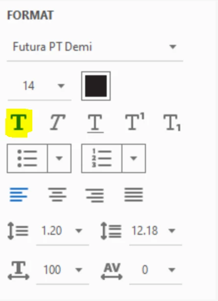
I have opened up each PDF and looked at the format settings and everything seems to be in order. The font used is Futura PT Demi
The screenshots show the slight difference in text boldness & thickness between the 2 names and also the format settings for both
I did look at changing the font for the 2 new cards to Futura PT Medium but not sure if this is the correct way of approaching it.
Any help or advice would be greatly appreciated