hello.im.tobi.kopp
Inspiring
July 10, 2019
質問

Neon light makes ugly halo outline when converted to CMYK printer's profile

  • July 10, 2019
  • 返信数 5.
  • 2875 ビュー

Hi guys,

I have kind of an urgent question:

I'm working on a newspaper-style exhibition brochure (final version due this Friday, omg!!!). The InDesign document is going to be exported in the specific newspaper color profile (named "WAN-IFRAnewspaper26v5"). I have no problems working with this so far, except with one picture.

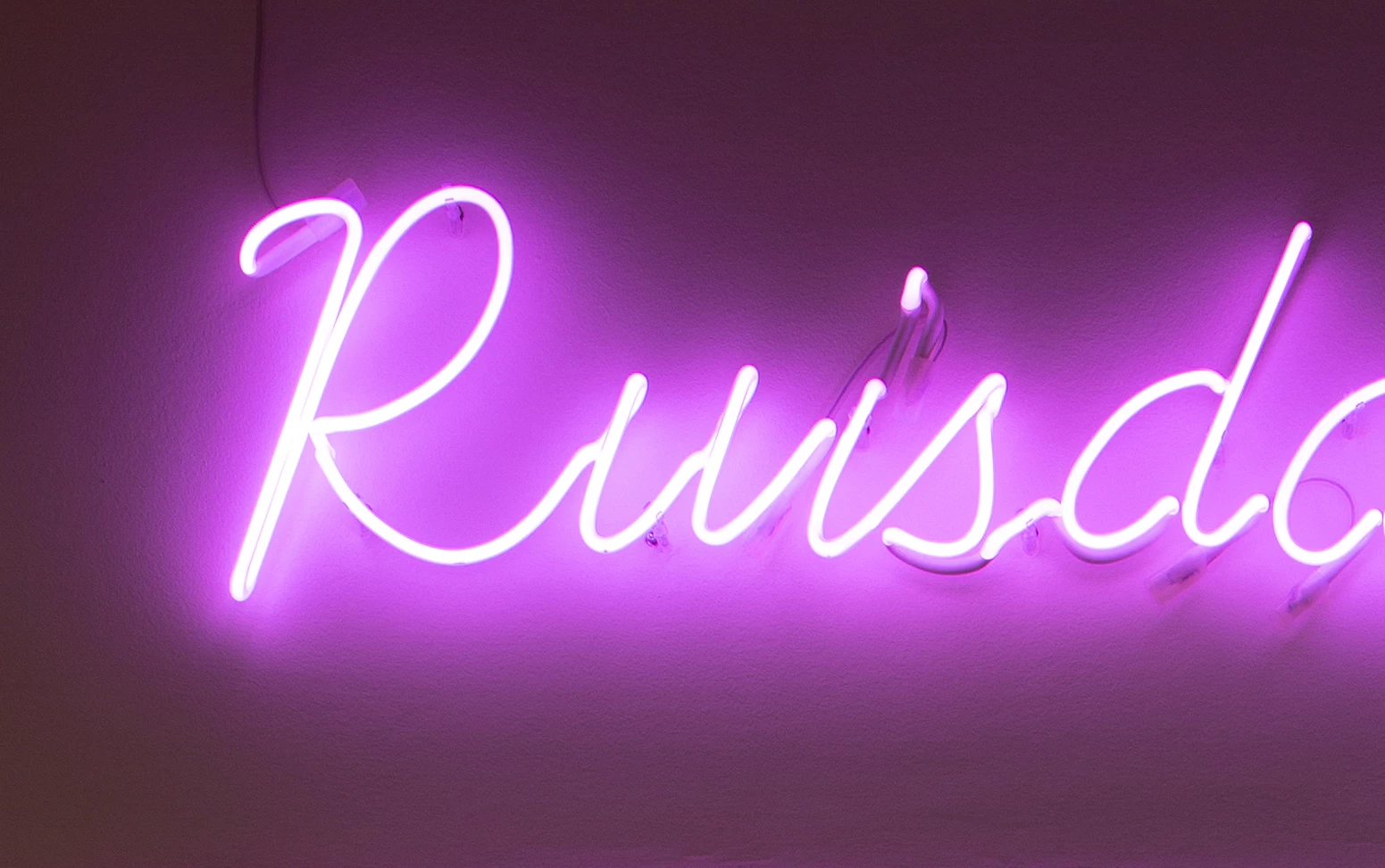
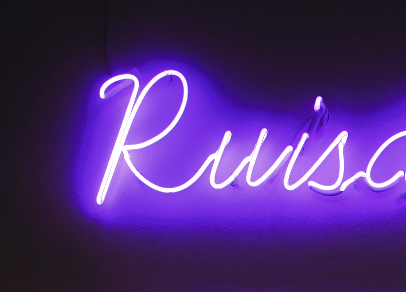
It's a neon sign. Whereas in the original profile, there is a very nice color / light gradient into "the dark", when converted to the printer's profile, there is a very ugly outline-kind-of-thing in the halo of the neon sign. It almost looks like it's a solid surface around the sign. See here:

Original:

Converted version:

Can you help me to make that look at least a little more decent?

I tried using different converting options, and tried to mess with color saturation, lighting etc., but it won't help.

Would be awesome!

Thank you so much,

Tobi

    このトピックへの返信は締め切られました。

    返信数 5

    Norman Sanders
    Legend
    July 11, 2019

    Consider this alternate approach: Increasing the vignette so that it becomes smoother will tolerate the conversion to CMYK

    1. Change Mode to Lab Color

    2. Choose the L channel and drag down to make an Alpha Channel

    3, Use Curves to create a solid black/solid white Alpha

    4. Invert to black type on white

    5. Select the entire Alpha and Copy

    6, Move to Layers and Paste an additional layerl: the Alpha

    7. Use the Magic Wand to produce black type on transparent surround

    8. Lock the transparent area and fill the type with white (asshowb above

    9. Choose the image Layer and add a Gaussian Blur for a smoother vignette

    10. Change mode to CMYK using your lithographer's supplied restricted range profile (choice fo color is another matter)

    Participating Frequently
    July 12, 2019

    Also remember if you are using blend modes you can separate the sliders by holding command (control on pc) and clicking on the slider. This way you can pull each side out and make the gradient smoother.

    One REAL cheat way to make it shine is to duplicate the layer with just the light and its radiant glow, fill with white and drop behind. Then you can just play with blend modes and transparency modes to make the color pop. Just be careful about selection edges when done to make sure there isn't a break line showing where those layers intersect with those underneath.

    rob day
    Community Expert
    Community Expert
    July 12, 2019

    One REAL cheat way to make it shine is to duplicate the layer with just the light and its radiant glow, fill with white and drop behind. Then you can just play with blend modes and transparency modes to make the color pop.

    You still have to consider that the banding and posterization the OP is experiencing is happening on the conversion into the small newsprint space. You could get perfectly smooth, saturated blend transitions in RGB mode, which get ruined on a conversion, so while you work you need to have Proof Colors turned on with the Proof Setup set to the destination CMYK profile in order to see the damage that will be done by the future conversion.

    rob day
    Community Expert
    Community Expert
    July 11, 2019

    Can you help me to make that look at least a little more decent?

    As others have noted you will have to make a compromise with the neon colors because they are so far out of gamut to the newsprint profile you need to use. There are some other things you can try:

    The WAN-IFRAnewspaper profile also includes saturated dark colors that are outside of the sRGB gamut—the gamuts intersect, and the newsprint CMYK space isn't entirely inside of the sRGB space. So maybe try and convert the sRGB original into a larger RGB space before you attempt to color correct so you can get at the saturated blacks on the conversion.

    If you set your Color Settings CMYK Working Space to the intended output, you can color correct in RGB and see what the conversion to CMYK will look like by setting the Proof Setup to Working CMYK and turning on Proof Colors. Here I've converted your original to ProPhoto 16-bit, set the Color Settings Intent to Relative Colorimetric, and turned on Proof Colors.

    I'm color correcting with a Hue/Saturation layer Magenta channel, where I'm shifting the hue toward red (which is less out-of-gamut), lowering the saturation, and increasing the lightness—watching for the best break from the magenta into the shadows:

    I'm also lowering the Lightness of the Reds:

    And adding a Curve layer to darken and add some red back into the background via the Green channel:

    hello.im.tobi.kopp
    Inspiring
    July 11, 2019

    Hey guys,

    I can't thank you enough!

    The thing is – I can get really surprisingly good results with the above methods, but it always starts having too much ink coverage (I'm only allowed to have 220%). So basically all I could do was very subtly smooth out the halo, everything else (changing colors, trying to get it more vibrant) is impossible to achieve. Unfortunately.

    Anyways, thanks again, it was at least fun and a learning experience.

    Also, I'm amazed how much effort you guys put in helping me!

    Stephen Marsh
    Community Expert
    Community Expert
    July 10, 2019

    Newsprint profiles are often challenging, particularly so when coming from a much wider gamut RGB original. Sometimes it can help to convert to a wider gamut intermediate CMYK that provides a "cleaner" conversion, and then convert a second time to the newsprint profile (experiment with all available conversion options and profiles). This goes against "conventional wisdom" to avoid multiple conversions and CMYK to CMYK conversions.

    hello.im.tobi.kopp
    Inspiring
    July 10, 2019

    Ok I did experiment with converting in another CMYK profile first (or even two or three)... sometimes it changes the color a little bit, but every time the halo stays almost exactly the same

    c.pfaffenbichler
    Community Expert
    Community Expert
    July 10, 2019

    What Render Intent did you use?

    Have you tried »Perceptual«? (One can set that for single images in Indesign under Object > Image Color Settings)

    hello.im.tobi.kopp
    Inspiring
    July 10, 2019

    Yes, as I said I tried different converting options. It doesn't help – that's why I'm asking ...

    c.pfaffenbichler
    Community Expert
    Community Expert
    July 10, 2019

    »original.jpg« has banding issues as it is – was that (a part of) the original at full resolution?

    Do you have the layered file? Is it 16bit yet?

    And much of the magenta »center« is simply out of gamut for that CMYK Space (see screenshot, View > Gamut Warning).