Mohammadmansour
Participant
April 15, 2021
解決済み

New logo for Photoshop

  • April 15, 2021
  • 返信数 2.
  • 504 ビュー

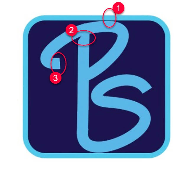
I designed a new logo for Adobe Photoshop.

I want you to use it in the next version of Photoshop if you like it.

このトピックへの返信は締め切られました。
解決に役立った回答 davescm

This is a user forum answered by volunteer Photoshop users - we do not work for Adobe. Adobe closely control their branding across the range of products they make.


A little feedback, which may help if you are making logos/icons going forward:

1. You have a colour difference between the border light blue and the lettering, effectively turning a two colour icon into a three colour icon.

2. The angled half cut of at the top of the descender on the P jars a little.

3. The start of the curve at the top of the P is angled slighty, it would be better to make it vertical or slant it further to make it look as if it was done on purpose.

4. Your lettering is off centre - the distance between the border and lettering on the left, is less than the distance between the border and the lettering on the right.

5. Logos for screen based use are better made in an RGB colour space (e.g. sRGB)
 

Dave


返信数 2

davescm
Community Expert
davescmCommunity Expert解決!
Community Expert
April 15, 2021

This is a user forum answered by volunteer Photoshop users - we do not work for Adobe. Adobe closely control their branding across the range of products they make.


A little feedback, which may help if you are making logos/icons going forward:

1. You have a colour difference between the border light blue and the lettering, effectively turning a two colour icon into a three colour icon.

2. The angled half cut of at the top of the descender on the P jars a little.

3. The start of the curve at the top of the P is angled slighty, it would be better to make it vertical or slant it further to make it look as if it was done on purpose.

4. Your lettering is off centre - the distance between the border and lettering on the left, is less than the distance between the border and the lettering on the right.

5. Logos for screen based use are better made in an RGB colour space (e.g. sRGB)


Dave


Kukurykus
Legend
April 15, 2021

Photoshop Family / Moderator, please unbind Actions and scripting tag from this thread.