 Adobe Community
- Home
- Premiere Pro
- Discussions
- Re: Color Management Still Not 100% Accurate on Wi...
- Re: Color Management Still Not 100% Accurate on Wi...
Color Management Still Not 100% Accurate on Wide Gamut Monitor

Copy link to clipboard
Copied
Hi All,
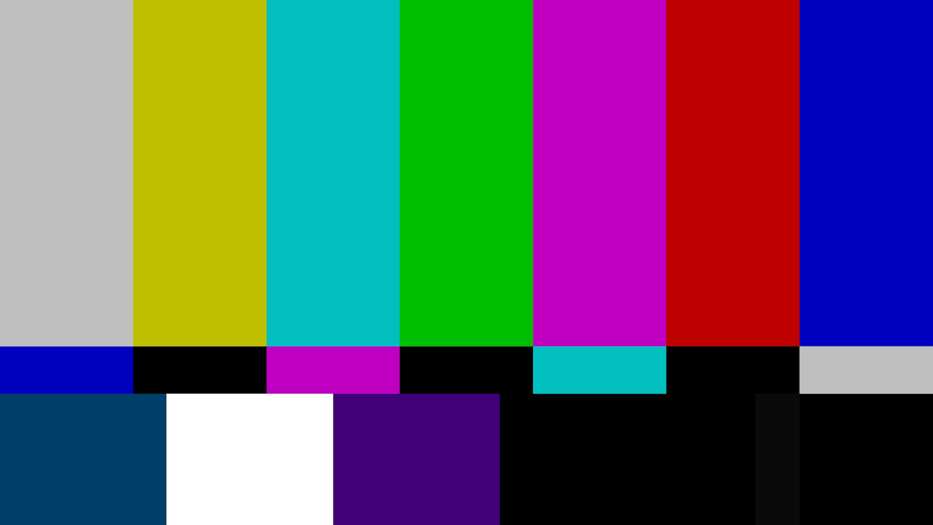
I was very excited to hear about Color Management being added to Adobe Premiere Pro CC 2019. I can confirm that color and/or gamma shifts are improved when "Enable Display Color Management" is checked under Premiere Pro CC > Preferences > General. There is still, however, a slight variation between what is seen in the Premiere Pro Program Monitor and what is exported by Adobe Premiere Pro CC 2019 or Adobe Media Encoder CC 2019. To the naked eye, the exports from Premiere Pro and Media Encoder seem slightly washed out when played back on Quicktime, YouTube on the Safari Web browser, or on the YouTube app on the iPhone XS Max. VLC Media Player over-saturates and shifts the colors even more. I am running the latest version of Premiere Pro Version 13.0 (Build 225) on a 27-inch Late 2015 iMac with a 5K Retina display. My processor is a 4GHz Intel Core i7, my Memory is 24GB DDR3, and my Graphics Card is an AMD Radeon R9 M395X. Does anybody have any insight into what could be causing these color/gamma shifts, despite the new Color Management feature in Adobe Premiere Pro CC 2019 now supposed to make what we see in the Premiere Pro Program Monitor 100% accurate to what will be exported? I have included the variances below (please look closely) on a Premiere Pro-generated Bars and Tone graphic for reference. Thank you in advance for your help!
A Screenshot of the Program Monitor within Premiere Pro CC 2019:

An Exported Frame from the Premiere Pro CC 2019 Project:
Please notice:
1) The slight hue difference in the bottom left cyan color.
2) The slight hue difference in the bottom middle purple color.
3) The lighter shade of black in the bottom right.
A Screenshot of the Exported Clip, Playing Back in Quicktime:
Please notice:
1) The slight hue difference in the bottom left cyan color.
2) The slight hue difference in the bottom middle purple color.
3) The lighter shade of black in the bottom right.

A Screenshot of the Exported Clip, Uploaded to YouTube, Playing Back on the Safari Web Browser:
Please notice:
1) The slight hue difference in the bottom left cyan color.
2) The slight hue difference in the bottom middle purple color.
3) The lighter shade of black in the bottom right.
I understand the the differences here are very subtle and are rather hard to see in a Bars & Tone graphic on this website. These differences become much more noticeable with one's specific footage, however, and bringing these above graphics into Photoshop with the blending set to "Difference" shows the definite variance I speak of.
Thank you in advance for your time and assistance as we try to make Color Management seamless within Adobe Premiere Pro CC 2019.


 69
Replies
69
69
Replies
69

Copy link to clipboard
Copied
Hi Chris,
At the moment Pr expects all imports to be in Rec. 709 at gamma 2.4. The conversion to display is not fake. Pr converts from Rec. 709 gamma 2.4 to the ICC profile you had chosen for your display.
Hope this helps,
Vlad

Copy link to clipboard
Copied
I was going from information from Lars Borg, head of color for the DVA's ... according to him, PrPro is internally coded at 2.4.
Neil
Copy link to clipboard
Copied
Hi Chris,
Both Pr and AE work with Rec. 709 at gamma 2.4, not 2.2. Dynamiclink also operates in Rec. 709 gamma 2.4. Pr, in fact, does understand your monitor ICC profile and converts to it when Enable Display Color Management is checked. Currently, Pr operates in Rec. 709 so you could look at it as having Rec. 709 as a fixed working color space. Now there may be some importers that do not produce Rec. 709 frames and for those colors will not look correct because they will be interpreted as Rec. 709 when Pr will convert them into the ICC profile of your monitor but, by and large, it should work correctly. If you leave Enable Display Color Management unchecked, there will be no conversion and values will be simply reinterpreted in the color space of your monitor.
Hope this helps,
Vlad
Copy link to clipboard
Copied
Hi Francisco,
Thanks for the reply. Per your request, here is the addition information you requested:
1) I can confirm that I am already using the top-most and default ICC profile on my iMac. It is, indeed, called "iMac."
2) I am not using a second monitor.
3) Adobe Premiere Pro CC 2019 has been launched.
4) GPU Acceleration is enabled and was already set to enabled.
5) Display Color Management is turned on and was already set to on.
6) HD Bars and Tone has been placed on a new timeline.
7) The Digital Color Meter app is opened.
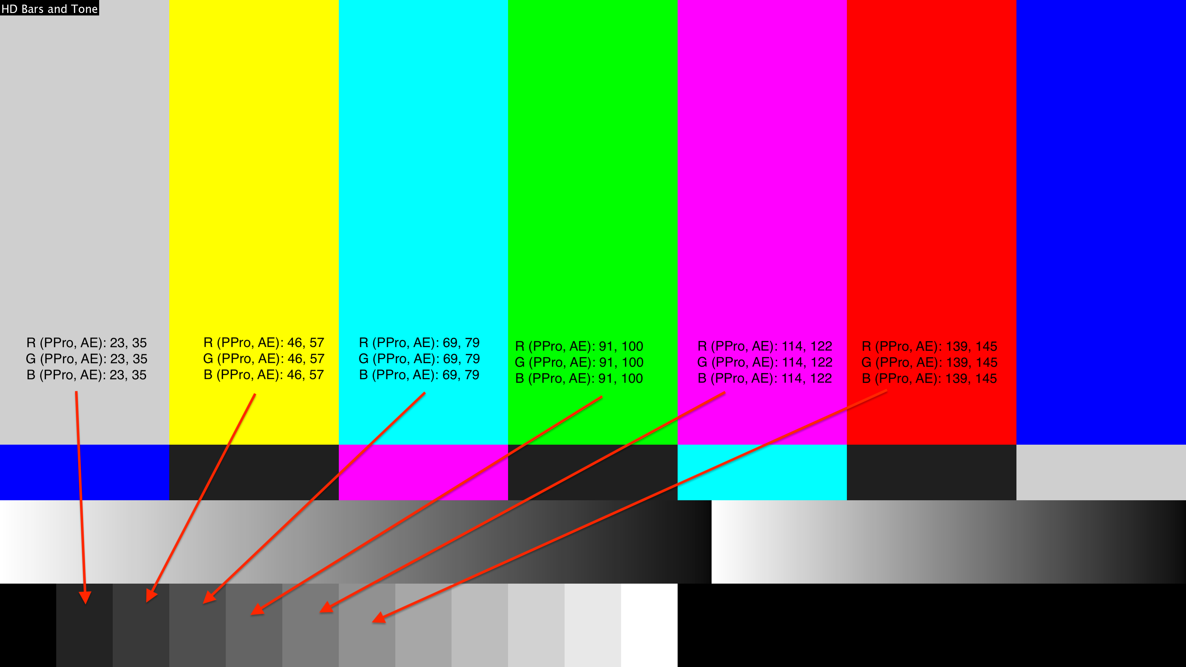
8) I have measured the RGB values of each part of the HD Bars and Tone graphic.
9) I have exported a few seconds of the HD Bars and Tone graphic, bringing that exported footage back into Premiere Pro.
10) I measure the exported file within the same Premiere Pro timeline with the Digital Color Meter. Values are identical.
11) I have launched Adobe After Effects CC 2019.
12) GPU Acceleration is enabled and was already set to enabled.
13) Work space is set to Rec.709 Gamma 2.4 in Project Settings/Color, everything else is set to default.
14) Display Color Management is enabled in After Effects and was already enabled.
15) I have imported the HD Bars and Tone file exported from Premiere Pro into After Effects.
16) I have measured each bar with the Digital Color Meter. Values are not identical. Interestingly enough, all color values ARE identical, but all black/white/grey bars on the HD Bars and Tone graphic show clear RGB value discrepancies. Please see the attached image for a few of the RGB value differences I am measuring with Digital Color Meter on the graphic.
This almost certainly indicates to me that something is still going wrong with the Adobe Premiere Pro Color Management. Colors are rendering perfectly, but black values/contrast is not.
A sincere thank you to everyone who has helped regarding this issue!

Copy link to clipboard
Copied
I guess that graphic is from AE, cause I put into PSD and 100 seems to match it that one square.
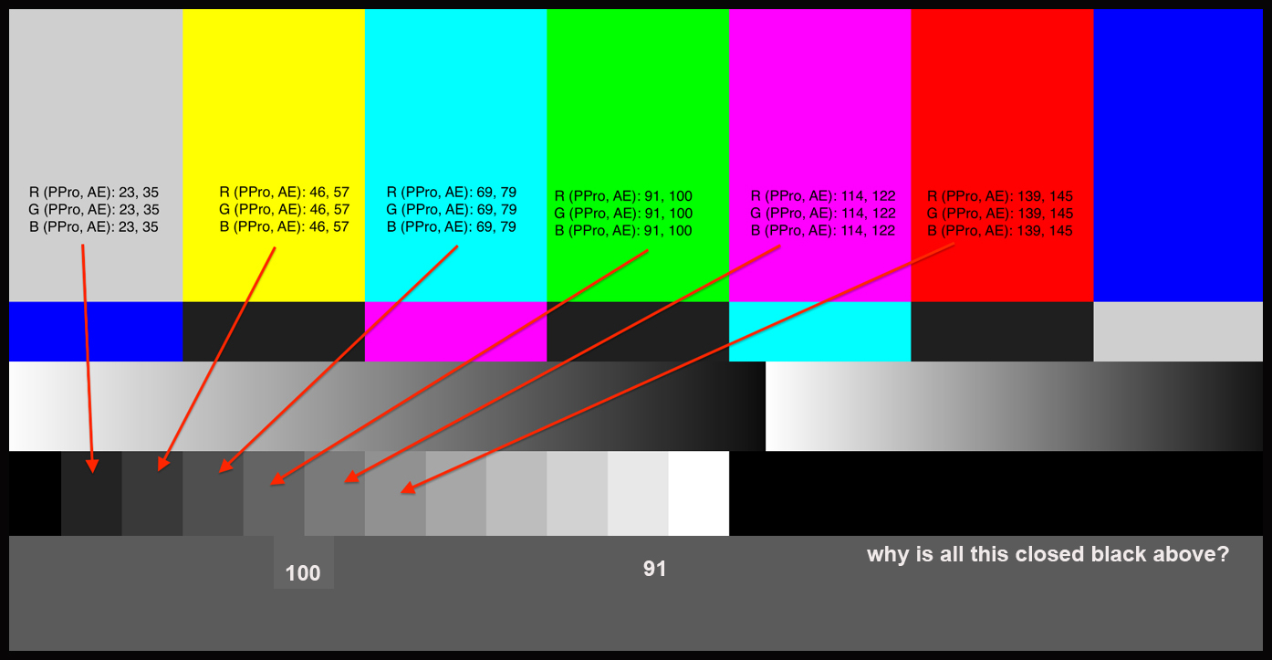
maybe AE and PPro are using different numbers for the math re: IRE (7.5 - 100, or 0 - 100 ) and like, maybe 0-255 in one and 16-235 in the other, if EVERYONE is having the same problem you are experiencing. Otherwise others are getting the same bars and it's just something with your setup. I hope someone can figure out how to fix it so it works for you. Clearly what I see on my monitors is different than what you see on yours, so samples of color and gray scale won't work for me to make guesses about what is up.
It will be interesting to follow what happens.

this is interesting article if anyone feels like reading.
Understanding Video Levels « digitalfilms
Another crazy guess...maybe something is going on with the pivot or offset in the scale. I suppose comparing a real printed gray scale card on monitor with bars could maybe help figure out which one is closest to the real deal ??
Copy link to clipboard
Copied
Oh, I get it now.. it's a totally new design of the bars ...
Copy link to clipboard
Copied
It seems to me that there is a history of rec 709 and NTSC that goes back a while. An article (linked above) explains it to some extent. First TV was black and white. Then it became color. In order to keep black and white TV's alive, new signal (different wavelength but very close in electro magnetic spectrum) was introduced. One signal is black and white. The other signal is color.
Interpreting this stuff in the fast evolving world of computers ( digital film and digital monitors ( NOT CRT)) has been very challenging for everyone. Test patterns for black and white are different than test patterns for color. PRINTED materials that pro shooters use also have different cards used for gray scale and color, and also other cards for 'back focus' of cine lenses.
This doesn't matter here, because the poster is NOT trying to match what was shot and what the production company WANTS for their "look". He is ONLY concerned with the obvious discrepancy HE sees between PPro and AE using artificially generated "bars and tone" thing.
As far as watching it on other platforms (websites, players, etc. ) … all that can get thrown out the window and ignored.
He is ONLY concerned with the claim that the new version of CC is color managed to create perfect color and gray scale.
I think there is some scientist color engineer who promised to help him privately to solve this problem on the poster's specific platform ( computer and monitor, graphics card, preferences in programs, etc. )
I am hoping I get to hear something about the result of that interaction because I applaud Adobe in general ( and that scientist specifically ) that they care so much to help and will do that ! How cool is THAT ??

Copy link to clipboard
Copied
I think there is some scientist color engineer who promised to help him privately to solve this problem on the poster's specific platform
I applaud Adobe in general ( and that scientist specifically ) that they care so much to help and will do that ! How cool is THAT ??
Yes, the scientist in question (Vlad) and I are helping BMACadelic privately to get to the bottom of this. Thank you, Rodney, for recognizing that we truly do care intensely about the quality of our products and want the best for our users. He is an engineer on After Effects and I am on the Premiere Pro Color team. We both worked on the Display Color Management feature in Premiere, so we should be able to help him out.
Copy link to clipboard
Copied
is there an update on this ?? is it an anomaly or systemic to all ?

Copy link to clipboard
Copied
I'm using a maxed out iMac Pro and this is still not working for me even with the checkbox selected in preferences. This makes it impossible to do any color adjustments. I don't know why it's so hard for the color scientists to understand what is shown in Premiere is not what is exported from Media Encoder.
Copy link to clipboard
Copied
Tummy, you misunderstand what display color management does.
Display Color Managment only affects what you see on the display inside Premiere Pro and Media Encoder, it has absolutely no effect on the colors in your exported file. I know it can be hard to understand, but what is inside the file, and what you see on screen are two different things. Each app is responsible for reading the data in the file and properly converting it into something that the display can actually show on screen. That is what display color management does - it reads the ICC color profile of your computer monitor and converts the colors in the file into that space so they look correct inside PPro and AME. Once again, it has ZERO effect on the colors that get exported in the file.
The problem of exported files looking different in QuickTime player and websites is completely unrelated to our display color management feature. We have no control over the way they choose to interpret colors in the file - but I can say that they are not doing it according to the internationally recognized specification.

Copy link to clipboard
Copied
Forgive me if I'm being ignorant here, I was excited for this colour management option thinking it would make editing on a new Mac more possible but it made an even bigger difference from what I see on exporting.
So what's the point of having the display 'correct' if it doesn't match any of the exported footage?
Copy link to clipboard
Copied
That's a very good question. Brings it down to basics.
I'd be very interested in the answer too. Maybe some sort of block diagram would help simplify things. Something simple that includes camera source material ( many variables potentially re: color ), peripherals ( monitors, input and output devices), adjustments made with PPro and scopes, and export types best suited to match SOMETHING.
hehe.
Copy link to clipboard
Copied
You are still operating from some incorrect assumptions. As noted in my posts above, you have to unlearn some of the ways you think this imaging system works, in order to get setup so it works properly for you.
The "system" is a mashup of parts. A basic computing system has first the computer hardware ... then the operating system (OS) and the way that is designed to work with a monitor to display images on screen ... then the video card, typically ... and a monitor.
Each is a separate entity with its own 'concerns'. The computer hardware just exists to compute & pass along the data of that computation, totally has no concern with that data. Doesn't see video data any differently than say a text or spreadsheet.
The OS has more interest in the display, but primarily these days that interest is to 'enhance the viewing experience' as the primary goal. Accuracy of display to any standard is not even a concern, the OS is designed to enhance your experience. Because the vast majority of users are known to have lousy quality screens with no management ... they want to help you get past being the dummy they expect you to be.
So there is normally little concern in the OS, as it installs, with showing any media to any sort of real pro-end standards.
Next, that video card ... most cards assume gaming if you're displaying video ... and have all sorts of 'enhancements' to that experience. So, you have a really dark scene in the game, the card automatically brightens the lighter parts so you can see better who's lurking in those shadows.
For Nvidia cards, you need to go into the Nvidia controls and turn that sort of crap off. You also need to set the card's settings so the card controls the monitor via the ICC profiles you calibrated into use for your OS. Proper video display settings for Rec709/sRGB video work.
Now ... that monitor. Like GPU cards, the monitors all assume video is gaming ... or watching some movie. Again, as shipped, monitors are normally set so that they totally disregard color flags and profiles of the media itself and instead "enhance the viewing experience" ... with juiced color settings, that gaming dark-scene thing mentioned above, all sorts of things like that.
You need to go into your monitor settings and turn all that crap off there also. Turn the monitor into a "dumb" piece of hardware that just shows what it's told to show.
NOW ... you can calibrate that monitor with a puck/software system, set the OS to use that resulting ICC profile for that monitor, and have a decent chance of working away. If you haven't done this, well ... there's no way you have any control of what is seen in anything anywhere. And your OS, your card, and your monitor, are all working against seeing any proper or standards met.
Now, we get to showing proper stuff on that screen.
Different types of media can have different 'tags' in them for how they ... hope? ... to be 'seen' and displayed by the system displaying them. Not all media is always 'tagged' for the appropriate color space/profile/details of how it should be seen. As in say a png of bars & tones that doesn't have a 'tag' for correct profile/standard. Each app will see that file differently as the app is designed to see untagged things. PrPro in this case assumes video sRGB, AfterEffects assumes graphics sRGB, and those two standards for sRGB are slightly different. Hence ... a non-tagged png or other file will appear slightly different between PrPro & Ae based on each app's default assumptions for untagged files.
Prpro and Ae both apply tags to their exports. If 1) the entire system the export is played back on is set as above, and 2) the app used actually pays attention to the tags, then and only then will that export be seen very close to the way it showed within the app that created it. No matter whether it was created in PrPro, Ae, Resolve, Vegas, whatever.
But even then, only in apps that pay attention to media tags.
Even if the system is set correctly, if the app pays no attention to flags, then ... that image/video will probably be off in some way from within the app that created it. As has been so often stated, QuickTime player pays no attention to tags, is one of the worst viewers possible to check for 'accuracy'. Same with Chrome and Safari in browsers.
PrPro or any other media creating program can only control color appearance within the program.
Your system has to be set to show properly tagged video media to that pro standard, and you have to use apps that actually pay serious attention to tagged media, to see nearly the exact thing outside the app in another viewer or program.
I hope that helps.
Neil
Copy link to clipboard
Copied
UPDATE: after investigation with BMACadelic we learned that the color bars file he is using to compare PPro and AE is an untagged PNG file (meaning it has no color space tag). Without a color space, it's up to each app to guess. PPro interprets that file as Rec709 and AE interprets this file as sRGB - that accounts for the difference between PPro and AE that he was seeing. Using a test file that is properly tagged as Rec709 absolutely matches in the two apps when display color management is properly configures in each. Interpreting his file as Rec709 in AE also fixed the problem of the two apps looking different.
The problem of files looking different in other apps like QuickTime and web browsers is not something that we have an immediate solution to - it's not a problem with Adobe products.
Copy link to clipboard
Copied
You are quite correct in your comments. Having been through long, detailed programs totally on color space/gamut/calibration for colorists, I know quite a bit of the general way things work ... and it isn't the way most people expect it to work.
Most people seem to think any one pixel's color in a file is an absolute ... every monitor/screen/app will "know" that color and display it the same.
That isn't even in the same galaxy as Reality. But still, they demand that things behave as if their totally unrealistic expectation is correct. Which leads to some sadly angry arguments.
Your comment about the use of a non-tagged bars & tone file causing the issue that BMACadillac had is quite a good example. How could a simple bars & tone be off? Easily ... without a tag, it's at the mercy of whatever app reads it ... and past that, of the OS and monitor settings.
"But wait ... Rec 709 is sRGB, how could those be different?"
Rec709 specifies the general sRGB color space, but uses a slightly different mapping of tones & hues. Even "base" sRGB and Rec709/sRGB are not exactly the same.
I've talked with people who buy a monitor and attach it and expect everything to be spot-on. But the color settings in their OS are set to 'enhance the viewing experience' as are the monitor out-of-the-box ... in different directions. And they're angry when things look different on other systems. But they haven't taken the time to make sure they have the correct OS settings nor that their monitor is set correctly and calibrated by at least a puck/software system ... and they're even angrier when told they need to do so.
Again ... they expected an unreasonable and completely erroneous thing is 'right' ... that all color is an absolute and should be the same for "any properly built app!".
No NLE nor grading app nor viewer can control the OS color settings nor the monitor settings/space/calibration. That's up to the user to become knowledgeable about and to control. An NLE or grading app can use settings from the user to attempt to ... within that app's viewers ... show the media as close to "proper" as possible. Properly 'tag' the media on export. That's all it can do.
That same media shown on an improperly setup system (which is the vast majority of computers out there) is totally at the mercy of the system/monitor/app capabilities within which it is viewed. QuickTime player is of course notoriously "color stuuuupid". It doesn't even attempt to read the 'flags' of files.
Safari and Chrome browsers the same ... the only browser that attempts to properly recognize video space 'flags' and utilize them is Firefox.
I've had people insist that say Resolve exports material that looks just the same on X as it does within Resolve. I've used Resolve through a couple versions now ... and gee, when I export from Resolve with the proper Rec709/sRGB settings, bring it up in QuickTime player ... oh, yea, same problems as exports from PrPro.
Because again, it isn't either PrPro or Resolve that are controlling what QuickTime player is showing, as it pays no attention to the info they put in the file header.
The user simply must know at least enough to choose a proper monitor for the work they are doing, and have their OS and monitor settings correct for that work specifically, and calibrate that monitor for the space to be used.
Then ... gee, how nicely things work!
Neil
Copy link to clipboard
Copied
Hi All,
What Francisco has said is true. We have determined that the Bars and Tone PNG graphic file was untagged and thus lead to the shift in color I was seeing between the Program Monitor in After Effects and Premiere Pro. We can now confirm that color management is consistent in both apps. Francisco - I just sent you and Vlad another email as even though color management is consistent in both apps, I'm still experiencing a very noticeable RGB value shift for the greyscale values no matter the browser or video player I'm using to view the export file. This also occurs on my sRGB MacBook monitor. I look forward to further discussing this via email with you and Vlad to tie up a few more loose ends regarding this issue.
Neil - Thanks for your input throughout this thread. Whereas I agree with what you say, I think it's important to note that there are many different levels of video editors that use Premiere Pro. We have editors coming from iMovie and we have editors who are so advanced that they understand the app inside and out. Some of us fall somewhere in between. I don't think it's uncommon or unacceptable for someone like myself to bring an issue such as this to attention. Make no mistake - it is an issue if users are experiencing such an issue on a large level and find themselves unaware of how to fix it or not understanding of why it happens. When one edits within an app and clicks "export" only to experience a different-looking result - without any kind of disclosure from the app, why wouldn't they expect to see exactly what they see in the Program Monitor? I'm not at all bashing what you're saying, not blaming anyone or anything here, simply hoping that you understand where users such as myself and many others are coming from when we see differences in our export and try to figure out why it's happening. It's not unreasonable. That's exactly what these forums are for. I'm lucky to have the knowledge that I do to understand why things are going wrong on the backend of the app. Others are not so lucky and lack such a knowledge. For them, and for myself, forums like this and threads like this help educate us and, ideally, help us to arrive at a solution or answer. It's all a learning experience and we are all very fortunate to have this medium to further our knowledge and solve the issues we have within Premiere Pro. Thanks again for your input. It's much appreciated.
Copy link to clipboard
Copied
BMA ... no worries, and yea, I understand all you said.
My 'shop' is a very small one-man affair. I originally came out of a now 40 year career as a stills portrait photographer, we had our own full color lab servicing our own studio and those of other picky sots back in the wet-lab days. Both the missus and I were very skilled at b/w and color enlarging, often doing things the "Custom Printers" for the major pro labs said couldn't be done. We were doing it on a routine basis. And of course, to keep our processor's chemistry in-control I had to become a master of quality control checks & such. Color, in all respects, and tonalities ... those matter to my eyes.
When I started in video post, wow ... that was frustrating. Everything I've posted in this thread & others on color, I learned from the ol' hard-knocks school. Well ... really, after the first few hard knocks I went after learning how this video thing really worked. And why mine ... didn't. Because at first, it sure didn't! My first attempts to export something were horrid to look at. Even though my system worked great for tightly color-controlled prints from Lightroom or Photoshop sent out with "no color correction" instructions to the pro print lab we used.
My colorist friends have several grand in their Flanders or Dream-whatever 'confidence' monitors, and spent more in their calibration gear than my entire "suite" sytem. They all have external LUT-driven calibration boxes for every monitor using the LUTs their calibration gear provides. They also have a "pro" come in a couple times a year to do a "real" calibration with his gear that costs more than my cars combined.
Yea, that's great but ... I can't justify that cost. Not anywhere near. But I still have to produce media that is at least very close to b-cast for the various things I work on, even though none of it currently is for b-cast.
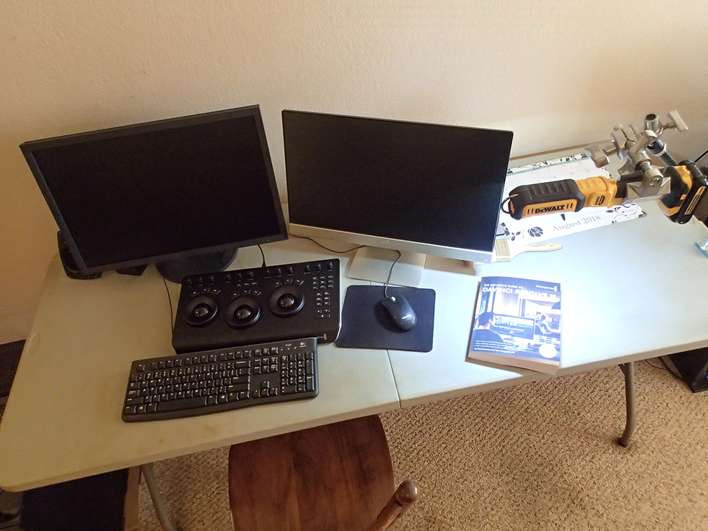
I run an LG "Ultrawide" 2560x1080 for my main UI monitor, and a Dell U2312HM for my 'confidence' monitor using Xrite calibration puck/software. Both monitors are set for totally 'manual' operation, no shading-for-black-scenes gaming crud or anything, and calibrated to Rec709 sRGB at 100 NITS.
My colorist friends shake their heads ... but when I've had them run quick QC checks for me ... "Well, um ... this was fine, but you know Neil ... you can't count on that system ... ".
The point is ... I've studied, bought stuff that, according to others, came as close to b-cast QC standards once calibrated as I could justify ... and then studiously applied the best calibration protocol I can.
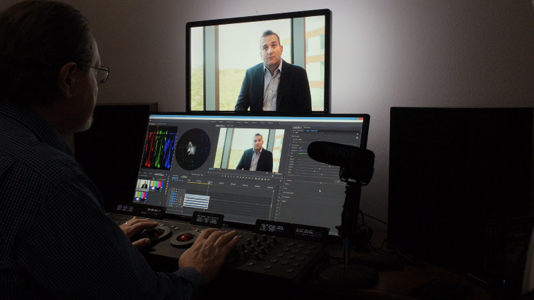
Including ... the room I'm in has totally neutral gray walls that match the Kodak gray-card in R, G, and B values ... and I have a back-lighting system by MediaLight that is set to reflect off the wall at 10% of the brightest value off my screen (Measured with a high-grade spot meter). As shown in the image below of me at work on a recent salvage job for another editor. (That odd black thing pointing at my face is my Rode shotgun mic for doing video tutorials.)
Do I have the high-end gear that would be pretty cool to have? No. Can't justify the cost. Do I have a setup I can have pretty good confidence in? Yea ... because 1) I studied before buying anything, and bought to specific qualifiers; 2) I run calibrations every week; and 3) I've had exports tested on fully b-cast compliant systems. And everything checks as within bounds, color pleasing to the eye.
It's that bit about studying not assuming ... and then applying ... that seems quite hard for some.
But I do remember teaching all those employees in the old color lab days. The most consistent thing between that work and this? No one coming in understands what's going on for color in any way even close to what really happens. And what actually happens in color/tonality is so far from what "we" expect it's pretty hard at first to get a grip on it. I used to tell staff (as I was training them to print color) NOT to think at all the first probably three weeks, just do as they were told. By then ... they'd realized the color changes from the test prints they made, that I was giving them, made no sense ... then eventually passed through that to understanding something was happening they did not understand at all. And finally, to asking ... what really happens here?
At that point, I could teach them. Until they learned that what they thought and what were had no relationship, and they learned to let go of their preconceptions and just listen then apply, they couldn't learn to see and correct color in printing.
I explained that to a major teaching colorist I know and he snorted and said, wow ... that was about 90% of his work when teaching those new to video color post work ... how to work.
It's different than the old print days ... but still the same, it seems.
Neil
Copy link to clipboard
Copied
Neil, I couldn't resist ...
That's a great photo. You notice the spot light on the wall for the monitor ? It's bouncing into your face. Also some overhead light (probably same light) bouncing into the tops of your hands. A very subtle back (edge) light on top of your head would have been sweet.
You should have mentioned, " I had to add some light to the room to get a decent picture, cause otherwise it's too dark and weird ( like the monitors are really BRIGHT compared to the rest of the room )"
hehe... I'm just joking around. Kinda bored, still doing tutorials ( 15.5) with nice calibrated monitor. You might mention (since you are calibrated the way you are ) that you DON'T USE the color management thing right now. As your calibration supersedes monitor ICC profiles. It would be a conflict.
Copy link to clipboard
Copied
Rodney ... well, your comments are from perhaps incorrect assumptions. Understandable, but ... not correct.
The separation or offset (or whatever you wish to call it) light is mounted to the back of the monitor ... a series of small LED lights. The angle you are looking at is from a very different one than my eyes do ... so you're looking into the brighter spot of it directly behind the monitor, which I never see while working ... I only see what shows from my position around the edge of the monitor. On the near side, think about 75% of the way to 'dark' wall.
Look at the far side, how 'dark' that wall against the monitor seems. Look at the near side ... now imagine a tone about 75% of the way to the darkish one. As noted in my post, this is a dimable system and I measured the light emanating from both the screen at full white as calibrated and the wall visible around the monitor as reflected to my position.
That light is totally set according to the standards for working in a colorist setup. Which is the surface behind the 'confidence monitor' should be at 10% (approximately) of the light of the screen's brightest tone surrounding the monitor. This 'sets' your eyes in an appropriate place to judge the tonality of images on the screen.
The light on my hands is a rather typical thing in many colorist/editor suites ... as the room in general is rather darkish, and you're looking at the brightest thing ... the keyboard is pretty dark. If you don't have a back-lit keyboard, a small carefully controlled directed light is pointed at your hands so you can see the keyboard. Very standard. Remember, I've got 40 years now as a professional studio portrait photographer ... I can control light precisely for quality, direction, and 'spill'. My keyboard light is well above the desk to my right with the light having both a 'snoot' and barn-boards on it. It only shows across the keyboard, doesn't even touch the monitor or my face or body. I can see the light unit really only as a silhouette against the darker room beyond it from my position, there's nothing bright up there to catch my eyes.
And no other lights were used ... nothing of this was "set up" to make a prettier picture.
For doing tutorials where I will be talking to the camera, the one this image came from, I do have a small LED light with barndoors mounted pointing at me to lift my face to a darkish-mid-tone area, without spilling onto the screens. Barely touches the near edge of the keyboard/Elements panel. And another bouncing off wall behind me to slightly lessen the blacks on the
dark side of my face. Due to distance/fall-off, that light is next to nothing by the time it gets to the screen ... so then, effectively, I'm lit just a bit more than in this image but all else is similar.
But neither of those lights were turned on for this shot. This is as-is when I'm just working.
As to the Display Color Management option ... I've tested with both DCM on and off. I'm in a position where it doesn't make any difference ... everything is set up correctly to begin with, so that setting neither helps nor hurts. My calibration is the ICC profile being used by the OS, btw. Each monitor has its own ICC profile the Windows OS/Nvidia hardware then uses for that monitor.
Neil
Copy link to clipboard
Copied
Neil, that is a great photo of your natural habitat. Thanks !
And also great to hear that everything is going well with monitor profiles ( ICC from monitor PNP).
Thanks !
Copy link to clipboard
Copied
Well, the whole computer display of video stuff is a mashup, which is why so many have troubles. We tend to assume "the system" is setup to work properly but in fact the OS/video card/monitor are actually setup to ignore proper color and give 'enhanced viewing enjoyment'.
Start with that, and now throw in wide-gamut monitors and HDR ... so there's various 'standards' different media might be needing. Competitive standards, in truth.
Yea, that's a recipe for train-wrecks ... 
This 'enable display color management' option is ... useful ... but not a cure-all, nor will it work for moving into wide ranging needs for media & monitors. For that, we'll need more options in PrPro's color management similar to say Resolve's user settings option. And yea, I'm pushing for that.
Neil
Copy link to clipboard
Copied
Taking a hint from your wonderful editing space (lighting), Neil, I arranged to build a little light thing for reading a manual I am using for a tutorial. It is a Dewalt LED work light with battery. It goes, studded C, gobo head, magic arm, gobo, cardellini clamp, LED light.
This arrangement keeps the light on my white walls down to a minimum. Also lets me adjust light so it doesn't reflect off shiny pages into my eyes. Works really neat !
Initial tests show no influence on exports. In fact, nothing I ever see is influencing exports. Also, I don't know why such a simple photo of a magic arm should be blurry … and think there's something wrong with photoshop probably.
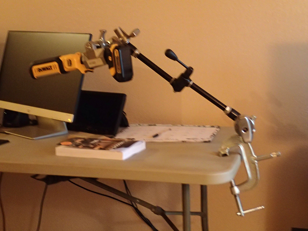
Looks like the C clamp is about to eat its way into the plastic table. Oh oh !
Copy link to clipboard
Copied
Hey, you have a BM Micro panel there, those are cool in Resolve ... but I don't know, can that do anything outside Resolve, like in PrPro?
Neil
Copy link to clipboard
Copied
I doubt it. I haven't even tried to connect the panel to PPro CS6, which is what I have.
I think that would be a huge waste of time. In fact, the panel doesn't do NOTHIN until you go to the 'color' page of resolve. It's all keyboard and mouse for the UI until you get to color.
that table is a 10 foot folding table in my living room ( for scale). I don't have room in front of me to have both keyboard and panel where it's comfortable. So, I have to move them (sometimes put panel in front, sometimes put it in back ). Is pain to move stuff but it's really the fact of life … stuff being where you want to use them.

 AdChoices