- Home
- Premiere Pro
- Discussions
- Re: fading in text one portion at a time
- Re: fading in text one portion at a time
Copy link to clipboard
Copied
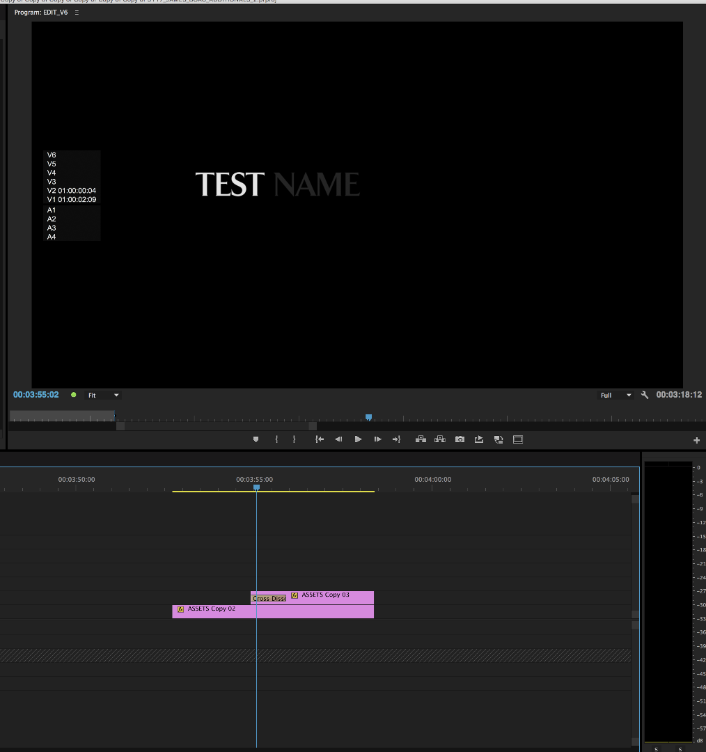
If someone could solve this for me, I would be FOREVER greatful...I'm doing a mission statement. Nothing fancy, pretty basic. white background, black font. I want the persons name to appear first and then the second portion of it to fade in second. I know the two parts need to be on second tracks but the top layer is blocking the second part from coming through so when the marker is over the clip for the second part, it just shows the top layer. obviously I need to change something, but the question is WHAT????! Help!
 1 Correct answer
Should have worked without that extra addition.
eg Upper downwards
Vid 3 - Title 2 (with alpha)
Vid 2 - Title 1 (with alpha)
Vid 1 - White BG
Could easily have been done with 2 Vid layers ( combined Title 1 and BG, and then Vid 2 for Title 2 but the 3rd layer gives better comp options and control.
Copy link to clipboard
Copied
You just need to have the text on two seperate layers, and fade the second layer in. See attached

Copy link to clipboard
Copied
GloryGazingMinistries - YouTube
I did try that and it doesn't work. What I'm trying to do is illustrated in the video above for about the last 20 seconds. I have the "Priscilla Williams" layered on top of the rest of the mission statement which is on the track below. The mission statement has a cross fade in and it won't show both parts at the same time. Just the top layer of her name. Any other possible suggestions?
Copy link to clipboard
Copied
screenshot your timeline so we can see exactly what you are doing
Copy link to clipboard
Copied
You need 3 layers:
1. Layer V1 would be just the white background;
2. Layer on V2 would be just the first name - all would be transparent except for the lettering.
3. Layer on V3 would be the text of the next name - all would be transparent except for the lettering.
The white background would show through the top two lawyers.
Copy link to clipboard
Copied
That worked with one extra addition. I had to change the opacity of the top layer to 0 and then it worked perfect. Thank you for your timely responses and input!
Copy link to clipboard
Copied
Should have worked without that extra addition.
eg Upper downwards
Vid 3 - Title 2 (with alpha)
Vid 2 - Title 1 (with alpha)
Vid 1 - White BG
Could easily have been done with 2 Vid layers ( combined Title 1 and BG, and then Vid 2 for Title 2 but the 3rd layer gives better comp options and control.