 Adobe Community

Copy link to clipboard
Copied
Hello i am working at a video of my travel to patagonia
I have clips form panasonic gh3 and sony action cam, shot in completelly different situation, sun, cloud, rain, snow, morning, afternoon evening..
i would like to apply some grading but don't know how..they are totally different..i know that i have split the trip in 4 different parts..related to the mood
I am still "week" with color correction, any hint would be really appreciated
Thanks a lot


 1 Correct answer

Scopes tell you what the signal is doing ... past that, you just need to learn how to read them, and what to expect from certain types of scenes.
Those out-door scenes you've posted here, with clouds ... those will have values approaching or even exceeding the top 100 line of the standard-range media for RGB Parade, Waveform, or the Histogram.
An indoor-scene that doesn't have any light-sources in it, say a typical evening living room? May not have anything that really should be above 80. Or may .
... 28
Replies
28
28
Replies
28
Copy link to clipboard
Copied
sorry i mean weak..absolute beginners

Copy link to clipboard
Copied
Just look up color grading for Premiere Pro in YouTube. You will get lots of video assistance.
Copy link to clipboard
Copied
Copy link to clipboard
Copied
Using the Lumetri panel, there's a few different ways to approach this. Depending on various things, of course. If you have mostly long clips, and will be doing a lot of cutting of short sections (sub-clips), it might be easier to grade the long clips then do your editing down.
That would work well for say you have three clips from five to ten minutes of continuous shooting, or more.
Another similar workflow is to make a sequence for each camera's similar shots, grade that as a group and "nest" it. A bit more complext but not too much, a quick practice or two can help.
More typically, you'll have many smaller clips, and that's where copy/pasting "attributes" comes in. You can grade one clip, right-click and "copy attributes", go to another similar clip, and "paste attributes" unchecking all but the Lumetri panel. You can also "save a preset" of a Lumetri effect, then apply that preset to other clips.
As to the grading itself ... I've a GH3 myself, as my main video cam. I know that with my footage, Lumetri quite often 'sees' the brighter parts as above 100 on the scale on the left side of the Lumetri RGB Parade and Waveform scopes. If you go to a clip, and at the top of the scope there's a solid thick line of "trace" signal, you've got "overbrights", and most of the Lumetri panel is not "allowed" to do anything with signals of a value above 99 (or below 1, for that matter). So for any signal above 99, you've got to get it 'down' before working in Lumetri.
For that I'll use the RGB Curves effect, drag/drop it on a clip, then go to the Effects Control Panel, and make sure that effect is 'before' (above) the Lumetri effect. (If you haven't touched Lumetri controls yet, it won't show, and then the RGB Curves is the first color effect showing anyway). In the RGB Curves effect in the Effects Control Panel, just drag the top right corner of the white curve down a little bit so the top values of the RGB Parade or Waveform scopes drop below 99. Then go to the Basic tab and start working.
First step of grading is neutralization ... try to get blacks to just above 0, whites to a reasonable level for the scene, as say, an interior with not a lot of lighting won't have any areas close to 80 let alone 90. Adjust maybe the "Exposure" control just a bit up or down to set the main "brightness" of the clip, and then adjust contrast/saturation along with re-touching other controls. The goal is a moderately saturated, "natural" appearing clip. Visually close to a "neutral" color balance, details in shadows & highlights, blacks, whites, and mids looking "natural" for the scene. Not perfect ... just ... neutral-ish.
Next step is to go down the sequence, and get a decent match between a few representative clips that are close on the timeline within a scene but of different cameras or camera settings. This is often called "adjusting Hero shots". This type of work is often better done between the Creative, Curves, and Color Wheels tabs of Lumetri. Once you've got those looking believable (or at least not visually jarring) then copy those settings to other appropriate clips around them in that scene or type of scene.
Then you go down the timeline checking to see that what you've created is something where the different types of scenes ... morning, afternoon, or evening out-doors, and interiors for daytime or evening ... look appropriate within each scene, and don't "jar" the eye within a scene or moving from scene to scene. You do expect jumping from an afternoon exterior to evening interior will look very different ... but if each looks appropriate for itself, the jump is fine. And keeping things within a scene relatively close again so the eyes don't "bounce" clip to clip is good. Perfect ... don't even try. Pro colorists laugh about "perfect".
Then it's finally time to see if you need to establish an overall "feel" or look to the project, often easier to do with Adjustment layers placed above your clips and spanning entire scenes or perhaps the entire sequence. Use the Lumetri effect upon the AL, give a bit of a look to the affected area. A bit more of a style or taste thing.
For this later bit, there are numerous LUTs/Looks that come with PrPro and accessed through the "Look" drop-down at the top of the Creative Tab of the Lumetri panel. You can use the drop-down arrow to access them, and then navigate through them with the right-arrow, to see what they do. They're way too strong for most work, so you use the controls to fade them down so they give just a touch of a Look to your clip/s. Then use other controls to further adjust to taste.
I think that's probably enough to keep you testing things a while ...
Neil
Copy link to clipboard
Copied
yws what i need is a kind of workflow..and mostly a kind of "work philosophy" according to my situation..where i have lots of small clips (15 minutes of video composed by average of 5-6 seconds clips) ) very different in contents
thanks neil this is very helpfull
Copy link to clipboard
Copied
The more and the shorter the clips, the more challenging the workflow for colorist stuff. The nature of the beast, as it were.
What you're talking about is a program that is a 'typical' colorist's full workfkow.
1) Neutralization
2) Selecting & grading "Hero" shots
3) Applying the grades from step 2 across the other similar clips within a scene/program
4) Blending the results of step three both within scenes and between scenes, paying attention to how similar types of scenes look throughout the piece
5) Choosing and perhaps applying a "look" for the subsections of similarity (say, afternoon, evening, interior-tungsten ... ) and of course the possibility of a project-wide "Look"
Steps 1) through 4) are pretty much required, and Step 5) is always optional.
Do your main editing first ... although, if you've got clips you're concerned about for say poor exposure or real bad white-balance in shooting, you can do a 'touch' of those with Lumetri to see if they'll be salvageable. Other than that, just edit until you've got your program 'done' for sequencing.
Then you start working "groups" of clips, and this gets a bit more complicated. Sorry, but no way around it.
---
One workflow I've done a couple times back in the beginning, was to simply choose all the clips that were very "similar", plop them on a new sequence, grade that sequence with an adjustment layer and then modify individual clips as needed ... then export that sequence as clips as a high-quality 'digital intermediate' using Cineform. Then I re-imported all those clips and replaced the ones on the "main" sequence. Sounded simpler, but ended up being as much work as other ways of doing it. The one grace it had was I could "see" how that would work better.
Once everything was replaced on the main sequence, then I went through the rest of the tweaking clips within a scene and then the scene-to-scene work. Not how I work now, but ... it was an easy-to-understand (for me at least) initial process.
---
Now ... for something as complex as you'll be working, I still tend to use SpeedGrade ... although they've discontinued the "Direct Link" process whereby Sg could open & work a Premiere Pro project file, there's an app made by NTown Productions, which is a SpeedGrade user from Austria's personal page/company. It's for PC, and has a very small fee. Open a PrPro 2017 project in it, it auto-converts one character of the header so SpeedGrade 2015.1 (the last release of Sg) can open and work the file. After finishing & saving the project in SpeedGrade, you go back through the app and it up-converts the project header back for use in PrPro 2017. Now ... I understand and like SpeedGrade, so this is not something everyone wants to do. Here's the link to a thread by Patrick in the Sg forum and his little app ...
Update: My little Speedgrade/Premiere Project Converter still works with 2017
Within PrPro, I'd STRONGLY suggest you get a Tangent Ripple control ... properly mapped, it would give you several times the speed of operation, and better results to boot ... for around $350USD. Not mandatory but it's easy to learn/map, saves you tons of time, and will let you find better results at the same time. Not required, but ... your choice.
---
Within PrPro and the Color workspace (full Lumetri panel), I'd suggest using the Basic tab for most neutralization, and the Creative tab if you wish to apply some scene-wide basic starting look to your media as mentioned in the first post. I mostly ... don't ... but many really like doing this.
Curves and Color wheels give you more/different/subtler tools for further mods to the image, and the HSL Secondary tab allows you to take some "problem child" such as overly saturated reds or something, or a hue that's just off a bit, and move those selected values a bit more to where you want them.
---
Ok ... you've got your edit basically done. Now to start coloring ... to do the basic neutralization, the idea is to get all clips as fast as possible to a neutral state for color balance, white & black points, and tonality/saturation so they look "natural". Proper technical white-balance, no crushed blacks or blown out whites. Details well into shadows & highlights. Speed of accomplishing this is important, perfection is NOT.
For Hero selection/working it's nice to have an open track or two above your edited timeline. Move everything such as titles/graphics or whatever you have above your sequence up a track or two and turn the visibility of those tracks off.
Then select your Hero clips, a good representative clip of several others you have either within a scene or across the project, and move the ones you'll be working just straight "up" a track. This gives better visibility of what media you're working, and easier selection of clips to work across. To start, it might be taking say one interior tungsten clip of each such scene of the whole project, moving them up a track, and working individually and across them so they have a similar 'feel'. You'll at times have multiple Heroes from a scene if there's multiple cameras involved.
Now take the Hero clip/s from a scene, and use the copy/paste attributes to apply that setting/s to the other clips of that camera/scene. You'll be doing this section with each "type" of scene you've got, so you'll be moving things up & back down with alacrity in short order.
Now you've got a program with fairly decent and appropriate color balance/tonality for "believability" and for eye-comfort as you play through the program. This is time for step 4), blending within a scene (can require some tight work) and scene-to-scene (more generalized work). This part of the project depends very much on total time available. For pure speed, sometimes if the Hero-work/application gets done pretty decently, this step may be minimized. If you've got time/budget, this can such a lot of time, but can give subtly better results. Your choice of course.
And step 5 again ... scene & program wide "Looks" ... is totally a Choice. I do at times, others it doesn't seem needed/appropriate.
---
Doing steps 3 & 4 can require some shot-matching, which is perhaps the biggest weakness of the current iteration of Lumetri in PrPro 2017. I suggest creating a custom shot-matching workspace with side-by-side Reference & Program monitors AND having the Lumetri scopes panels open along with the timeline and Lumetri panels. It can be done on a large enough single monitor, but I do like having my twin-monitor setup for this. I created a new Panel on my second monitor, and dragged the Reference and Program monitors onto it, with equal space for both. I use the zoom controls as needed to view sections of each as needed, and set the Reference monitor to show a clip I've graded, and the timeline & program monitor are working the clip I'm grading to match the one in the Reference monitor.
---
You can stack multiple instances of Lumetri, either on a clip or on Adjustment Layers added above a clip.
The full "Lumetri" panel ONLY controls the last instance of Lumetri applied to a clip ... in the Effects Control Panel, it will be the bottom one. However, by twirling down the controls for each section within the ECP you can still modify the settings, though you can't use external control surfaces like the Ripple on anything but the 'active' full Lumetri panel.
For stacking multiple LUTs/Looks, and for doing multiple secondaries, stacking Lumetri is needed.
The other method of stacking Lumetri is by creating an Adjustment layer above your clip/s, and then using the Lumetri panel with that. This does make it possible to have multiple Lumetri "on" a clip, with all of them still using the main Lumetri panel, by selecting which 'layer' you're working, the clip or AL's above it.
---
And as noted in my earlier post, if you have "superbrights" especially from that GH3, you will need to apply an RGB Curves effect "before" Lumetri (by moving it above the Lumetri in the ECP) and use the white "exposure" curve or perhaps an individual color curve to move the top data back down under 99 on the Lumetri RGB Parade scope.
I did find that I could use the Curves panel in Lumetri to bring the top values down, export a cube LUT from Lumetri that I named with a "1" as the first character and placed in the folder with the Adobe Technical LUT's. That's the first LUT that shows when you hit the right-arrow to navigate the Basic Tab's LUT-drop-down box, and does move the data down so the other controls of the Basic tab are usable. So I use that now to quickly lower the signal data so that I can stay within Lumetri and avoid having to grab another effect.---
Hope some of this is useful ...
Neil
Copy link to clipboard
Copied
what i found difficult is how to act in the basi correction..light/dark for example
Let s say a clip is too bright, too light or a bit overexposed..
i can adjust exposure, highlight, white...
and the same when is dark..changinf blank instead of white..but basically each one of these might work for these scenery
Now ..what to use..in what part these parameters change from the ohers?
Copy link to clipboard
Copied
That you learn by testing things. Doing. Experience. No other way to do so.
I do recommend using a left-to-right "ramp", a gray-scale image that starts a 0 (black) on the far left and goes through say 40 or more small steps to 100 (pure white) on the right side. You drop that (still or graphic, probably) on a timeline/sequence, get the Lumetri scopes "out" set for RGB Parade, Waverform (either Luma or RGB), and Vectorscope YUV. (You can do a web search for "video gray-scale ramp" or similar terms to find something.) A ten-step gray-scale is also useful.
Select the ramp graphic, then ... play with the color/tonal controls which watching the scopes. What part of the data signal moves, and how far/fast? Go through every control on every panel, doing a LOT of re-setting so you see each control starting from a "clean" state ... and starting from a "worked" state. What does it actually do? How does it modify what has come before? Then try the same thing with a fairly "normal" video clip.
Work your way down through the panels & individual controls until you're very familiar with what happens with each control. An hour of playtime/practice with this will get you better work and save hours of time messing with a "real" sequence in total frustration.
The Basic tab's black/white and saturation, and contrast controls are very much what you expect. Black moves the bottom point with less effect as you go up the scale, White the opposite, Saturation pretty simple, and Contrast controls the spread from pretty much the 50 point on the 0-100 scale on the left side of the scopes. More contrast, more spread ... less contrast, less spread.
"Exposure" seems a mashup of contrast, gamma, and a colorist-style "Lift" control. It moves mostly everything but ... it's got slightly different effects on shadows, mids, and highlight areas.
"Shadows" moves the shadows more than mids & highlights, but does seem to move everything at least a little. "Highlights" is the same from the opposite end, so using one typically means countering the far end of the scale by moving the other. Or use them to brighten/darken the feel of the whole clip instead of the Exposure control.
Creative tab controls are rather more ... unique ... in what they do. Just play with them and watch the scopes.
Curves ... are pretty much straight-forward curves controls.
Color wheels ... pretty standard Colorist-style color wheel tools, interior of the "ball" controls the color (Chroma), vertical slider to the left brightness (Luma), and these work very much on the proper parts of the data signal. Shadows does very little to higher highlights & vice versa. Mids control doesn't affect black/white points at all.
HSL Secondary is a specialized tool ... I wish we had an option to add more to any particular instance of Lumetri, as I tend to do quite a bit with them. One of the things I miss from SpeedGrade, and one reason some of my work still goes there through Patrick's little conversion app I mentioned in the first post.
Neil

Copy link to clipboard
Copied
Neil's way is good. I wrote a post a while back on how to read scopes for neutralizing clips. It worked so well for me that you might be able to adapt it to your new Lumetri workflow.
-A Quick How-To-Guide for matching all clips to a standard waveform in 3 easy steps in Premiere.
Before you begin, open up vectorscope HLS, vectorscope YUV, and Waveform type luma
-add effect fast color corrector to clip
1. View waveform luma:
using effect fast color corrector:
set black point ire 7.5
set white point ire 90
if black and white points are already maxed out, set output level so they are set.
for grey point(the middle slider), view HLS vectorscope, make as small a dot as possible, increase just until you see other parts increase. a large part of shadow will also automatically match 30% on the waveform luma. You'll find this also creates a consistent slightly Log look so its easier to grade and match later on.
2. White balance(click white balance eye dropper) or... if you can't find a white spot, temporarily set saturation so that it all fits inside HLS vectorscope. Watch the HLS vectorscope so that the large Hue wheel sets the weighted brightest part in the center.
There's a secret trick to get all skin tones to match and thus a faster color match between shots, the "skin tone line".
Temporaily set Saturation 200% to easily see bright saturation line.
Set -Fast color corrector-Hue Angle - line up brighest line in HLS(not YUV) vectorscope between where line red and yellow would be in the YUV vectorscope(around 11:00 o-clock). This is the overall Hue angle for skin tone.
3. Set saturation in fast color correctior to 90% of YUV vectorscope edge from center(100% is touching sides) so all clips have same saturation.
you've now perfectly matched black point, white point, contrast, gamma, saturation, hue in like 10 seconds per clip. And the best part is, they're all easily gradable.
a tip:
don't forget to keep an eye on your histogram for any sharp spikes, this means your footage is probably 8 bit and you could introduce quantization errors into your grade.
Copy link to clipboard
Copied
Different strokes ... the video-tape-era IRE "setup" points are mostly ancient tech these days, but still stick their ugly heads up in some video players and for some users in YouTube uploads, besides some broad-cast operations that still work largely with tape-based equipment. If one isn't needing to meet those specific needs, the 7.5/90 IRE work is excess baggage. But if you need to meet those, it's aboslutely needed.
Personally, that old IRE-setup dragon can't be killed too quickly. Should be totally unnecessary in a digital age.
To me, the 'skin tone line' is a useful area, as for example, my wife and I have very different skin hues even though we "look" to the eye very similar. If you put me directly on that line, other people in the clip won't normally be "too ... bad ..." though often pretty close, but Miriam will look a bit off. If you base the "skin line" hue-angle adjustment on Miriam's skin, every other person will look ... odd. Even the background and clothing colors will be off. It's always a balancing act. There's a LOT of stuff on the web written by colorists on the measured seven or so different main 'types' of skin tone/hue groups, and where each one will tend to sit on the Vectorscope depending further on how tanned they are, skin temps cold to hot, that sort of thing.
It's based on the physiology of the various skin types, actually not their (apparent) visual color so much. How skin appears to our eyes is often not how skin appears to the scopes.
Still, for your situation, I can see your explained total workflow works great for you. And that's of course one of the fascinating parts of editing, colorist, Fx, and audio work ... every different worker has their own way of doing things even if they use the same "basic" tools.
And it's why when one is starting out, well ... practicing & playing with different things as done by others is so necessary. Pick & choose what works for "you", whoever "you" is.
Just watched a BBC program about the six guitars that influenced/informed/changed the work of Mark Knopfler. He was a founder of Dire Straights, also writer of most of the group's "seminal" music, from Money for Nothing through Romeo & Juliet
and Sultans of Swing. It was noted he's been voted or listed by various pop/rock publications and sages as one of the "X top rock/pop guitarists of all time". I've always been amazed at hearing his work.
But I chuckled through a lot of the program. He's got a very different method of making sound on a guitar with his right hand, never using a pick, only mostly thumb & index finger. I've seen a very few others that do something similar, but his is decidedly a ... unique ... approach.
Watching him show how he came up with say the Money for Nothing 'hook' and main rhythm guitar sound ... the "iconic" riff throughout Romeo & Juliet, among others, it's quite clear that if you strum a guitar just like him and in the occasionally different tunings he uses, what he did just sort of "happens" to come out.
But if you try and replicate the exact note patterns with a pick or standard finger-picking, and all on 'normal' tuned guitars ... what he did is often very, very difficult to re-create.
He created some fascinating tunes, sounds, and patterns, glorious to listen to, and very effective. Yet because of the very idiomatic style and rhythm of his hands, and his method of playing, they were all rather easy technically for him to do. Just seemed sort of obvious when he sat and knocked about on the guitar a bit. Sounded cool.
I don't think he'd have been nearly a "standout!" guitarist if he was just trying to get a gig playing songs of other bands. He's not really that "type" of guitarist. However ... as a guitar "hero", and as a composer of stories set to music based on a guitar, he's clearly an icon and legend. The guy's freakin' amazing, as some I know would put it.
But again ... different strokes for different folks. Just like for editing. Figure out what works for you. Keep learning. Watch how others work ... especially note how they mentally approach their work, how they break down projects & steps. Maybe even test out a nearly full copy of someone else's workflow for a few tries ... but keep what works better for you than what you've been doing. Junk the rest.
Keep working, and keep learning. Test!
Then apply & move on.
Neil

Copy link to clipboard
Copied
Neil, thanks very much for the tips. I'm mostly lurking, but learning a lot.
I have some long footage of my family 8mm film. I just had them re-transfered into ProRes (Had them in SD before). The new HD files do much better when adding color correction. So, just one thing, if I edit in a clip that has several actual (8mm) "scenes" in succession, do I put a through-cut into the timeline, and then apply the color correction to that separate bit, etc...
tia
Copy link to clipboard
Copied
If they're different "shots" really, in either different spaces or types of lightings, yes ... always.
If it's a continual shot either panning from one space/lighting to another or moving from one to another ... that's more negotiable.
Sometimes I just set the first part correctly, then set the correction for the second part, and key-frame between them.
Sometimes I've cut into a separate clip just the bit that's where the change occurs, and then just keyframe that one clip. If it's a fairly long continuous shot, over a minute say, I normally do the latter.
Neil
Copy link to clipboard
Copied
Thanks for the informative replies Neil. From this thread and another I thought I'd try the HSL secondaries and was easy to do a little test on it while I was comparing two film to video transfers
Copy link to clipboard
Copied
That's a good idea ... do a short test, then export it and check it out, imported back in or perhaps in VLC or through a GOOD well-setup tv. Basically, you've got to see it played through something you can trust. But you do need to see what comes out from your adjustments in order to learn fastest & best. At times, I've figured that well, I'll do a whole chunk & see what it's like ... but it takes too long to view and come to a conclusion. Short tests of several individual things, then a few of combined effects, do much better.
And you'll get a feel for what it is you're doing as you go along.
Neil
Copy link to clipboard
Copied
ok..i have followed some videolesson and started to watch the scopes panel that seems really useful
then again what i guess..what the scope shiould tell me?
ok for me is clear that vertically should be as much distribuited as possible to have full range of black and white ( i am talking of waveform scope)
but what is inside? it should be also equally distribuites?
and yuv scope? i have understand that signal should not go out of the lines around. Also i found a nice tutorial about the skin tones and the line relates(though i agree with Neil about the real possibility to use it for all
Copy link to clipboard
Copied
also i see in lumetri there is the pencil to set the white balance..do you think is always to be done or just when it is strongly noticeable that it needs white balancing?
Copy link to clipboard
Copied
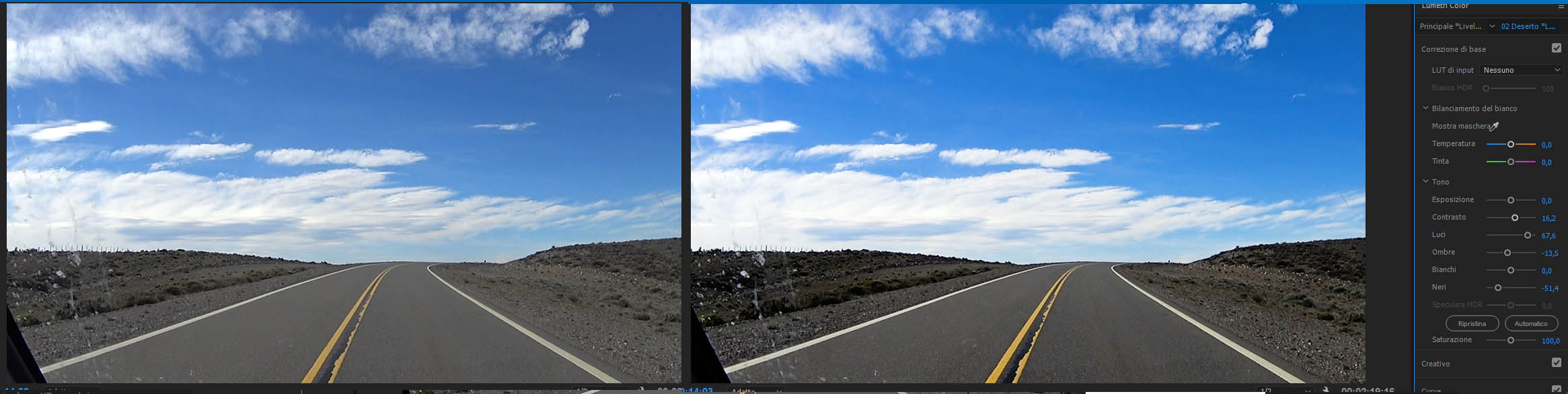
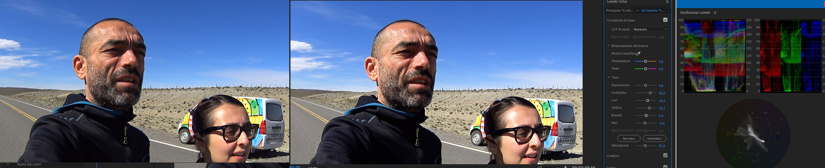
here a couple of frame before and post correction
what do you think?
Copy link to clipboard
Copied
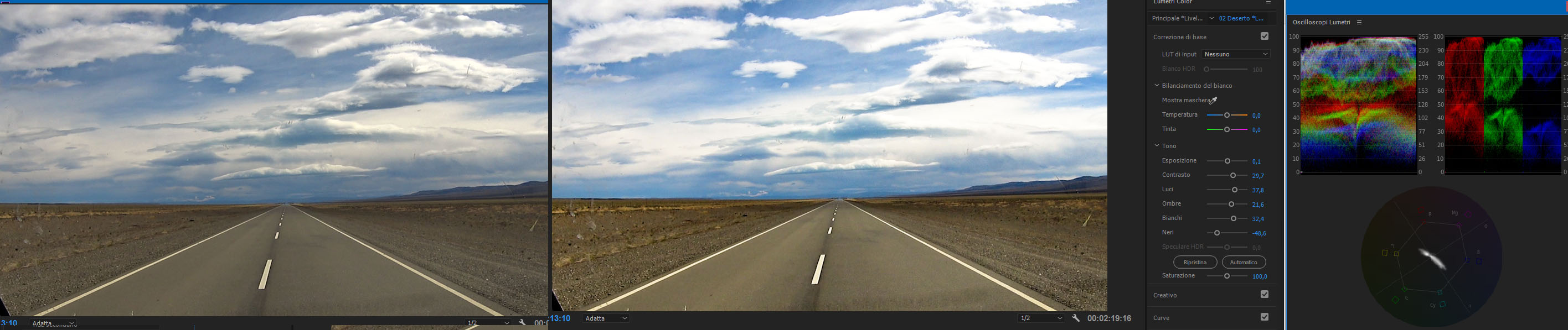
and this
Copy link to clipboard
Copied
Scopes tell you what the signal is doing ... past that, you just need to learn how to read them, and what to expect from certain types of scenes.
Those out-door scenes you've posted here, with clouds ... those will have values approaching or even exceeding the top 100 line of the standard-range media for RGB Parade, Waveform, or the Histogram.
An indoor-scene that doesn't have any light-sources in it, say a typical evening living room? May not have anything that really should be above 80. Or may ...
An outdoor evening scene by twilight, with no light-sources showing ... may have nothing above 65 on the scale.
On the bottom side, an outdoor desert-scene of sand dunes & scrub red dirt, blue sky & a few clouds, may have nothing below 10 to 15. I've seen scenes that were fine of such things with nothing below 20.
That twilight-scene may have a lot of the scene below 20, with some totally "crushed" black areas ... and be perfectly "natural" like that.
Look up skin tone types especially for articles by colorists ... there's a range of "appropriate" skin-tones, but even then, if the scene is lit by an old-style fluorescent bulb and you want the "feel" of that, it's going to have green/yellow tinge with maybe also a "spike" of magenta to really push it home.
Saturation MUST be within the outer boundaries, and then ... varied according to the scene content. Some scenes have little saturation, some have a lot more. Some need less than they have, some need more than is "natural" on the media. And sometimes, part of the hue spectrum need less or more saturation that was 'natural'.
So ... it all depends, once you get past neutralization. That first step, is to get everything as far as possible within 2-98, and saturation controlled, with "natural" looking color balance, to see what you've got. To match other clips quickly. Then you modify for correct visual "feel".
Neutralization is heavily dependent on what the scopes say ... feel is built consulting the scopes while watching the media.
It takes learning & practicing, and watching what others do, and what yours looks like, and what others think of your output. Same as learning to waltz ... easy enough for the basic step of course. But to get from the basic ability to move across the floor to being a ballroom-capable waltz dancer ... takes time, work, practice, and continual criticism from others.
Neil
Copy link to clipboard
Copied
ah is very important to know that in some scenes, (like you said) i can accept different value from the standard that would suggest to keep everything inside 2 and 98. i thought that i always need to be within 100 and closest as possibile to 0
in this way.,.i realize my frame are not really neutralized..at the opposite they ten d to have a strong impact, i could say
i would like your opinion in waht should i aim to when neutralizing, what are the point to check to say this is neutral and ok...noth.in term or visual sensation of the frame and in term of tecnical data i can get from scopes
Copy link to clipboard
Copied
When I'm in straight neutralizing mode, I tend to try and balance the three colors in the RGB Parade ... matching black & white points, and the middles too. In the Parade & Waveforms, you're looking left-to-right in each color (RGB Parade) or across the scope (Waveform in color mode) across your scene. You can often see a strong shape in one that's also repeated in the other colors. I'll try to match those.
I will see the scene in the playback monitor, and if that's say totally inappropriate in the highlights as perhaps there's some really bright reddish tones in the upper end where there aren't blues/greens in that scene ... well, the blues & greens won't have a high reading. But in many scenes, this does work for a fast start on the scene.
The other thing ... checking the exact center area of the Vectorscope, where the two lines cross. If there are supposed to be neutral colors ... grays & blacks & whites ... those should be centered in the Vectorscope. If they aren't, I center the trace. While watching the screen, to make sure that I have moved the neutrals over the center and neutralized them. Sometimes to check, I'll zoom in the playback screen on an area with good neutrals.
Neil
Copy link to clipboard
Copied
yes about some strange lorization ..i understand..i was interested also in light/dark part..that seems to be the essentials before
btw..you know if there are some clips or site, when can train doing a kind of guided correction?
Copy link to clipboard
Copied
There are quite a number of free sites if you Google/ Yahoo/ Bing for Premiere Pro plus color correction plus Lumetri. Of various quality, knowledge of either/ both color correction and what actually happens in Lumetri versus what many think the controls do.
There are also some Adobe video tutorials on using Lumetri. Also of more or less use.
Now that my background technical stuff is fully operational for my new website I'll be putting up a new series of blog posts on Lumetri in general and especially using the Tangent Ripple control and some with the full Elements panel.
Coming in January. I'll post back here as they come up as they'll also be linked to the Adobe ACP page.
Also ... I do like lynda.com for training videos and there are some fine ones there. Paid site of course.
Neil
Copy link to clipboard
Copied
great thanks!
and what s your blog url?
-
- 1
- 2

 AdChoices