- Home
- Premiere Pro
- Discussions
- Premiere Pro CC 2017 UI is wasting space
- Premiere Pro CC 2017 UI is wasting space
Copy link to clipboard
Copied
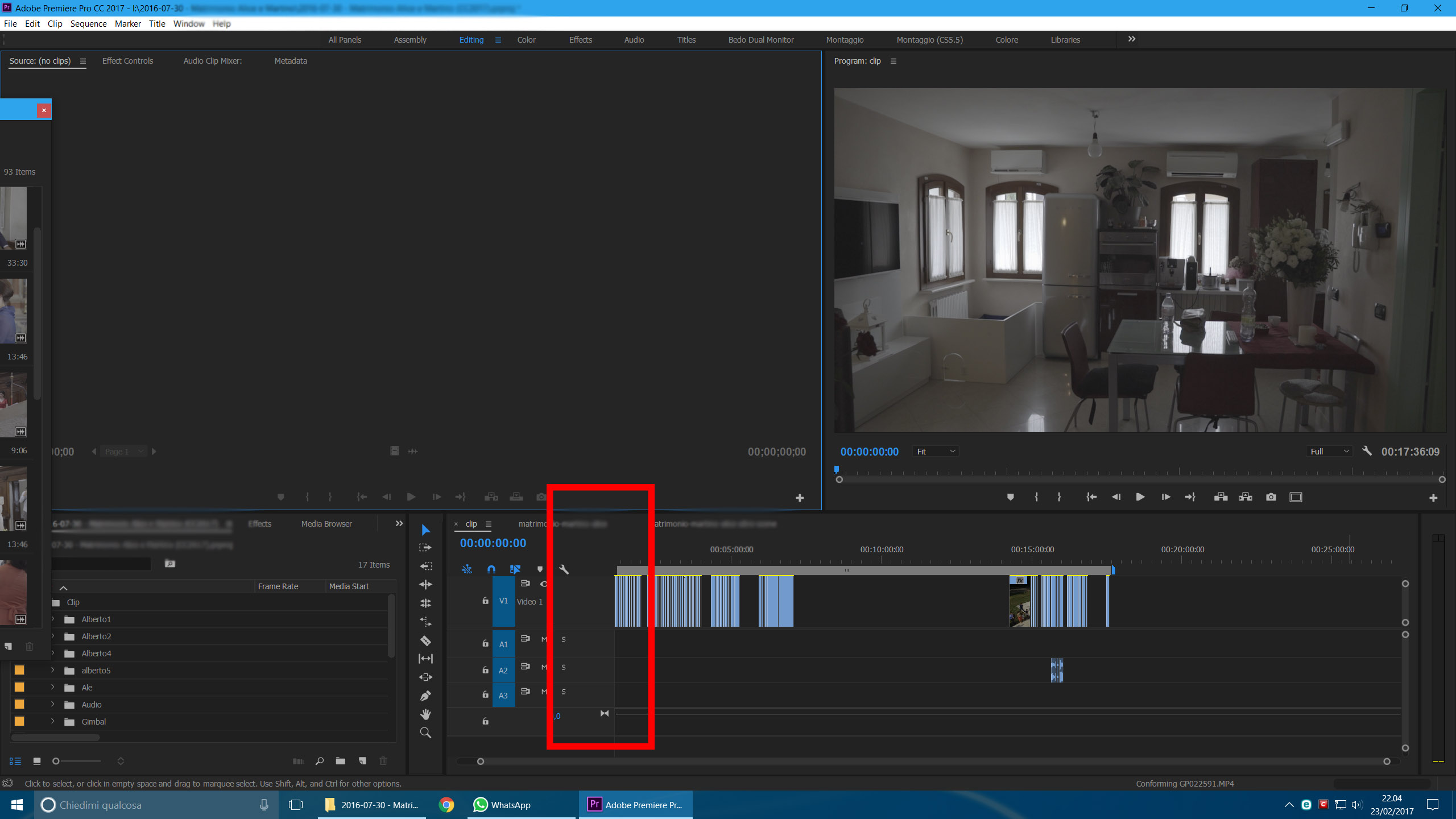
The new UI of Premiere 2017 is wasting space at the left end of the timeline. There is no reason for this. The timeline itself could be larger.
That space cannot be reduced by clicking at the border and moving it.
See attached image

Is there a way to fix this?
Thank you
 1 Correct answer
Hmmmm yes, a little frustrating. Played with it for a while to confirm but can't seem to shrink it any further, even by taking more buttons out.
Copy link to clipboard
Copied
Hmmmm yes, a little frustrating. Played with it for a while to confirm but can't seem to shrink it any further, even by taking more buttons out.
Copy link to clipboard
Copied
I put the track name next to the eye.
When tracks are at their minimum I can still read the name.
Did the same for the audio.
Copy link to clipboard
Copied
I add the audio levels to the tracks, so the space does get used in my case.
Copy link to clipboard
Copied
I sent a Feature Request/Bug Report Form
If you are annoyed by the same problem, please do the same!
Thank you