• Global community
    • Language:
      • Deutsch
      • English
      • Español
      • Français
      • Português
  • 日本語コミュニティ
    Dedicated community for Japanese speakers
  • 한국 커뮤니티
    Dedicated community for Korean speakers
Exit
15

QT Gamma Compensation LUT has oversaturated all my imports

Community Beginner ,
Nov 01, 2023 Nov 01, 2023

Copy link to clipboard

Copied

Hello everyone! I've recently realized I had issues with my video exports' colors being washed out and found this QT Gamma Compensation LUT trick online. These are the assets I downloaded for those LUTs. It fixed my issue with my project at the time but now, I'm working on a different project and as I import pictures or videos, all of them look oversaturated.


I know there was also an Undo LUT for it but it doesn't seem to work (or I'm probably just not using it right). I tried downloading the newest version (and deleting the old one) of Premiere Pro as well as resetting some of my preferences but the issue persists. I also unchecked the "Display Color Management" & "Extended Dynamic Range Monitoring" options under Preferences which fixes the color while I'm editing or during playback but it still exports oversaturated.


Screen Shot 2023-11-02 at 1.29.05 AM (2).pngScreen Shot 2023-11-02 at 1.30.29 AM (2).pngScreen Shot 2023-11-02 at 1.31.09 AM (2).pngScreen Shot 2023-11-02 at 1.29.12 AM (2).pngI'm spent trying to figure out what's wronff & I'm struggling to finish my work so any and all help is very much appreciated!


P.S. I've attached screenshots of my workplace so you can see the difference between previous clips and the new oversaturated ones.

TOPICS
Editing , Error or problem , Export , Formats , Import

Views

11.9K

Translate

Translate

Report

Report
Community guidelines
Be kind and respectful, give credit to the original source of content, and search for duplicates before posting. Learn more
community guidelines

correct answers 1 Correct answer

LEGEND , Nov 02, 2023 Nov 02, 2023

Ok ... this is a thorny issue, and you're probably better off dropping the LUT now anyway. This last thing first ...


In Premiere 24.x and on, there's a new panel in the Color Workspace/Lumetri panel, the Settings tab. This is a HUGE step forward, and one I'd requested like four years ago finally come to fruition.


ALL color management settings are available there, and there's some new behaviors to the app in general ... so you need to know how to work now because it's different than it was!


Lumet

...

Votes

Translate

Translate
LEGEND ,
Nov 02, 2023 Nov 02, 2023

Copy link to clipboard

Copied

Ok ... this is a thorny issue, and you're probably better off dropping the LUT now anyway. This last thing first ...


In Premiere 24.x and on, there's a new panel in the Color Workspace/Lumetri panel, the Settings tab. This is a HUGE step forward, and one I'd requested like four years ago finally come to fruition.


ALL color management settings are available there, and there's some new behaviors to the app in general ... so you need to know how to work now because it's different than it was!


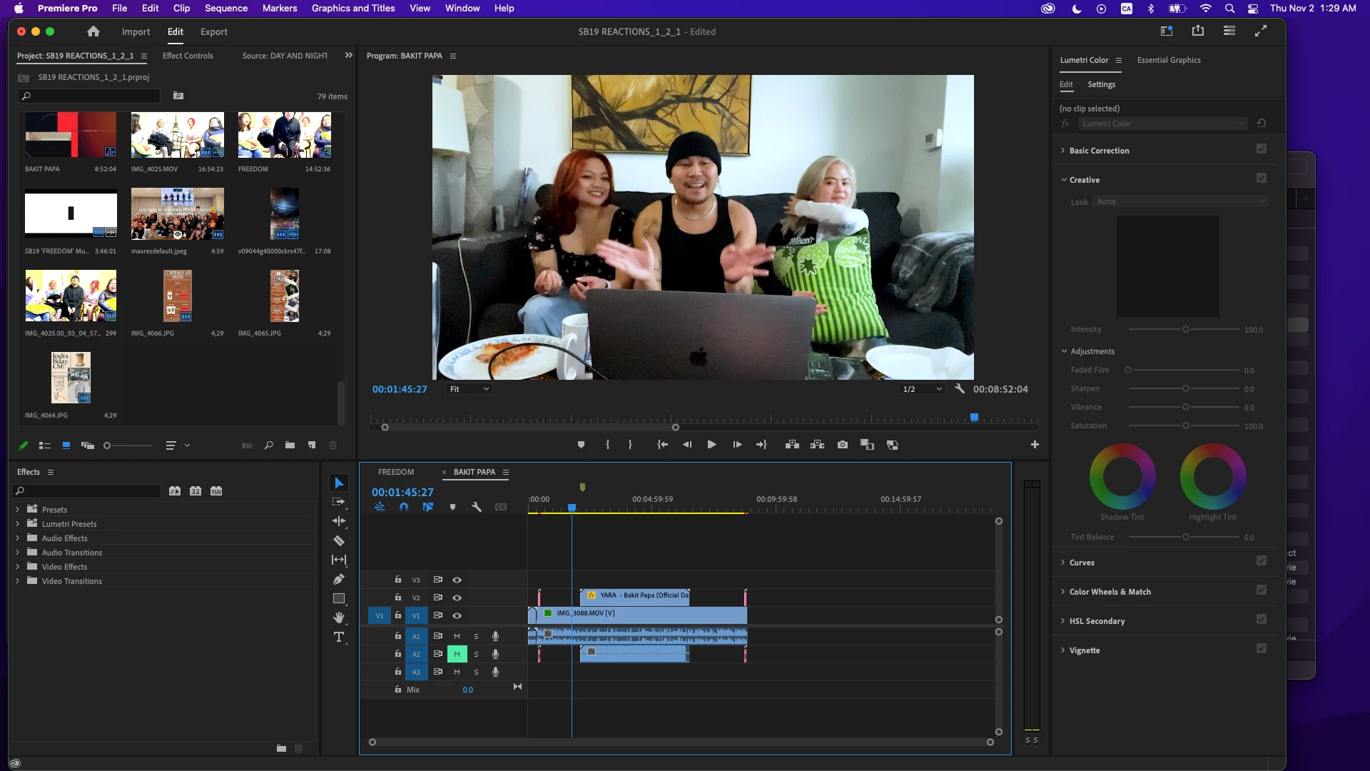
Lumetri Settings tab settings

First, some of your media may be like iPhone or something, that shoots HDR in the HLG format. That's much easier now. Set the "auto detect log" switch on in the Project section of this tab.


In Sequence settings, which now applies to the current active sequence, set the working color spaces as you wish. Rec.709 for 'general' stuff, HLG if you want to export HDR, either one works.


And in the Sequence settings, set "auto-tonemapping" to on. This will remap the image ... safely,  with an algorithm rather than a LUT thankfully ... to the color space and dynamic range of the sequence. For either Rec.709 or HLG workflows.


Now ... go to the section for display ... there's a setting for Display Gamma ... I don't recall exactly what it's called and I'm on my tablet ... which has three options:

  • Broadcast gamma 2.4
  • QuickTime gamma 1.96
  • Web gamma 2.2


For Mac users, if you set the option to gamma 1.96, you will see a very similar view of the media inside Premiere and outside of it on a Mac with any app that allows the Mac utility ColorSync to control color management.


This would  include QuickTime player and Chrome and Safari browsers. VLC will probably display too dark/contrasty/saturated on your Mac, because it will still use broadcast Rec.709 standard for a display gamma of 2.4.


Why the difference?


Apple for some reason set the ColorSync controlled Rec.709 display to the camera transform ... essentially gamma 1.96, rather than the standard broadcast standard for display of Rec.709 media with gamma 2.4. That's why outside of Premiere on your machine, Premiere's native (previous) behavior looks "light". 


Understand, that will only look light on a Mac, my standard PC with a fully broadcast calibrated/profiled monitor will show the 'darker' image you've been seeing in Premiere ... of the same export that on your Mac looks too light.


But be aware: some Macs have the screen/display option for "HDTV Rec.709 gamma 2.4"!


That is the "correct" broadcast standard gamma that Premiere natively uses. That my system, nearly all PCs and Android devices, and any broadcast compliant system users. And if that is the option set on a Mac monitor, ColorSync will show the darker, contrastier view of the file. (Consistent with the rest of the non-Mac world, then.)


So ... set your Display gamma in the Lumetri Settings tab to QuickTime gamma 1.96, forget the LUT, and be happy. It will be light on my machine, but you're not watching on my machine anyway, right?

Votes

Translate

Translate

Report

Report
Community guidelines
Be kind and respectful, give credit to the original source of content, and search for duplicates before posting. Learn more
community guidelines
Community Beginner ,
Nov 02, 2023 Nov 02, 2023

Copy link to clipboard

Copied

This seems to have been the fix, thank you so much for the super insightful and easy to follow instructions! As this was the first time I've ever used a LUT, can you advise me on how to remove the LUT completely? If I have the Effects section toggled on at Export (even without Lumetri Look/LUT checked), the display still shows this oversaturation. Did I make a permanent change on my program?

Votes

Translate

Translate

Report

Report
Community guidelines
Be kind and respectful, give credit to the original source of content, and search for duplicates before posting. Learn more
community guidelines
LEGEND ,
Nov 03, 2023 Nov 03, 2023

Copy link to clipboard

Copied

If toggling on the Effects section changes the view, twirl down the section, go through and see what the settings there are set to.

Votes

Translate

Translate

Report

Report
Community guidelines
Be kind and respectful, give credit to the original source of content, and search for duplicates before posting. Learn more
community guidelines
Community Beginner ,
Nov 05, 2023 Nov 05, 2023

Copy link to clipboard

Copied

Not sure that there's anything unusual going on in the Effects section to be honest. You can take a look yourself and see what I could be overlooking! Screen Shot 2023-11-05 at 1.13.30 PM.pngScreen Shot 2023-11-05 at 1.13.38 PM.pngScreen Shot 2023-11-05 at 1.14.17 PM.png

Votes

Translate

Translate

Report

Report
Community guidelines
Be kind and respectful, give credit to the original source of content, and search for duplicates before posting. Learn more
community guidelines
LEGEND ,
Nov 05, 2023 Nov 05, 2023

Copy link to clipboard

Copied

There's a Lumetri LUT option selected and active. Deselect that.

Votes

Translate

Translate

Report

Report
Community guidelines
Be kind and respectful, give credit to the original source of content, and search for duplicates before posting. Learn more
community guidelines
Community Beginner ,
Nov 05, 2023 Nov 05, 2023

Copy link to clipboard

Copied

Only on one of the screenshots, yes. Just to show you that selected or not, the clip preview looks crazy when Effects is selected.

Votes

Translate

Translate

Report

Report
Community guidelines
Be kind and respectful, give credit to the original source of content, and search for duplicates before posting. Learn more
community guidelines
LEGEND ,
Nov 06, 2023 Nov 06, 2023

Copy link to clipboard

Copied

If you're not using an effect in it, then ... why have the Effects section selected?

Votes

Translate

Translate

Report

Report
Community guidelines
Be kind and respectful, give credit to the original source of content, and search for duplicates before posting. Learn more
community guidelines
Community Beginner ,
Nov 06, 2023 Nov 06, 2023

Copy link to clipboard

Copied

It's automatically toggled on for me whenever I go to the Export tab. I'm not so sure why myself. 

Votes

Translate

Translate

Report

Report
Community guidelines
Be kind and respectful, give credit to the original source of content, and search for duplicates before posting. Learn more
community guidelines
LEGEND ,
Nov 06, 2023 Nov 06, 2023

Copy link to clipboard

Copied

Ahh. Hmmm. Wondering about that ... 

Votes

Translate

Translate

Report

Report
Community guidelines
Be kind and respectful, give credit to the original source of content, and search for duplicates before posting. Learn more
community guidelines
New Here ,
Apr 23, 2024 Apr 23, 2024

Copy link to clipboard

Copied

Thanks Men, I was checking my export project into QuickTime and it showing me no Color corrections on footages however when i open the same export footage into VLC it shows me exact what i made colors on footages into Premiere pro so its not and adobe issue its and Media Player issue.

Votes

Translate

Translate

Report

Report
Community guidelines
Be kind and respectful, give credit to the original source of content, and search for duplicates before posting. Learn more
community guidelines
Explorer ,
Jan 18, 2024 Jan 18, 2024

Copy link to clipboard

Copied

I too have been using QT+Gamma+Compensation for a while and it was great.  Now with Premiere 24 it seems to be way oversaturated.  Isn't it wonderful to spend a lot of time constantly changing your workflow to compensate?  

Votes

Translate

Translate

Report

Report
Community guidelines
Be kind and respectful, give credit to the original source of content, and search for duplicates before posting. Learn more
community guidelines
LEGEND ,
Jan 18, 2024 Jan 18, 2024

Copy link to clipboard

Copied

They finally updated the user controls for color management in Pr24, and perhaps you haven't taken care to set them up as you desire. Do so.


The "gamma compensation LUT" is only of use on Macs with Retina monitors, that do not have the correct (new) reference modes, and therefore use Apple's badly implemented "Rec.709" color management. Apple uses an incorrect display gamma is the root of the problem, seen with QuickTime player, Chrome and Safari browsers.


But not with VLC and Firefox that do their own color management.


The LUT actually darkens the shadows and up into the midtones so that outside of Premiere on that Mac, the image in Qt player looks as it did inside Premiere.


Of course, on all PCs, Androids, and all proper broadcast-spec systems, that file will have crushed blacks, over-dark shadows, and too-deep mids. But ... it's a pick your poison thing thanks to Apple, so ... you have choices.


In the new Settings tab in Lumetri ... you can set the display gamma to Qt 1.96, then you don't need the LUT at export because you are seeing the same display as outside the program in Qt player.

Votes

Translate

Translate

Report

Report
Community guidelines
Be kind and respectful, give credit to the original source of content, and search for duplicates before posting. Learn more
community guidelines
New Here ,
Jan 31, 2024 Jan 31, 2024

Copy link to clipboard

Copied

Thanks for all of this great advice. I too am trying to wrap my head around the new gamma display preferences and change my workflow after using the QT adjustment lut for the last year. I'm a mac user and do youtube content. I see that gamma 2.2 says WEB next to it. Would this be the best option over 1.96 to use? Then my video grade would be middle of the road and hopefully display decent on both PC and Mac displays? Or should I stick to 1.96 and not worry about what it looks like on anything but a mac? I'm concerned because a lot of our content is display on tvs as well which I believe uses the 2.4 standard. Thanks in advance!

Votes

Translate

Translate

Report

Report
Community guidelines
Be kind and respectful, give credit to the original source of content, and search for duplicates before posting. Learn more
community guidelines
LEGEND ,
Jan 31, 2024 Jan 31, 2024

Copy link to clipboard

Copied

You're right about the TVs tending to default with Rec.709 to gamma 2.4. Because .... they're designed to display broadcast media, which is all gamma 2.4 based for Rec.709.


But many non-Mac monitors also assume gamma 2.4 for Rec.709 files. Though they run up to say 350nits brightness, way above the Rec.709 100 nits brightness figure. 


And some monitors just see Rec.709 as "sRGB", like unto "the standard for web still image use", and apply the color space, but without the display function because they don't follow video standards in the monitor design.


It's all a jumbled mess Out There. Learning and accepting that is actually the first step to becoming proficient in creating content with a controlled Look to it. Weird as that sounds at first.


As to what choices to make, I always suggest testing.  But then, with over 40 years in professional imaging, including many years of that messy ... crud ... called "film", which was nasty to work with, quite often very unpredictable ... I learned I had to test things thoroughly until I could prove exactly why it did X now, but if you changed this little thing, it would do not Y, as you would expect, but Z, of all things.


Film was ... "organic", I suppose, which in reality means totally unpredictable in sort of predictable ways. Yea, figure that one out ... sheesh. Because the only way to predict was to create entire scnenarios and test every separate variable out. Which I did, over and over as emulsions changed. Drove me nuts, but then ... when I had a paid client, I knew pretty close how that film would react. Meaning I could complete the job at the level I expected of my work.


The options you have, that we all have, given the mess that Apple created with the choice to apply the camera transform to the diplay of the file ... are pretty simple and stark.


Working in the QuickTime/1.96 Environment


While 'comforting' to many Mac users, it is a panacea with hidden pain for them. It does "look normal" outside of Premiere on their Mac, and on Retina screens without the new reference modes. And would be a good solution if everyone you are providing content to is on a Mac screen and does not use Reference modes.


If any significant portion of your viewing base is outside that limitation, well ...  for those viewers ... the image may be way too dark in the mids, crush some blacks, and be oversaturated.


Working in Web/2.2 Environment


As many colorists have noted, this is kinda sorta a middle ground. Images viewed on non-reference Macs will be a bit lighter and maybe sorta less saturated than on your screen, on full-on Rec.709/broadcast standard screens, a bit dark ... so perhaps, less painful than either of the other two options.


Working in a Full Broadcast/Rec.709 2.4 Environment


This option means your media will, on every screen, look comparable to all other professionally produced media on that screen. As virtually all professionally produced Rec.709 media is created tightly to the Rec.709 full broadcast standards by pro colorists.


I'll add, most of the pro colorsits I know and work with choose this option, as ... well ... they're used to producing to the standard. And have had drummed into them the maxim that once it leaves your suite, you have no control whatsoever ... so just deliver and get on with Life. I've heard the following a lot: "It is what it is."


Deal with it, meaning ... after you've delivered The Job ... fuhgedaboudit ... 


I find that pro colorists can adopt that attitude easier than amateurs, and I think that is because they are SO used to Reality. Being as no one ever sees exactlly what they see, in their suite, anyway. Most colorists have very specific contracts that all clients must sign, including a clause stating that all acceptable change requests must come from viewing the file in an approved environment on an approved screen. With the colorist determining what's "approved" in all cases.


They just never assume anyone will see what they see anyway.


So why the hard work and expensive gear they use to meet those standards?


Simple. Because then ... in relative terms ... their work will always look professionally produced, as other professionally produced media on any one screen.


So they're not so much worried that it "looks the same" as they saw it, after it gets Out In The Wild. Just that it looks like other pro produced media.


Granny's green TV is gonna make everything mostly shades of green. If you produce to the standard, your media will be the same shade area as other pro media. You can't change what her screen is gonna do to the media.

Votes

Translate

Translate

Report

Report
Community guidelines
Be kind and respectful, give credit to the original source of content, and search for duplicates before posting. Learn more
community guidelines
Community Beginner ,
Mar 14, 2024 Mar 14, 2024

Copy link to clipboard

Copied

Bless you R. Neil Haugen, and your granny's green TV.

Thank you!  Your insight into the gamma compensation mess is illuminating:)

This is the most helpful, clear-headed, non-jargon-y, up-to-date info that I have found anywhere.  Of course, you're not presenting THE SOLUTION to the issue, but (thank the technicolour Heavens) you're presenting THE ANSWER to the gamma/output riddle.  Yes, test, test and test, then test again.  Most of all, you can't control your granny, your client(s), or your audience.

I think that the pro-sumer zone is part of where things gets muddled, so Apple can be forgiven...somewhat.  "Industry professional standards" apply to...industry professionals, but there's so much content produced (and post-produced) by overnight professionals (and/or sideliners), that this insider knowlege (ex: gamma specs) has suddenly become relevant...to everyone.  If filmmaking is to be democratized (or digitized), then this counts as a growing pain; call it the (small, yet frustrating) cost of admission.  2.4 forever!

It is what it is.

Votes

Translate

Translate

Report

Report
Community guidelines
Be kind and respectful, give credit to the original source of content, and search for duplicates before posting. Learn more
community guidelines
LEGEND ,
Mar 14, 2024 Mar 14, 2024

Copy link to clipboard

Copied

My colorist buds are rather heavily Mac/Apple aficianados .... to put it mildly.


They are FURIOUS with Apple over this, as they made a total mess where there shouldn't be an issue to begin with. As we are all stuck with this for the foreseeable future.


As I do mention ... all Rec.709/standard video media you watch on any device is graded to full-on Rec.709 standards, including being done on a monitor with the gamma 2.4 display transform. It doesn't seem to bother most Mac users though ... as they don't realize this.

Votes

Translate

Translate

Report

Report
Community guidelines
Be kind and respectful, give credit to the original source of content, and search for duplicates before posting. Learn more
community guidelines
New Here ,
Jun 10, 2024 Jun 10, 2024

Copy link to clipboard

Copied

This is really useful thanks. Sorry if you've sort of already answered this. So if you're final output is to youtube / vimeo / online, does it basically depend on whether they're watching on mac / pc and what browser? Eg:
- On mac safari it will come out lighter and less saturated if editing to REC709 2.4, but normal if working in quicktime 1.96.
- On PC chrome / explorer etc it will come out normal if editing to REC709 2.4, but dark and saturated if working in quicktime 2.4.
- somewhere in the middle if working in 2.2 web.

Does that sound about correct for youtube export?

Votes

Translate

Translate

Report

Report
Community guidelines
Be kind and respectful, give credit to the original source of content, and search for duplicates before posting. Learn more
community guidelines
LEGEND ,
Jun 10, 2024 Jun 10, 2024

Copy link to clipboard

Copied

Every screen will be different from every other. Period, end of story.


If you think there will be consistency, forget it. You can't even completely match two high-end monitors, fed from LUT boxes, from the same computer in the same room. 


This is why colorists setup according to the standards for their monitor and their viewing environment. Which means that their resulting exports will, on every other screen, look relatively like other pro produced media on that screen.


It does not mean that their export will look like it did on their machine on any other screen out there. That ain't happenin'.


Yea, it seems stupid, but that's what it is. ALL pro media is produced with monitor and room environment set tightly to the standards. And then ... you let it go


You have no control of any other screen, and they will all be differenf from yours.

Votes

Translate

Translate

Report

Report
Community guidelines
Be kind and respectful, give credit to the original source of content, and search for duplicates before posting. Learn more
community guidelines
Explorer ,
Jun 10, 2024 Jun 10, 2024

Copy link to clipboard

Copied

LATEST

Yes things are relative when it comes to various monitors.  I think the frustration come in when things seem to change behind the scenes without notice.  For those of us who produce for regular TV broadcast, we are shocked when what used to be good suddenly looks like sunburn and sweat.  There is no way to figure out what each TV station in various markets may be doing, so the new rule is just err on the side of less saturation.

Votes

Translate

Translate

Report

Report
Community guidelines
Be kind and respectful, give credit to the original source of content, and search for duplicates before posting. Learn more
community guidelines