Feature request: Restore manual diacritic ordering and ligature control for Arabic shaping in InDesign (version 21.2 x64)
using Adobe InDesign version 21.2 x64.
In previous versions (up to version 17), the order of diacritic marks (e.g., Kasra then Shadda) affected their positioning—allowing the Kasra to appear correctly under the letter instead of under the Shadda.
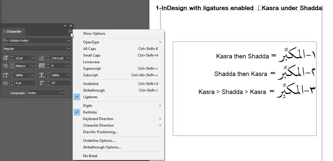
However, recent versions strictly enforce Unicode mark-to-mark positioning, causing the Kasra to always appear under the Shadda regardless of input order, which negatively impacts classical Arabic typography.
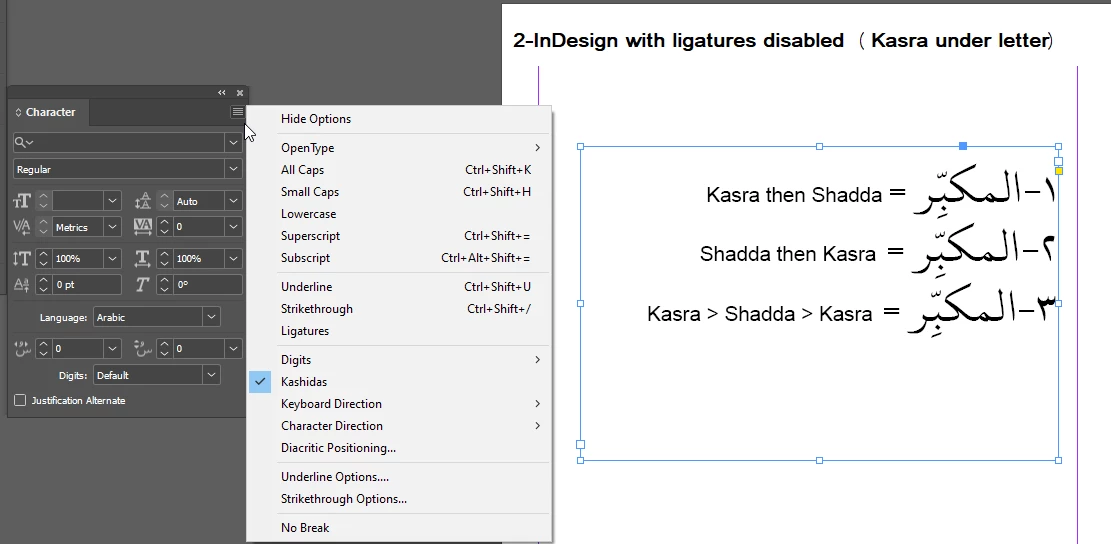
Moreover, I have found that disabling ligatures restores the correct placement of the Kasra under the letter, but turning off ligatures for an entire large project (like an 800-page book) is impractical and disrupts the overall text appearance and quality.
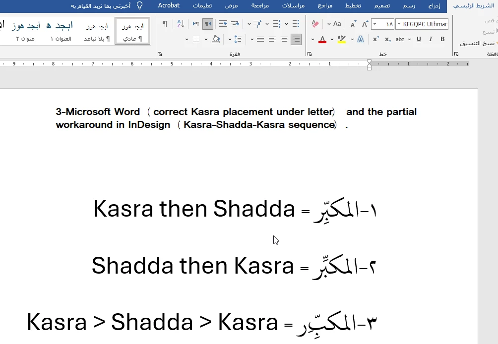
Importantly, this issue is not caused by the font itself. The font used, KFGQPC Uthman Taha Naskh, behaves correctly in Microsoft Word, respecting the input order of diacritics and displaying the Kasra under the letter as expected. This clearly indicates that the problem lies within InDesign’s text shaping engine rather than the font.
Additionally, I discovered by chance that if I input Kasra then Shadda then another Kasra in InDesign, the Kasra appears under the letter (although duplicated), which means the feature works partially, as shown in the attached image number 1-3.
I also tried using the Diacritic Positioning panel in InDesign, but unfortunately, it does not solve the problem, and the Kasra still attaches under the Shadda rather than under the letter.
Please find attached images demonstrating the issue:
1-InDesign with ligatures enabled (Kasra under Shadda)
2-InDesign with ligatures disabled (Kasra under letter)
3-Microsoft Word (correct Kasra placement under letter) and the partial workaround in InDesign (Kasra-Shadda-Kasra sequence).
Please consider adding an option to:
Restore manual diacritic ordering to allow flexibility in Kasra and Shadda placement.
Provide finer control over ligatures specifically related to diacritic positioning in Arabic texts.
This feature is essential for professional Arabic typography and will greatly improve productivity and output quality for Arabic users worldwide.
Thank you very much for your attention and support.
Best regards,