Bad resolution text
I am doing this nice thing with rays behind a text. I am happy with the rays, I can improve this with curves and collor correction etc. But the letters are not so "defined" and high-rsolution. Its a 4K resolution composition. Can I correct this somehow? As far as I can see everything else is high-res. I have some bevel-alpha and I am not sure if this is the way to go. I would like 3D-letters but I must use classis3D because the text need to be in blending mode Screen. I know that you can make letters 3D by copying them multiple times and move them in Z but its some work. I have posted similar question before, I need som more suggestions how to improve the text and make it more readable and better resolution. It does not help much changing the color.
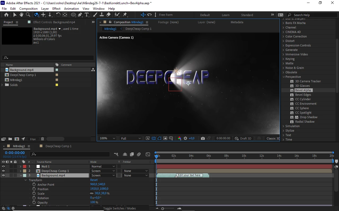
I include a printscreen.