Copy link to clipboard
Copied
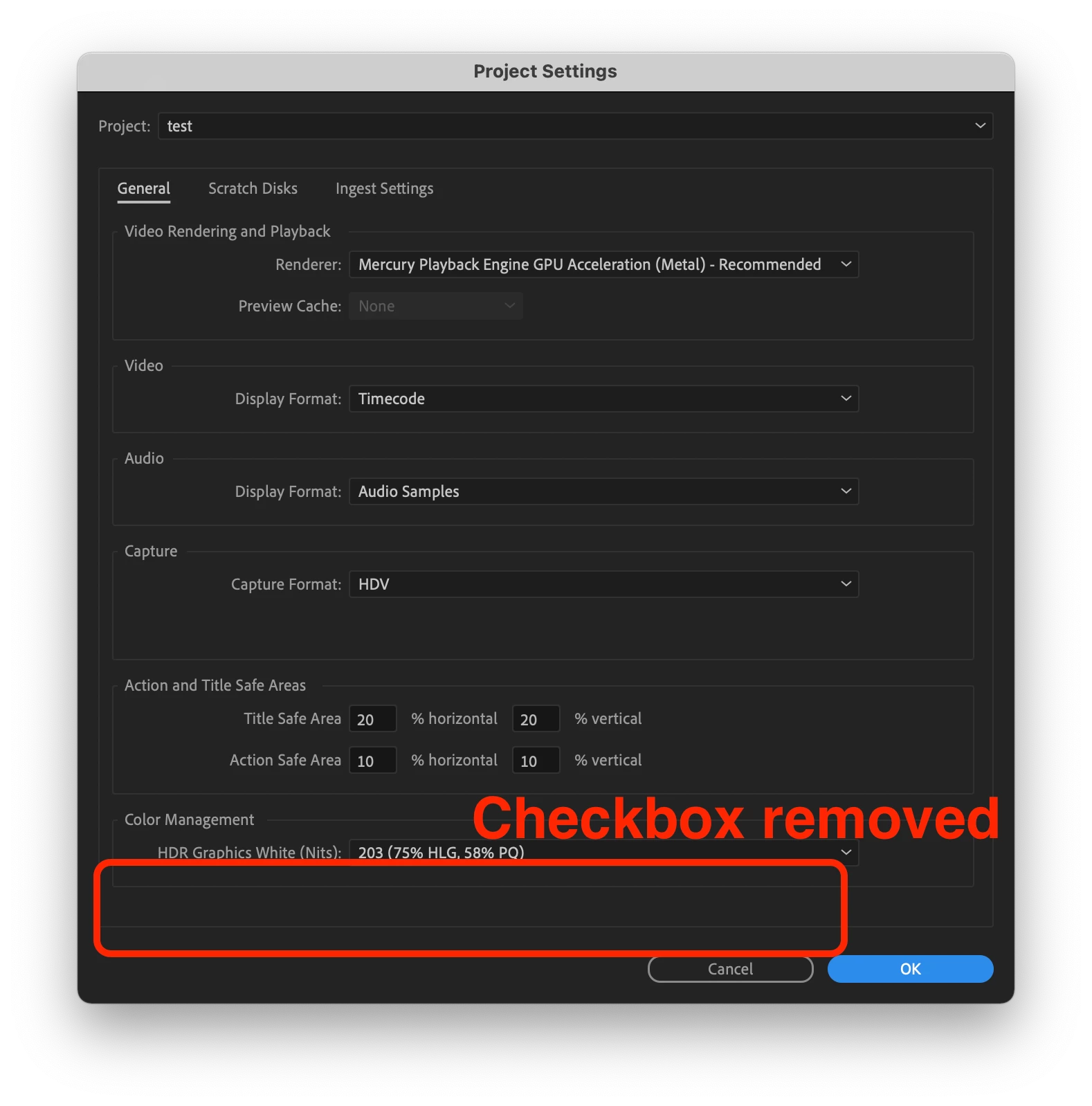
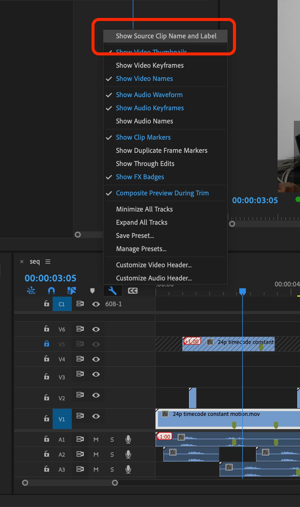
New in Premiere Pro Beta 15.2 (Build 9) is a refined workflow for controlling how label colors and clip names are displayed in the timeline. Previously you could use a checkbox in the Project settings called “Display the project item name and label color for all instances” to control if your timeline clips used their own independent name and label color or matched the source clip in the Project panel. Now, this option has been removed from the Project Settings and can be found as a view option in the wrench menu in the Timeline panel called “Show Source Clip Name and Label”.
This change means you can easily toggle this view setting via a keyboard shortcut. Additionally, if you are working in a Production you now have a way to control this setting and decide if you want your clip name and label colors to be unique to the timeline, or reflect the source clips.
Let us know how this feature is working for you!
Copy link to clipboard
Copied
Tell the team "thanks!" Matt. Been wanting something like this before Productions came in. Gonna be very useful especially with productions and all the collaboration on projects that is the modern "thing".
Neil
Copy link to clipboard
Copied
Hi Matt,
While this is an improvement, it's only a half-hearted one at best and is therefore DISAPPOINTING!
The Pr team had an opportunity here to truly fix this feature once and for all by SEPARATING the settings for label color and for clip name, so that they can be turned on/off INDEPENDENTLY one from the other (I pointed this out weeks ago in your FB post). Why can users only turn both settings on or off? This all or nothing approach is of ZERO help to users that want to synchronize clip names but not label colors, since they manually color code certain clips in their Timeline for reference. The issue with the current approach should be more than obvious. Why is the Pr team failing to see it?
I posted a FR about this problem months ago: https://adobe-video.uservoice.com/forums/911233-premiere-pro/suggestions/42136510-give-us-unified-fi...
PLEASE fix this so that it finally makes sense, with an individual on/off setting for synchronizing clip names, and a separate on/off setting for synchronizing labels!
As always, thank you for listening!
Copy link to clipboard
Copied
Hopefully this illustration from my old FR helps explain the persisting issue with grouping 2 unrelated things into the same on/off option:
Moving the option to the Timeline's wrench menu might be helpful to some, but not nearly as helpful as it would be had the underlying problem been fixed. It's like upgrading a car's tires while ingnoring the fact its engine is on fire. 😉 Hopefully this can be sorted out before the official release!
Copy link to clipboard
Copied
@Pierre Louis B. It's totally valid to want clip name and label color to be separated. Believe me, we debated and considered it. But for any change to an application as complex as Premiere Pro you have to weigh every bit of complexity added against its usefulness and need. The reality is that the overwhelming majority of users and use cases prefer clip name and label color to be linked. You claim they are unrelated, but that's not really true. Every time you look at a clip you see its label color and its name. Allowing for a scenario where the name could be referring to the clip in the bin, but the label color would not match adds complexity and possibility of confusion.
That's not to say if your workflow would benefit from them being unlinked you are wrong! But we made the decision in this case to go with the simpler route that also aligns with how Premiere Pro has worked up until this point. As always, thanks for the input.
Copy link to clipboard
Copied
Hi Matt,
The current approach is similar to forcing clips in Pr to be resized both Horizontally and Vertically, but NEVER just horizontally or vertically.
Do most users want to resize clips H+V at the same time? Yes.
Would only allowing simultaneous H+V resizing be 'simpler' to code. Yes.
Does this mean Pr should only ever allow users to resize H+V (never just H or V)? NO!
To solve this, Pr, Photoshop and most other programs allow the H and V values to be locked or unlocked from each other. If it's so important that users be able to turn both clip name and label color sync on/off at the same time, couldn't a simple lock checkbox achieve this?
I find it hard to believe that saving users the extra half second it would take them to check/uncheck 2 side-by-side options takes precedence over the very real need some users have to sync just one of the two settings rather than both, which no amount of time spent in Pr (half second or half century) can currently solve. If saving users that half second is so important, then by all means add a lock checkbox to optionally lock both settings to each other. This would be a logical approach that respects the needs of all users, rather than disregarding the needs of some in order to provide a benefit to others that's negligible at best.
The main reason I need to label individual clip segments in my Timeline rather than having all instance of the clip colored in unison is to visually mark Warp Stabilized clips so that I can easily refer back to them later once they finish analysing. Here's how I go about doing that with a single shortcut:
For this reason I always kept the sync checkbox off, but lost the benefit of syncronized clip names in the process.
Hopefully this helps illustrate the benefit of seperate sync options.
As for the argument that the decision was also made to "aligns with how Premiere Pro has worked up until this point", if that's the case, then why even make the change from Premiere to Premiere Pro back in 2003? 😉 When something is fundamentally broken, the solution IMO is to fix it rather than perpetuating the problem just for the sake of alignment with past 'brokeness'.
If anything isn't clear, please let me know! 🙂
Copy link to clipboard
Copied
I like that this has been removed from the Project settings, but I do understand why some want Label Colors and Source Clip Name to be separated.
Copy link to clipboard
Copied
I think this illustration pretty much sums it up.
The only thing it leaves out are the pros and cons from the Pr team's perspective:
Separate Settings
Pro: would provide flexible options that respect the needs of all users
Con: takes more work to code in needed flexibility
Unified Settings
Pro: less work to code plus keeps new inflexible design 'consistent' with inflexibility of previous design*
Con: it remains an inflexible design
*To be fair, the argument of consistency (i.e. as Matt wrote: "aligns with how Premiere Pro has worked up until this point".) turns from a Pro into a Con when it is used to perpetuate an inflexible design.
Question: Does anyone need to change this setting on such a regular basic that the extra half second it would take them to turn 2 settings on/off vs 1 would actually outweigh the benefits of flexibility to all other users?
I'd love to hear other people's thoughts regarding this. Thanks!
Copy link to clipboard
Copied
"This change means you can easily toggle this view setting via a keyboard shortcut."
I just realized that there's a simple solution that would make it possible for users to toggle both separate settings I suggest on/off at the same time, thus providing both convenience and flexibility at the same time: Give users the option of assigning a keyboard shortcut to each of the two individual syncing options I'm proposing, and allow the same shortcut to be assigned to both, thus effectively linking both options together so users can easily turn both on/off in a single step!
This would effectively remove the only true Con for Seperate settings and the only Pro worth mentioning for the current unified setting. Here's an updated illustration to show the changes:
Note: If a user has one sync option on and the other off, and they use an identical keyboard shortcut that turns both settings on/off, then in this rare situation the toggle could simply default to turning the off option to on, before toggling both options off when the shortcut is pressed again.
What do you think?
Copy link to clipboard
Copied
I'm in favor of Pierre's suggestion but totally understand if it means a programmer spends time doing this vs. fixing problematic bugs or improving the software stability, I'll take that instead. While I wouldn't personally benefit from separating these values (especially if it's now keyboard mapable to on/off this checkbox), I can absolutely see how you would especially as an editor who does a TON of turnover work and VFX editing.
Copy link to clipboard
Copied
I agree with you Brian, but would add that since the programming team has decided to spend time improving this feature, they
might as well take the extra time needed to make it work intelligently so that it serves the needs of everyone. Breaking 1 checkbox/keyboard shortcut into 2 can't be all that much work since all of the fundamental code is already there. To be fair, this should have been designed to be flexible to begin with, years ago. Fixing it is long overdue and it would truly be a shame for the poor design to be perpetuated even now during a refresh of the feature!
Copy link to clipboard
Copied
Couldn't agree more, but I'm taking a more cautious "beggars can't be choosers" approach because this change as it stands is 1000x an improvement over what we had before and will totally be a game changer for me when I'm doing my next turnover to VFX in Premiere (sadly I'm in Resolve on my current project so I'll have to wait for the next movie before I can hop back into Premiere). I have a sneaking suspicion that those of us with this much investment in this silly checkbox are the minority and that the vast wealth of Premiere users are probably happily in bliss with the way things were, so I'm assuming that the folks at Adobe do have to weigh the time spent on one thing vs. the time they'll need to spend on other things that a majority of editors are asking for through user research.
Copy link to clipboard
Copied
The checkbox used to be so hidden that I imagine most users didn't even know about it, let alone asking for it to be fixed. The new location is an improvement for sure!
In a situation like this it's hard to gauge what users want since most people don't even know what they're missing until they finally have it. Given the choice to sync clip names + the freedom to color code individual clip segments, many editors would surely take that option, which sadly the current workflow doesn't allow. People generaly don't miss options they never imagined having but that doesn't mean they shouldn't be given the best options possible.
With the current workflow I can never benefit from syched clip names because I'm forced to turn off the sync checkbox to be able to label individual clip segments in my sequences. It was an ill-conceived design to begin with and I find it disappointing the Pr team is choosing to perpetuate the inflexible design rather then fully fixing it.
Are there other bugs and fixes I care to see more than this? Yes! BUT, since this specific feature is currently being worked on, there's probably no better time than now to fully fix this issue once and for all.
Copy link to clipboard
Copied
When we talk about complexity and wanting to keep things simple where we can, the ammount of time or difficulty it would be to have a programmer implement it is only one (usually lesser) concern. The real concern with complexity is increasing the states the application can be in.
With name and label linked, the application has two states. This was the case when it was a project setting checkbox and is still the case after this change moving it to the wrench menu. This is what I meant by saying that this change is choosing the simpler option – it's the same amount of complexity that already existed.
Splitting the options out means the application can now be in four states (both off, name on, label on, both on). That is the additional complexity we are trying to avoid, if most users don't need or care for this option. Adding that complexity is a one time cost in terms of development time, but an ongoing cost in terms of testing internally as well as externally for users and our support. Now if you are seeing something strange in your clip's name or label, there would be four states to consider rather than two.
You may think in this case it's worth the complexity and that's valid. But based on our total gathered feedback and internal discussions on it, we've decided to keep name and label color linked for now.
Copy link to clipboard
Copied
Thank you for providing some additional insight Matt.
I agree 100% that whenever it's beneficial, it's worth reducing complexity as much as possible. I just don't think that's the case here. There's a very real reason to want to sync names but not labels. The amount of complexity this would add would probably be negligible at best, if not wholly non-existent for most users. After all, how simple-minded are we presuming Pr editors to be if we imagine they can handle a "Show Source Clip and Label" option but not "Show Source Clip" + "Show Source Label" despite the benefits? If anything, 2 separate, side-by-side options might be ever easier to understand, since turning one option on/off would only affect one thing at a time.
Perhaps a good question to poll users on would be:
The new "Show Source Clip and Label" setting is something:
A) I see myself needing to turn on/off on a regular basis
B) It's a "set it and leave it" kind of think I'll set once and forget about
Or better yet:
When synchronizing clip names and labels:
A) I only ever want to have both turned on/off at the same time
B) I would like the flexibility to turn them on/off individually so that... (real world benefits explained here)
I'm willing to bet the majority of users would answer B) in both cases.
"Now if you are seeing something strange in your clip's name or label, there would be four states to consider rather than two." The only strange thing I'm seeing is an option that doesn't provide me and other editors with the flexibility we need, when it so easily could. This strangeness would disappear with 4 vs 2 states, rather than increase. I can't imagine 4 states introducing any more strangeness than 2 states ever did.
I would truly appreciate it if you'd consider running one or both polls above in the Pr Editing FB group. After all, the way feedback is gathered can greatly influence the results, and the poll you ran simply doesn't delve into the matter of providing flexible vs linked sync options. There's a reason more people aren't asking for flexible syncing options: they've never had them to begin with and therefore probably never imagined the benefits it would bring. BUT if they actually understood the benefits, I imagine most would opt for flexibility (barring users who dismiss any ideas that aren't their own pet peeves, no matter the benefit to others, because they'd rather see the Pr team working on their issues first. Unless this is taken into account when gathering feedback, it can easily skew results.)
The only fair way to gauge "if most users don't need or care for this option" is to ask the right question(s), providing poll participants with the pros/cons of each approach rather than relying on them to imagine the benefits of the proposed alternative.
As always, thank you for listening!
Copy link to clipboard
Copied
I agree with Pierre's latest post. Especially about the "4 states being easier for the user than 2 states".
As though the recent change is better than the old, being able to choose would be an even better upgrade to functionality.
There are many times when I want to change the name or label state of only one 'half' of the states stated. By state, of course.
Neil
Copy link to clipboard
Copied
PROBLEM:
In Pr 15.1 & 15.3 beta, turning on the item name synching results in all duplicated instances of a particular .mogrt renaming to the same name. This makes absolutely ZERO sense from a user's perspective. If I duplicate a .mogrt title dozens of times in my Timeline for easy reuse and I want to individually rename some or all of them to know which title is which, I should be able to do so while also synchronizing item names between the Project window and Timeline! A workaround is to drag a new copy of the .mogrt from the EG panel each time rather than duplicating an existing one, in which case each instance can have its own name, but that's an unreasonable amount of extra work for users, especially if they've modified a .mogrt's properties and want to duplicate it to create a new title that starts off with those same modified properties.
PLEASE fix this so that it works logically.
Thank you!
Copy link to clipboard
Copied
I agree that his makes using MOGRTs a lot harder than it needs to be. It's not really new in this beta, but it's still annoying.
Copy link to clipboard
Copied
Pierre's spot on.
Big PITA!
Copy link to clipboard
Copied
I'd like to make sure I understand the issue here. Given this scenario:
Is this not what you would expect? That seems logical to me and consistent in behavior. If you don't want to see the source name, don't turn on the setting. If you often need to work with the setting on, but occasionally want to flip it off to the check the titles, you could map it to a keyboard shortcut now because of this new change to take it out of Project Settings, and easily toggle it as you need to.
Do I have the above correct? If I do, great now we're on the same page and I'd love to hear suggestions on a better solution. And if I have it incorrect please correct me so we can be talking about the same thing.
Thank you!
Copy link to clipboard
Copied
Hi Matt,
What you say may be correct from a "consistent in behavior" viewpoint, but what's the point of consistency if it goes against what users want?
If a user creates a new .mogrt and then duplicates it in their Timeline:
Parent .mogrt: Title 1
Child 1: Title 1 > Renamed to "Relevant Title 1"
Child 2: Title 1 > Renamed to "Relevant Title 2"
Child 3: Title 1 > Renamed to "Relevant Title 3"
What could possibly be the benefit to users of having all of their manually renamed titles automatically revert back to the parent .mogrt's name ("Title 1") whenever they turn on file name synching?
In the case of .mogrts, manually renamed instances should keep their manual renames whether file name sync is turned on or off. Renaming a .mogrt while file name sync is on should only rename that specific instance and NOT all other instances.
I thought the reasons for this are self evident. If not, I can try explaining it another way.
Overall, consistency is extremely important, but only when keeping something consistent is actually to the benefit of users. In this case, it isn't to anyone's benefit, consistent or not.
Copy link to clipboard
Copied
I'm with Pierre and Neil.
I understand that this is "consisten behavior" - but clearly, in this case the behavior works AGAINST the editor.
MOGRTs are not like other clips. Most MOGRTs are very individual copies of a parent template - totally unlike a video clip, an audio clip or any other type of clip.
We do NOT want MOGRTs to work like other clips because they're used in a completely different way.
Copy link to clipboard
Copied
And ... @mattchristensen ... remember that Jarle was one of the original inspirations for the creation of mogrts ... and um gee, he wrote The Book ...which Adobe still provides as The Right Way To Work Mogrts ... right?
😉
Neil
Jarle Leirpoll ebook hosted by Adobe: Making Mogrts
Copy link to clipboard
Copied
>...remember that Jarle...
Yes, we work with Jarle regularly, and have for many years.
Thanks to all, for the thoughtful, detailed feedback.
We believe the feature is useful and valuable, as currently implemented.
We also understand why users might not want to apply this behavior to .mogrts, and have written up "Exempt .mogrts from this new behavior" as a feature request (DVAGE-5893) for the Graphics Engine team to consider.
Pierre asked: "What could possibly be the benefit to users of having all of their manually renamed titles automatically revert back to the parent .mogrt's name ("Title 1") whenever they turn on file name synching?"
Agreed, that would not be beneficial. Users who do not want sync'd .mogrt names, should not enable syncing.
Copy link to clipboard
Copied
Hi Bruce,
Pierre asked: "What could possibly be the benefit to users of having all of their manually renamed titles automatically revert back to the parent .mogrt's name ("Title 1") whenever they turn on file name synching?"
Agreed, that would not be beneficial. Users who do not want sync'd .mogrt names, should not enable syncing.
The point is that users shouldn't have to choose between
1. unsynced clip names + properly named .mogrts, or
2. synced clip names + messed up .mogrt names
We should be able to benefit from having both synced clip names + properly named .mogrts at the same time! (This goes without even mentioning users that want to sync clip labels... since both clip name and label syncing have been crammed into a single all-or-nothing checkbox, users who need to sync labels cannot benefit from individually named .mogrts in their Timeline! They have to choose one or the other, but can never benefit from both at the same time)
To fix the problem with .mogrt names, please consider the solution I suggested in my previous post of combining both source name and renames:
Parent .mogrt: Title 1
Child 1: "Title 1" renamed to "Relevant Title 1"
Show Source Clip Name and Label turned ON
Child 1: name appears in Timeline as "Title 1 > Relevant Title 1" (or some variation thereof)
Show Source Clip Name and Label turned OFF
Child 1: name once again appears in Timeline as just "Relevant Title 1"
Thank you!