
解決済み
I got a "no, thanks", too "much artifacts". What is wrong?? Thanks for your advice.

Ignore Jason's comment. He doesn't know what he's talking about.
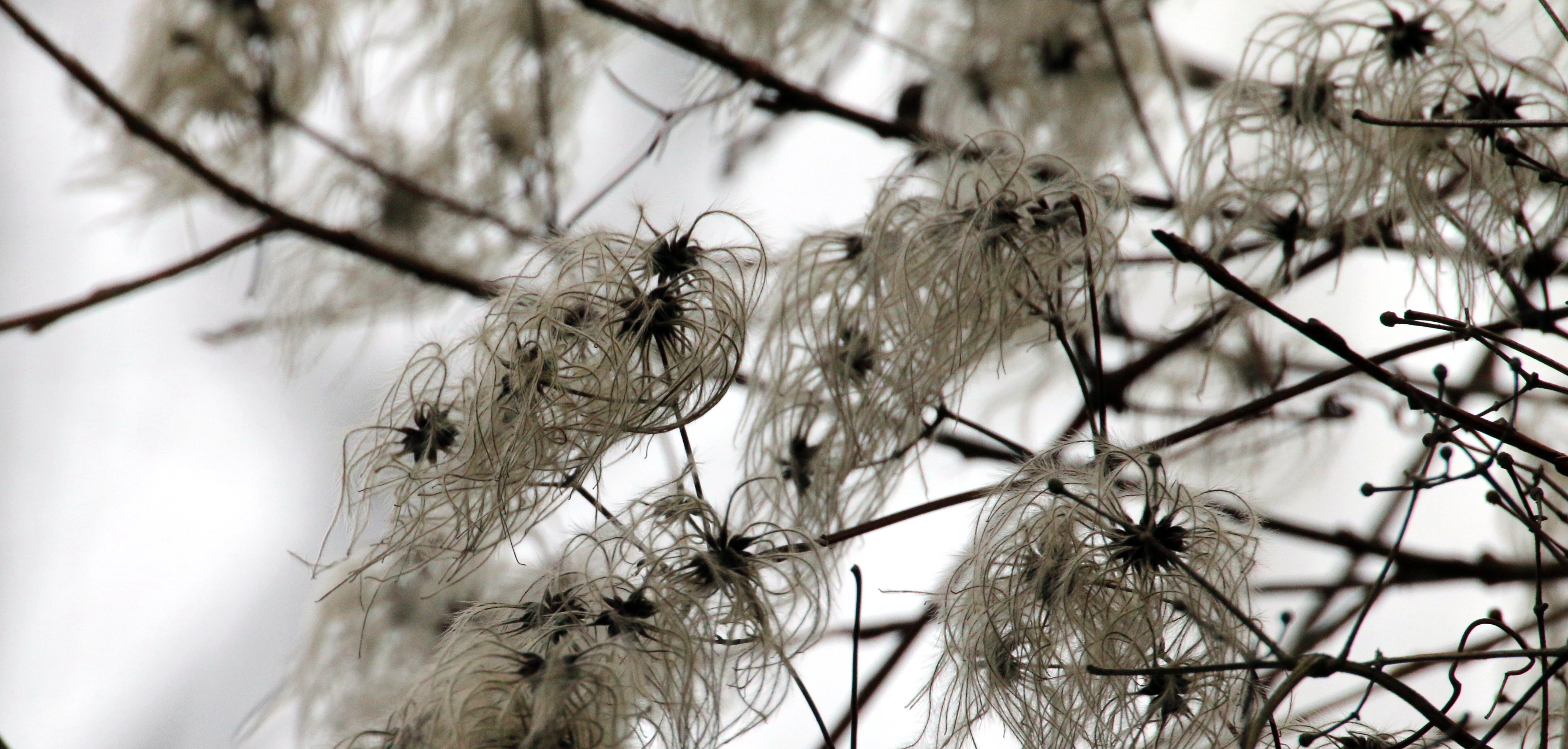
Here's what the last two posters are referring to
See the red and green? That's chromatic aberration. Get rid of it with a click in Lightroom.
Jo has a point that the commercial value of this image isn't that great. And the lighting is bad because your camera exposed for the overcast sky and not for the flowers (?) themselves. Get off auto mode and start using manual to learn about controlling metering. This could probably have used a flash to get it right.
Personally, I would forget this image and use the rejection as a learning experience.
Enter your E-mail address. We'll send you an e-mail with instructions to reset your password.