TOC in RH2022 defaults to a "drill down" display; would like it to display as it did in Classic RH
Hi,
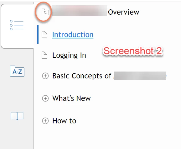
We are using RH2022, converting up from RH2015. We have approx 33 merged projects, and we have followed the parent-child merged project set-up as outlined by Peter Grainge very carefully. So far, so good. However, when we generate the help using azure blue and responsive HTML, our TOC appears as in Screenshot 2 below. It is what I think is the "drill down" TOC. The folder at the top in the orange circle must be clicked on in order to see the other merged projects. When another merged project is clicked on, the user again will only see the topics for that project.
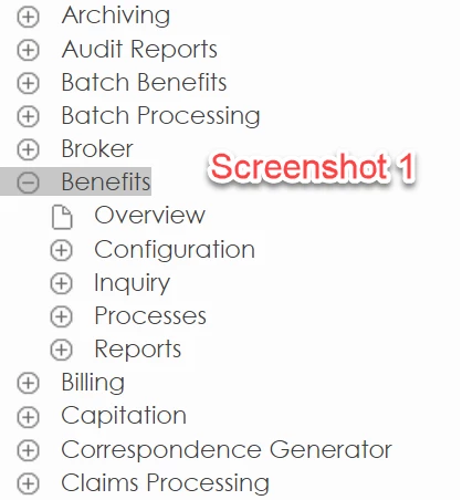
Screenshot 1 is the generated TOC from RH2015. Each project--Archiving, Audit Reports, Batch Benefits, etc., is a merged project. When you click on one of these merged projects, as I have done with "Benefits," you see the topics associated with Benefits, but you also continue to see all the other available merged projects.
Screenshot 1 is what we want for our help in RH2022 using azure blue and responsive HTML. Based on comment to another user with TOC questions, is the best way to achieve this to do the following in usersettings.js?
model.publish(rh.consts("KEY_MOBILE_TOC_DRILL_DOWN"), true);Change 'true' to 'false'.
Or am I missing a setting in RH2022?
Thanks for your help.


