- Home
- After Effects
- Discussions
- Re: Black bars on side of composition
- Re: Black bars on side of composition
Copy link to clipboard
Copied
Hello!
I've been pulling my hair out trying to figure out why I'm getting black bars on my project. Here are some screenshots and details of my problem:
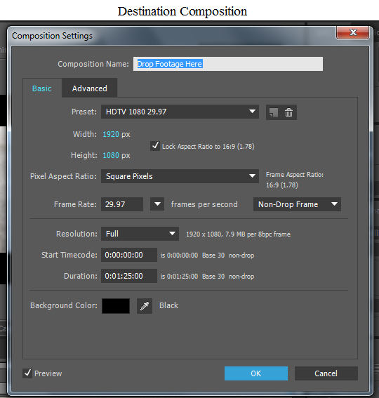
I'm pulling a composition into another composition. Both compositions have the same settings (except duration):

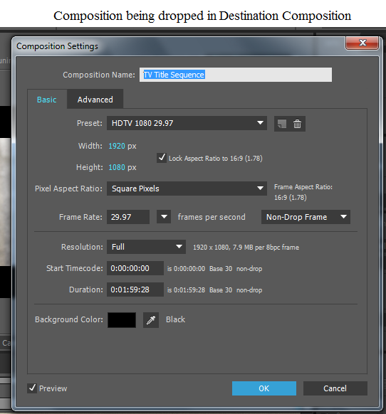
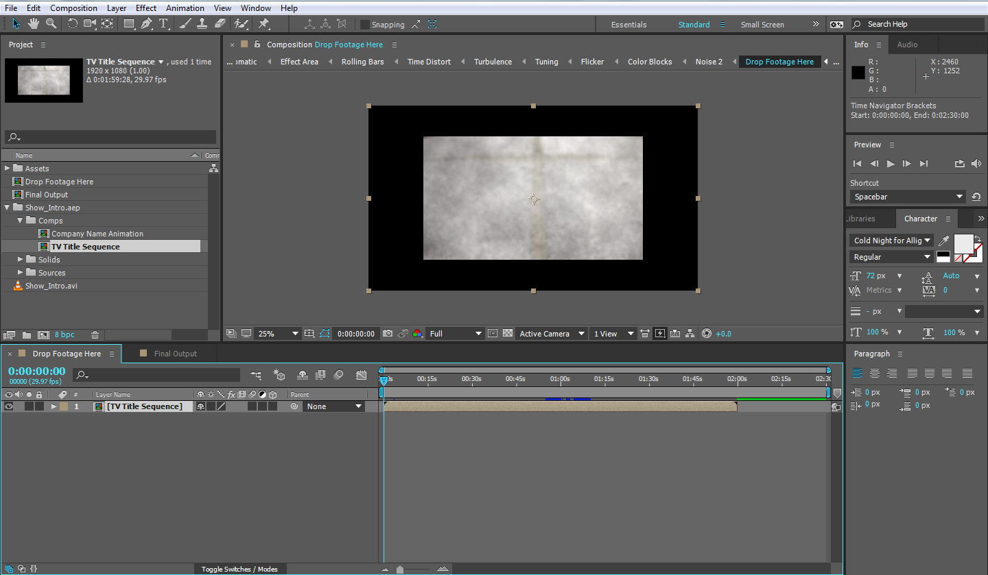
When I drag the TV Title Sequence comp into the destination composition--Drop Footage Here, however, I get this in the Composition panel:
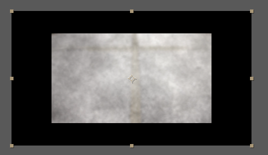
I can resize the TV Title Sequence comp to fit the black window (I'm assuming this is the Drop Footage Here composition), but that doesn't seem to be a best practice. I've searched high and low for an answer to this but can't find one. They're the same dimensions so I don't think it's a problem with dropping something too small into something too big.
What do you think? Any help would be great appreciated!
 1 Correct answer
I'm sorry, but I don't understand. How would adding a solid fix this problem?
it won't. this is only to demonstrate that you have HD720 asset or assets (or scaled to about that size) in an HD1080 Composition. you are using a big box for an element or elements that don't fit the box. you can either make your box smaller or make your element or elements bigger. I assume you want your element or elements to be bigger.
The only question is - is this just that one asset that Szalam mentioned? or is the
...Copy link to clipboard
Copied
Go into your child composition and change the zoom information on the composition panel to "Fit".
Copy link to clipboard
Copied
Hello, Szalam!
Thanks for taking the time to respond and help. Do you mean the Magnification Ratio popup in the Composition panel? I changed it to Fit and got the same problem. Nothing is nested, so I don't have any parent-child relationships.

Copy link to clipboard
Copied
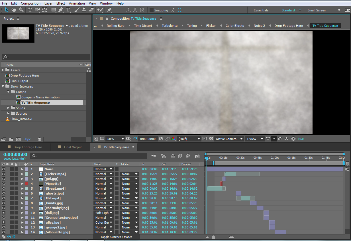
Open your TV Title Sequence comp and show us that screenshot.
Copy link to clipboard
Copied
You guys are so great. Thanks again! Here's my TV Title Sequence comp. Is this what you mean? The Comp settings are also pictured.

Copy link to clipboard
Copied
There it is! In your TV Title Sequence comp. It's not filling the screen there. Looks like "Street.MP4" isn't filling your screen. I'll bet if you make a solid (colored, say, red) over top of that whole comp, the solid will fill your main comp just fine. So the issue is there in the precomp.
Copy link to clipboard
Copied
I'm sorry, but I don't understand. How would adding a solid fix this problem?
Also, to further complicate things, I'm an Instructional Designer. I'm writing a class on After Effects; the answer I provide to students (Because I know one of them will ask, "What about the black bars on the side?") should be best practices. I guess I don't get how adding a solid would fix what seems to be a size issue.
Copy link to clipboard
Copied
To further demonstrate, set the zoom level for the TV Title Sequence comp to be fit. ![]()
Copy link to clipboard
Copied
And when I pull up the TV Title Sequence comp in the Composition panel and choose Fit, I still get 33.3% and the black bars.
Copy link to clipboard
Copied
I'm sorry, but I don't understand. How would adding a solid fix this problem?
it won't. this is only to demonstrate that you have HD720 asset or assets (or scaled to about that size) in an HD1080 Composition. you are using a big box for an element or elements that don't fit the box. you can either make your box smaller or make your element or elements bigger. I assume you want your element or elements to be bigger.
The only question is - is this just that one asset that Szalam mentioned? or is the all of them? if it's just that element, go and do as Dave suggests and fit it to the comp. if not, read on because you need to scale your footage up* and there are a few ways to go about this:
here's one:
1. go to composition settings and change the width to 1280. it will change the height to 720.
2. select that composition in the project panel
3. go to scripts->scale compositions and click it
4. select new comp width and enter 1920 and click scale
DONE!
here's another way:
1. create a Null layer (layer->new->Null)
2. select all the layers Ctrl+Shift+A, deselect the null (Ctrl+click)
3. under the parent column select the null as the parent
4. scale the null to 150%
5. delete the null if you want
here's another for the really lazy ![]()
1. in "drop footage here" comp, scale "tv title sequence" to 150%
2. press the collapse switch. make sure things don't look funky. if they do - uncheck it

* of course scaling pixels to 150% of their true size will soften them. it depends if you have scaled down some footage - say scaled them in Ae to 60% to fit the composition (which upon re-scale will be about 100% scale i.e full quality), or if all your layers are 100% scale in the nested comp. anyways, maybe evening softening the images as a result is good enough for you because the other option is prepare all your assets from the start as HD1080 size and replacing them...
Copy link to clipboard
Copied
You are so fantastic!!! I tried the first way, and it worked beautifully! Now, I assume you guys are pros; is this a best practice or a work-around? Again, I'm an instructional designer who is writing a course for introductory-level After Effects CC users. Is this a best practice or work around? I'm not trying to call out your wonderful responses or help (it's greatly appreciated), but by including this step as a troubleshooting tip, am I leading my students astray? I don't want to do that!
Copy link to clipboard
Copied
The best practice is to work within the dimensions you need from the start. If you need to change it after the fact, you got a few ideas. The null in the project window is related to a null you created at some point in one of your compositions. It is not used for anything so you can delete it. You should run the training material that's available in the adobe website because we are discussing basics here: After Effects tutorials
Copy link to clipboard
Copied
Thanks, Roei! I understand this is pretty basic stuff. I'm writing for Intro. students and am learning myself; it's not ideal, but that's how things go sometimes. Thanks again!
Copy link to clipboard
Copied
Finally, because I'm infinitely curious and want to preempt student questions, what's going on here? I noticed a Null layer was added in the Project panel. What's that about?
Thanks again for all your help. It's been invaluable!!!
Copy link to clipboard
Copied
I'm talking to myself here, but here's a screenshot of the null and its settings.

Copy link to clipboard
Copied
CETC wrote:
I'm sorry, but I don't understand. How would adding a solid fix this problem?
Roei is right. I was just suggesting that as a demonstration that the comp is the right size, but the assets it contains are not.
CETC wrote:
And when I pull up the TV Title Sequence comp in the Composition panel and choose Fit, I still get 33.3% and the black bars.
Right, as you've noticed, that's because what you've put in there is too small. That's what I was trying to show you. Glad we've got the problem sorted out!
Copy link to clipboard
Copied
Ooh, also open the "Drop Footage Here" comp and show us the interface screenshot in there.
Copy link to clipboard
Copied
Drop Footage Here comp and settings
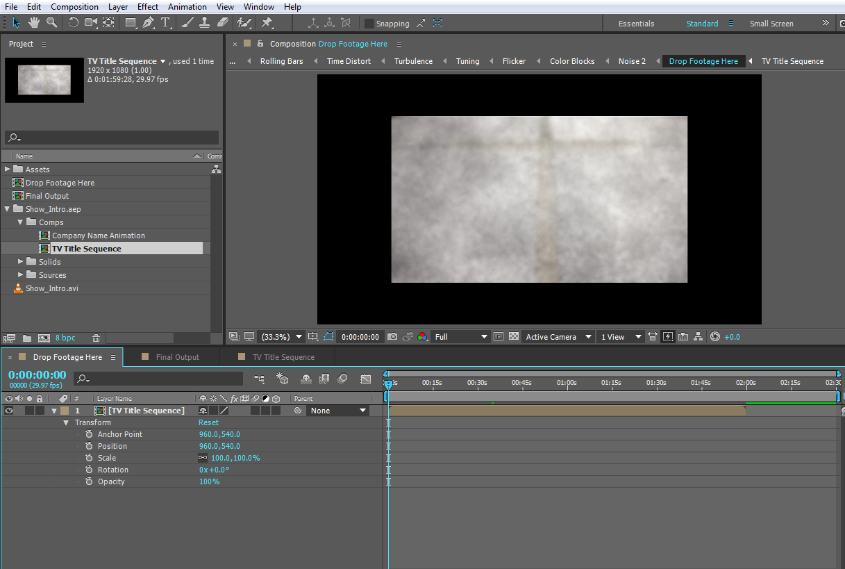
Comp settings
Copy link to clipboard
Copied
When I drag the TV Title Sequence comp into the destination composition--Drop Footage Here, however, I get this in the Composition panel:
it appears you are using an HD720 footage item inside an HD1080 composition. or at least one footage item that is scaled 66.6667% of an HD1080 dimensions (which is HD720). lets us see more screenshots of your full Ae interface. show your footage itemsand how they are placed inside the composition.
Copy link to clipboard
Copied
Hello, Roei!
Thanks for taking the time to help. Here's my interface:
Copy link to clipboard
Copied
Roei,
I think you nailed with the footage items. Jeez. I don't know where I messed up with the dimensions along the way, but do I really need to go in and re-do my project? Is there a way to fit everything to the comp now, several iterations later?
Copy link to clipboard
Copied
Find the comp where you put the 1280x720 footage. Highlight the footage layer in the comp. Now use the "scale the footage to fit the comp" keyboard shortcut -- ctl-alt-f Win, Cmd-Opt-f Mac.
Done.
