New Keyframe "Halo"
Copy link to clipboard
Copied
Why do you guys change things that are not broken and that nobody is asking to be changed?
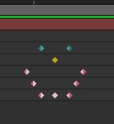
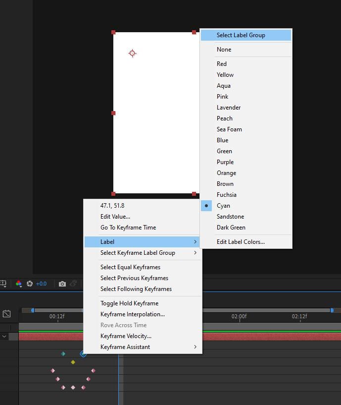
The new keyframe "halo" obscures adjacent keyframes when they are close or the timeline is pulled out.
I really hate banging my head against a wall but you guys have enough things to fix with this software to keep you busy for the next 5 years. Why are you making changes for the sake of making changes? Are you being paid "per change" or something? STOP IT! Who is making these decisions? Who is requesting changing how selected keyframes display? Anybody? Who made this decisions and why? I demand names! 🙂 smiling cause I'm uh-sposed to. 🙂
Copy link to clipboard
Copied
I actually like it. I think it is easier to see what keyframes you have selected and move one to the left or right.
Copy link to clipboard
Copied
That depends on how many frames are between the keys and how far out you are zoomed in the timeline.
One adjustment I have had to make is working zoomed in further and with a shorter work area. Maybe I should have been working this way all along. Nevertheless, I believe the team has better things they could be doing with their time.
Copy link to clipboard
Copied
Colored keyframes have been requested for quite a while, and I believe this new method of demonstrating what's selected was a necessary by-product.
Copy link to clipboard
Copied
Keyframes have been colored for as long as I've used AE. The entire keyframe used to turn blue when selected. Before that they truned yellow. So I honestly don't even undrestand what you're talking about.
Copy link to clipboard
Copied
If your keyframes can now BE yellow, blue, or any other color all the time and by choice, they kind of needed a new strategy for showing selection, right?
Copy link to clipboard
Copied
Doens;t address my point that the halos obscure adjascent keyframes when they are close, which they often are. I could give you 6 or 7 suggestions off the top of my head to answer your question about what do when keyframes can be any color. But I won;t waste our time.
Copy link to clipboard
Copied
Designiate ONE color that indicates and "active/selected" keyframe--like bright yellow, or white. Making all the label colors a little less saturated or bright, rather than doubling the size of a selected keyframe so it obscures adjascent keyframes.
Copy link to clipboard
Copied
For what it's worth, they solicited and got a lot of feedback from the community while they were developing the colored keyframes feature, to make sure it worked well for as many people as possible, and was available in the beta for a fair amount of time before being included in the public release. I remember seeing a lot of talk about this highlighting in particular.
I'm sorry you don't like it!
Copy link to clipboard
Copied
It's not about me not liking it. It's about the fact that it obscures adjascent keyframes.
Maybe Adobe should stop getting their ideas from community forums (including me) and start getting them from time tested production houses who use the product consistently on a professional level.
Or have they all stopped using After Effects?
Copy link to clipboard
Copied
I think the Halo makes the selected keyframe easier to see, especially when they are close together, and the little space to the left makes it easy to click in the hole and grab the previous one. I rarely use the mouse to grab or move a selected keyframe; I jump to them using the J and K keys.
Maybe we have a different way of working. I also like the idea of label groups for keyframes but think they would be more useful if you could select grouped keyframes the same way you can select labeled layers. I use that all the time...
Copy link to clipboard
Copied
Yes it probably comes down to how we all work and the specific work we do.
And I do usually marquee select keys with the mouse so that's a big difference.
I'll just have to make a couple of adjustments to my workflow.
Copy link to clipboard
Copied
Rick - you totally can!
Copy link to clipboard
Copied
But I guess if the selection was not a halo then you wouldn't be able to see what color keyframe you have selected. I see the benefits for those who want to color their keyframes and use groups. I just need to start working in more concentrated workspace so my keyframes are further apart. I guess if I don't actively participate in the development then i have no say.
I get it. Sorry for the rant
Copy link to clipboard
Copied
That's the point I was making re: visibility now that colored keyframes are in the mix - sorry if I was unclear.
You're certainly entitled to be annoyed by something that changes up your workflow, but just stating that the team is making an effort to be transparent and involve the community as much as possible. Not everyone will agree with every decision, of course, but I do think they're doing a good job of listening and incorporating user feedback.

