Unwanted shutter on text
Copy link to clipboard
Copied
I'm stumped and in need of a little help.
I have an animated text layer in 3D space that is showcased by a couple of AE cameras. However, the camera movements result in a "shutter" on the text during said movement. I'm not quite sure what is causing this effect and how to remove it. I have posted a link below of a render of the problem section so that you can see what I am talking about.
https://www.youtube.com/watch?v=VSmBeqPiW-0
I have tried enabling and disabling motion blur. I have played around with the shutter angle and samples per frame. Changing those values does not fix the problem. Do you have any suggestions? I'm not sure if it matters as the text is 2D in a 3D space, but I am just using the Classic 3D renderer. I don't know much about Cinema 4D and am not sure if it would help.
Thanks in advance!!
Ryan
Copy link to clipboard
Copied
The shutter is the result of black background, white font with hard edges and camera movement and speed.
The distance those letters are moving from frame to frame is to high, therefore the illusion of smooth movement fails.
One is confronted with the same issue when it comes to rolling credits and you can see such a shutter in cinemas, too.
Usual adding motion blur is the wrong way, but if you can live with a decreased font-quality, it's an easy fix.
More professional solutions will be:
- adjusting camera movement to decrease travel-distance of letters from frame to frame
- changing font style
- adjusting font color and background color to decrease contrast between them
- increasing fps - but this only works if you keep the higher fps through the whole production line and screening, of course.
*Martin
Copy link to clipboard
Copied
You can try Direction Blur applied at a very low amount to minimize it. However, you'll need to animate the angle fo the Direction Blur as well. It should be parallel to the direction of the position change.
Copy link to clipboard
Copied
Thin fonts and high contrast backgrounds must move a whole number of pixels per frame to avoid judder or stroboscopic effects on the edges. It's a phenomenon that those of us that grew up shooting 35mm film with motion picture cameras are very familiar with. It's called Critical Panning speed. If the speed is wrong, the image will seem to stutter and jerk as it moves on the screen. The combination of retinal retention in the human eye, frame rate, and distance all combine to cause the problem.
This is fairly easy to fix if you have a 2D layer, but when you are moving 3D layers and cameras it gets more difficult. The solution is to make the fonts a little thicker, reduce the contrast and change the motion. This is really hard to preview in After Effects because the footage needs to be played back full size and at full frame rate. The refresh rate of the screen can also cause problems. Footage that has no judder at 24
You can hide the problem if the speed is close by using motion blur. The easiest thing to do is to change the default comp shutter angle from 180 to 360 or more to soften the edges when the type is moving. The other thing you can do is make the project 29.97 or 30 fps instead of 24 or 25. That option depends on your audience. Rendering a 60fps comp will only help give you a wider range of speeds for some of your audience because not everybody's screen or internet connection will reliably playback 60fps footage. The size of the frame also matters. Footage that had judder problems may look fine half screen and terrible full screen.
When you get a little more experience you will be able to judge whether or not your animations will have these problems by just looking at the timing.
Copy link to clipboard
Copied
Nice how all the ACPs are repeating my answer...
Copy link to clipboard
Copied
Thanks for your responses. I'll look into changing the movement and speed of the cameras. There's nothing I can do with the thin font and black background, that's exactly what I was told to use...
I'll also look into raising the FPS. It is currently at 29.97 and I believe that is the max that our "final format" screens are at. But I'll be sure to make sure, and I'll go higher if I can.
I will also play around with the motion blur and a directional blur some more. I'm hoping that a combination of all of these things will solve the issue.
Thank you so much!
Ryan
Copy link to clipboard
Copied
Slowing down the camera movement will have the most impact.
Instead of directional blur - which needs to be animated along the camera movement, give Force Motion Blur a try. It's like the internal AE motion blur but you can easier play around with shutter angle and samples.
One more idea: you can add a mask to every single letter (there was an easy way, but my memory is insufficient - start with duplicating the text and convert the duplicate into masks or shapes) and apply a little feather to the edges. This will soften them and locally decrease contrast which should lead to a bit more smoothing.
Good luck!
*Martin
Copy link to clipboard
Copied
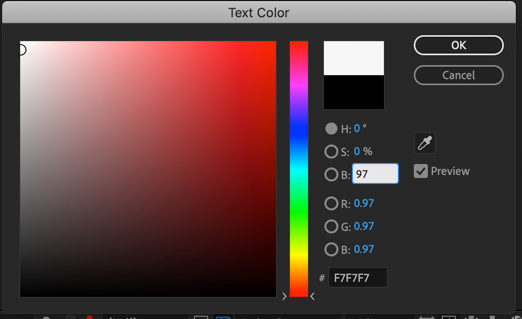
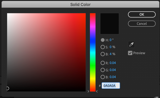
I don't know about converting the text to masks. Easier would be to throw a little blur or use a copy of the text as a track matte with a little blur. I don't think either would do much to hide juddering text. You would be better off just adjusting the color. Set Black to 3 or 4% brightness and white to 97%. This will give the aliasing some color values to work with if you are in an 8-bit comp and it will also improve things in a 16 or 32-bit comp because your deliverable product will be 8 bit anyway if it is any of the standard distribution formats (H.264).
Just increasing the shutter angle in the comp will have a huge effect on motion blur and it will render a lot faster than CC Force Motion Blur. If you want to force motion blur Pixel Motion Blur dies a better job. Either effect will take longer to render than regular motion blur and it's almost impossible to see the difference.
If you push all the way in on the timeline you can see the shutter angle and if Preview is turned on you can watch the change in real time. This is the default setting which will match motion blur on normal video footage shot with the standard shutter speed of about 1/51 of a second at around 24 fps.
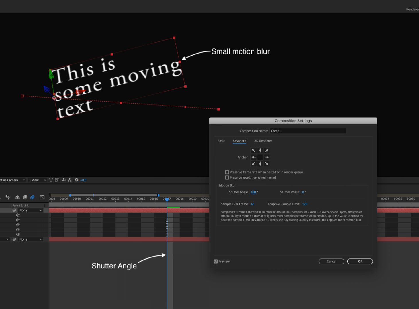
Here's what it looks like with a 360º shutter:

Or you can go completely crazy with 720º
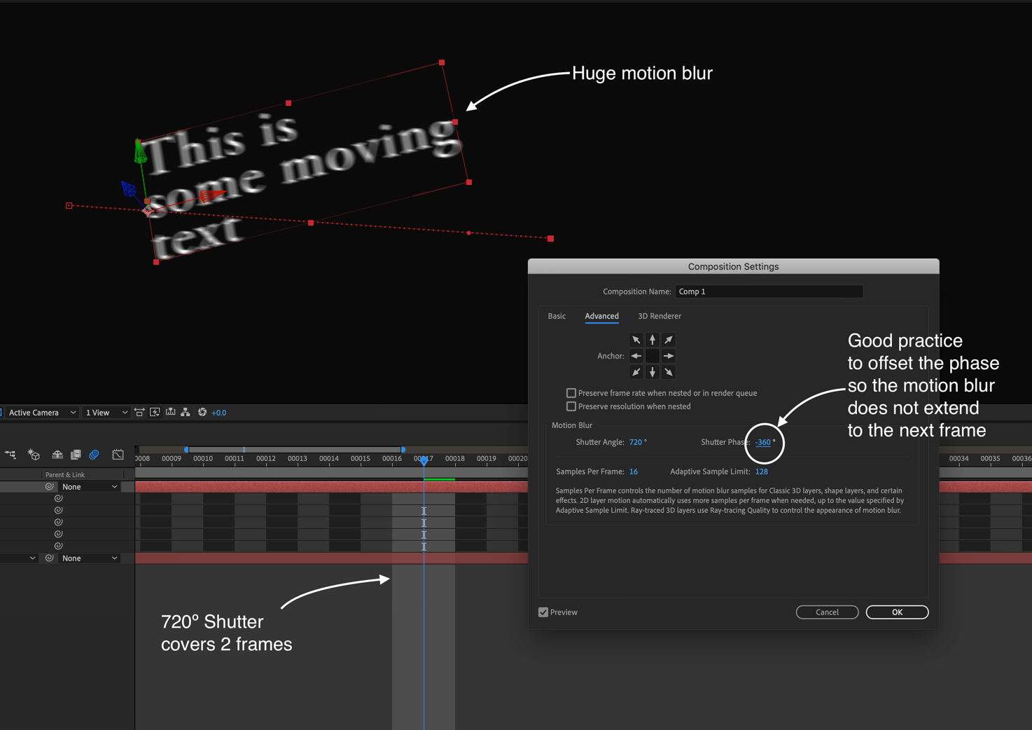
CC Force Motion Blur at 720º or Pixel Motion Blur at 720º look exactly the same:
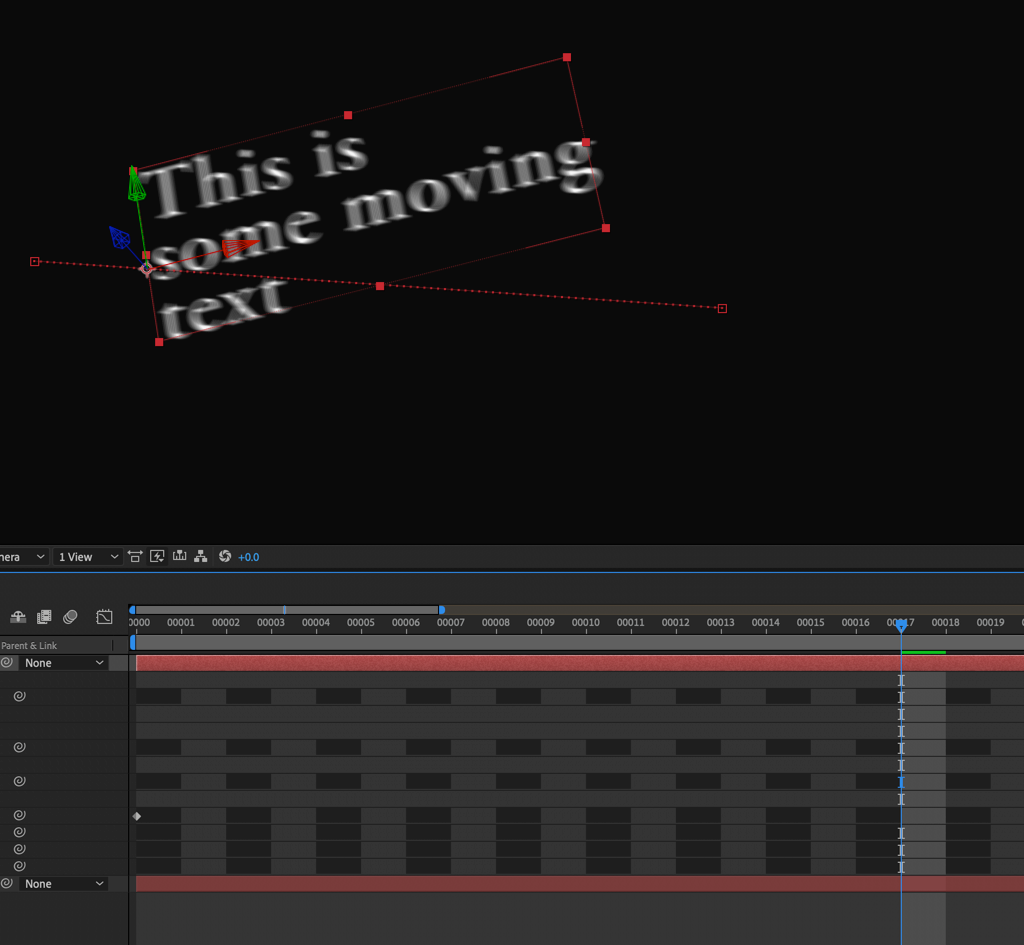
But you are stuck with longer render times.
The first thing I would do with the project is to reset the background and text color and increase the shutter angle to something between 250 and 300º. I would also think seriously about adding a 1-pixel stroke to that font to fatten up the thin lines a little bit.
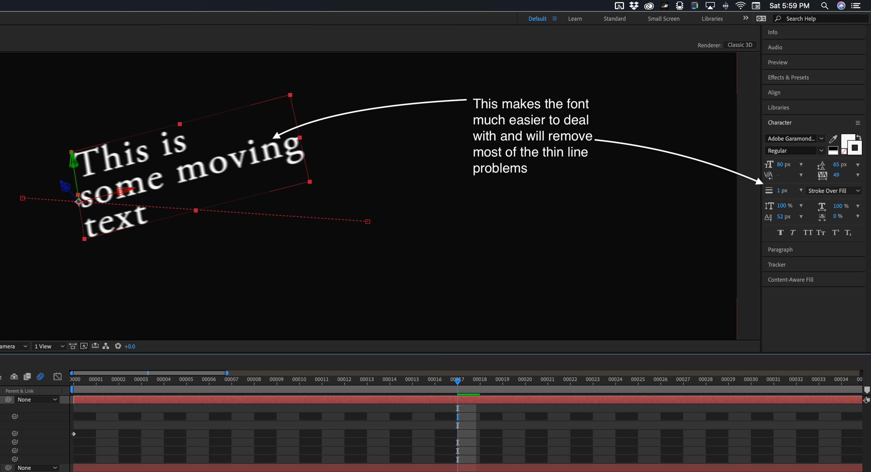
Video is not print and Serif Fonts with very thin parts are not very friendly with motion and position.
Copy link to clipboard
Copied
Rick Gerard sidenote:
I once wanted to imitate old film texts, like the name of a movie on screen, and found a very specific soft edge on the letters due to analog film. I helped myself with feathered masks and the outcome was very close to my references.
The problem with motion blur is, that it made a hard-to-read text (shuttering) even harder to read (blurry). So, you solving one problem by creating a new one. Throwing motion blur on this issue is not the best solution, smoothing high contrast edges might be. Prevent such a situation would be perfect.
Some addition reading: Why are my End Titles Jittering, Juddering, Flickering, Stuttering, Ringing, Pulsing, and Strobing?
*Martin
Copy link to clipboard
Copied
Color helps, but the solution is speed. If you can't get a handle on speed, motion blur or some kind of blur is the best option. Even if you soften the edges of the type, if the speed is wrong the text will judder. There is no overcoming the stroboscopic effects of motion and time when you are dealing with frames. You can get any motion to judder at any frame rate. All you have to do is violate the rules.
By the way, that is not the only article on judder. Here's mine as well as a link to the User Guide from the FAQ section of this forum. FAQ: Why does horizontal motion stutter (judder) in my movies, such as during pans?
You don't have that problem with character generators in broadcast facilities or fancy editing suites because the timing of the movement of the text is locked into only the speeds that work. A ChyronHego or similar $$$ broadcast character generator does not have an infinite choice of scrolling or rolling speeds, you only get to pick a few.
The feathered masks option for all of that type will give you exactly the same result as adding a slight overall blur, or blurring a copy as a track matte, or even, in some cases one of several matte chokers. The OP's video would generate hundreds if not thousands of masks and I would be seriously concerned with the stability of that kind of action. Just for fun I copied your last post and pasted it into a text layer, then created masks from the text. I didn't count the masks but I had to page down 22 times to see all of the masks. I don't know of an easy to set the feather for all of those masks without dragging a selection around all of them. I just don't think a few hundred feathered masks is a good option for a type layer.
Refine Hard Matte works on a text layer, more options than just a feathered mask.
Copy link to clipboard
Copied
Rick Gerard, Thanks for your detailed information. I was able to play with the camera movements a little yesterday. With the time I had, I was able to slow down the speed. It did make a drastic improvement. When I can get back into the project, I'll try to lessen the contrast like you noted and try a stroke on the text.
Video is not print and Serif Fonts with very thin parts are not very friendly with motion and position.
Yes, I know. Thing is, that is the font for the *final* series artwork, and consistency is a key point for our production value. So, there's nothing much I can do about the font; I did not make that decision.
As for the idea with the masks (martinr84659894), that seems a little to complex. And yes, probably a little unstable as Rick mentioned. I have enough issues with stability and Adobe software as it is (ie my Media Encoder has a mind of its own...).
I really appreciate you guy's comments. This sort of workflow if fairly new to me in AE, and I really appreciate the help.
Thanks again!
Ryan
Copy link to clipboard
Copied
I may have found a much easyer solution for this problem
the problem seems to come from vectors or maybe more specifically the collapse transformations switch ( I think the issue has more to do with a glitch than real world physics).
solution:
- if your text is far away swap it out for with a raster image of your text
- when you need to zoom into the text, fade on the vector text and fade off the raster text
This solution fixed my shimmering or strobing vector text, in my case it was a PDF
Get ready! An upgraded Adobe Community experience is coming in January.
Learn more