

Want to get consistent position of graphic "frames" with text in ePub reflowable output from InDesig
My client asked me to create an ePub output of an existing printed book from an InDesign layout they shared. There are three types of callout boxes with "frames" made up of a category name in a box with an angled edge plus a line above, and a line below the information. See the InDesign layout image where I point out one of these.
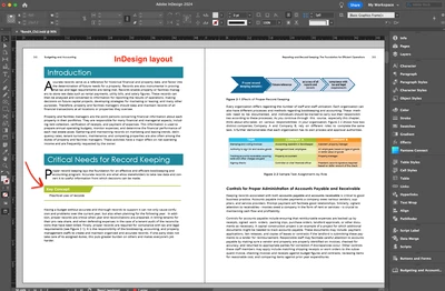
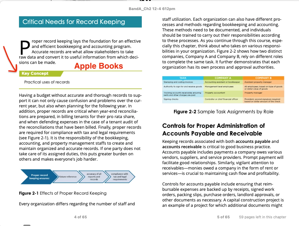
The layout had the line/title graphics grouped as one object and placed over the text, and anchored to it. That wasn't working for ePub. I figured out that I had to ungroup these "frames" and place the upper title/box/line above its content and anchor it above, then anchor the lower line below the content. When you look at the ePub output in the Apple Books image attached, it looks fine. Some of these callouts have three or four lines of text, so by having the title line and the lower line anchored above and below, the text can be the space it needs to be and the lines don't interfere.
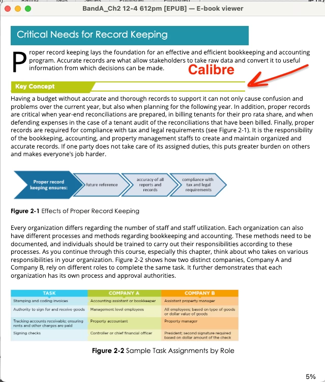
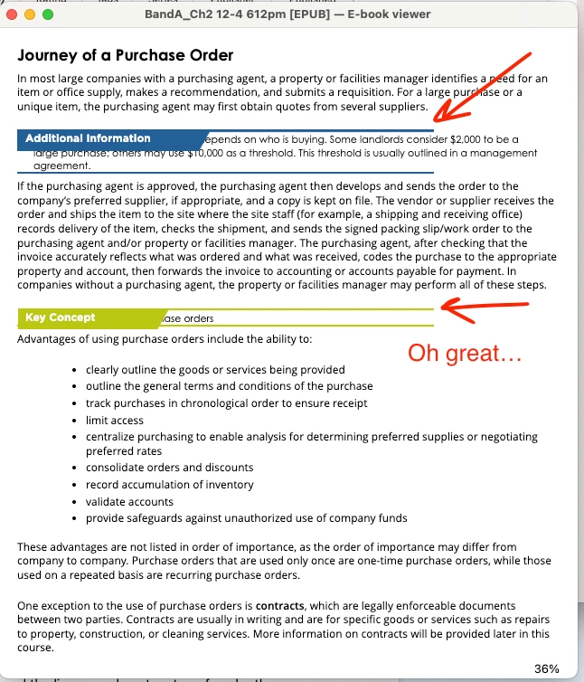
But... the output in Calibre is no good. The content is behind the title items and the lines are almost on top of each other. I'm learning a lot about ePub this year and I'm doing well, but this one has me stumped. I'm do add custom css files to output so I know what I'm doing there.
Is there a better practice for converting the look of these features in a reflow able ePub so that I know they'll be consistently displayed? I thought I had this set when viewing in Apple Books, but Calibre is saying I don't. This "trick" is the final big hurdle to solving their need to have an ePub version of their materials.