• Global community
    • Language:
      • Deutsch
      • English
      • Español
      • Français
      • Português
  • 日本語コミュニティ
    Dedicated community for Japanese speakers
  • 한국 커뮤니티
    Dedicated community for Korean speakers
Exit
1.0K

The new export screen is clumsy, bulky, and requires more clicking. [Export]

Participant ,
Jan 24, 2023 Jan 24, 2023

Copy link to clipboard

Copied

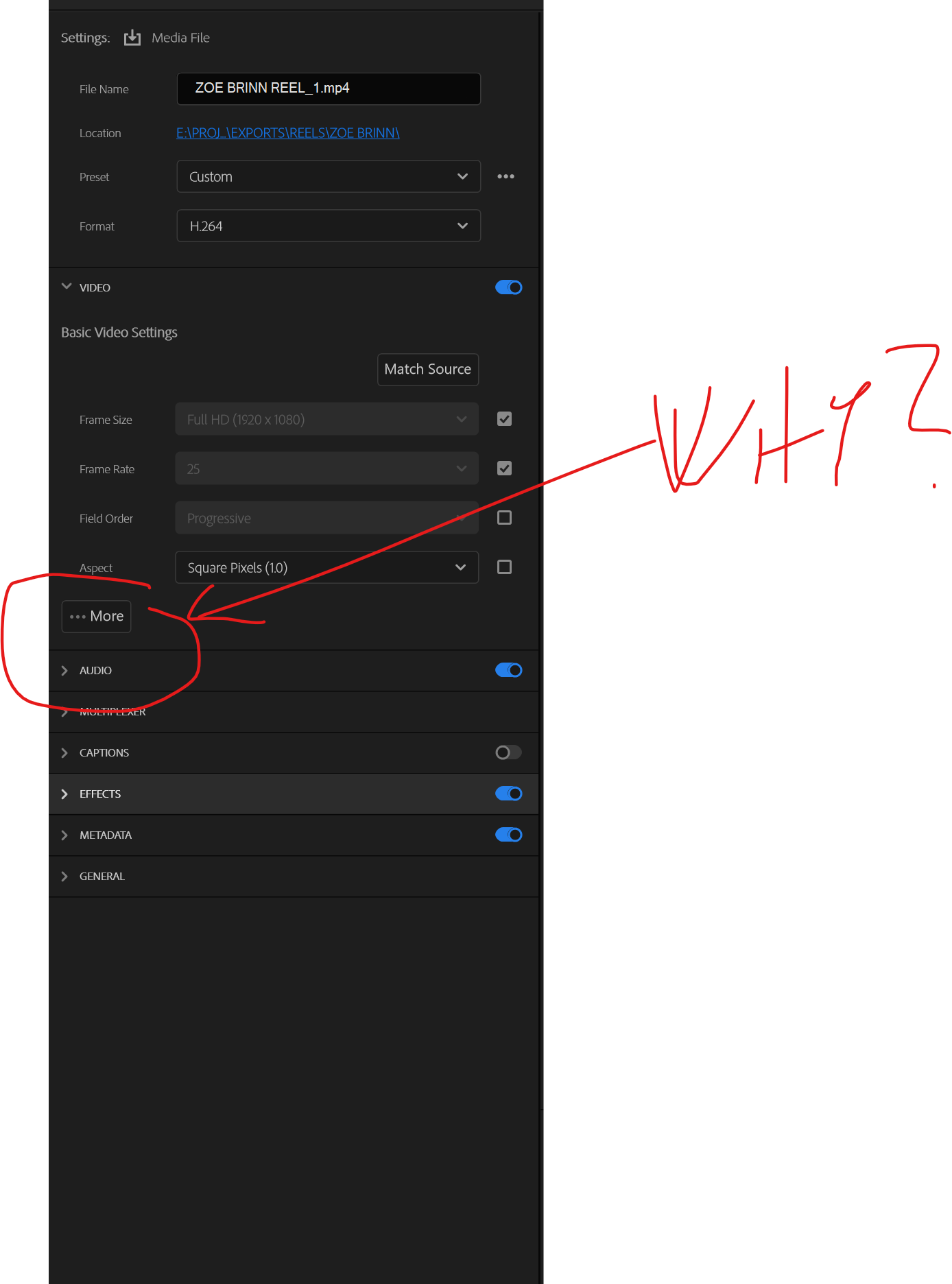
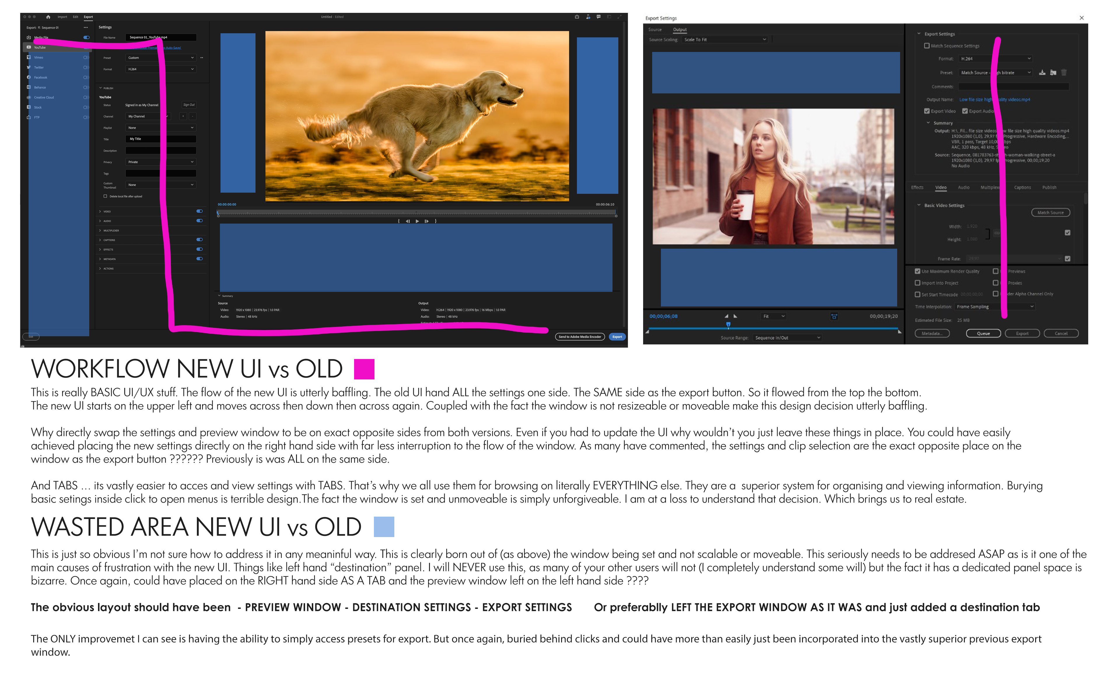
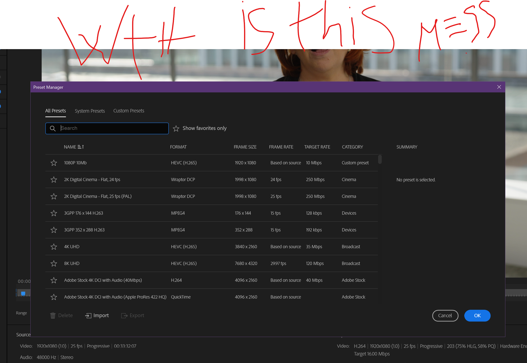
I used to be able to easily zip up and down the various settings just with a quick scroll of the mouse wheel. Now, I'm constantly clicking, clicking, clicking to open various tabs. Because the boxes are much bigger, far less information is being displayed on my screen. Please, is there some way I can go back to the friendlier older version??
Idea Under review Locked
TOPICS
User experience or interface

Views

46.2K

Translate

Translate

Report

Report
Community guidelines
Be kind and respectful, give credit to the original source of content, and search for duplicates before posting. Learn more
community guidelines

correct answers 1 Pinned Reply

Adobe Employee , Aug 10, 2023 Aug 10, 2023

This thread is now closed. I encourage people to log bug reports and feature requests, following the directions provided in the links. Specifics are great and, particularly for feature requests, explaining how a feature change will benefit your workflow is very useful. 


Votes

Translate

Translate
replies 819 Replies 819
819 Comments
New Here ,
Jan 24, 2023 Jan 24, 2023

Copy link to clipboard

Copied

Here's an idea... Maybe not hide critical everyday options like the bitrate setting within 2 submenu's?? I feel like the people designing Premiere Pro aren't using the program at all or otherwise they would have figured these things out themselves. Just naming the file you want to export has become crazy more difficult! I totally agree with Bennett Morrow.

Votes

Translate

Translate

Report

Report
New Here ,
Jan 24, 2023 Jan 24, 2023

Copy link to clipboard

Copied

I'm now opening Media Encoder every time I need to export anything, I just don't have the time in my delivery schedule to wade through the new export UI, very frustrating.

Votes

Translate

Translate

Report

Report
New Here ,
Jan 24, 2023 Jan 24, 2023

Copy link to clipboard

Copied

It's hard to rewrite with the same name an existing file exported earlier as the way it was before. Would it be possible to choose the old file by clicking on it in the appropriate directory ? Media Encoder still use this way...

Votes

Translate

Translate

Report

Report
Contributor ,
Jan 24, 2023 Jan 24, 2023

Copy link to clipboard

Copied

@Francis .... Change is hard ... dealing with completely unnecessary change is frustrating beyond measure. Particularly a change that is so poorly designed and thought out.

Adobe needs to revert the exporter. The new one is a trainwreck.

I have now rolled back to 22.2 and there I will stay. After 30 yrs of using Premiere I will now look at other software. The UI changes in 22.3 are just utterly baffling and have made it too frustrating to use.

Votes

Translate

Translate

Report

Report
New Here ,
Jan 24, 2023 Jan 24, 2023

Copy link to clipboard

Copied

Indeed, the whole new Idea is just rubbish. Sorry to say but this looks like its Just created to look clean and fresh but has never been putted to the test by real video editors. Also the new create project screen is not workable. Im not interested in template video's and edits the size of mount everest. Just let me input a project name and location. Keep it simpel guys.

Votes

Translate

Translate

Report

Report
New Here ,
Jan 24, 2023 Jan 24, 2023

Copy link to clipboard

Copied

CRITICAL: This is a counter-productive update. It's not "change is hard", this feels like rushed product management decision making.

The overall design should have raised serious red flags.

Custom render templates are hidden.

SO much clicking. I do not like having to expand every option.... at least keep them open?

I used to be able to see all my important settings at a glance, I needed 3 clicks & I was good to go.

Votes

Translate

Translate

Report

Report
New Here ,
Jan 24, 2023 Jan 24, 2023

Copy link to clipboard

Copied

Please give us the option to revert back to the old, OR KEEP THE MEDIA EXPORT RENDER PROCESS USING THE "LEGACY" RENDER SETTING, while you finish iterations.

Votes

Translate

Translate

Report

Report
New Here ,
Jan 24, 2023 Jan 24, 2023

Copy link to clipboard

Copied

This UI is terrible...

First, you need to navigate through dozens of dropdowns.

Then you can't see existing files in the folder.

(Am I exporting v7 or v8? Lets try to type in the name and see if the "overwrite" dialog will pop out... [headbang])

Why am I getting my H264 preset as an option when I'm exporting wav?

And the list goes on...

Oh, and don't get me started with working on huge ultrawide while having filename in the upper left and export button in the lower right.

Like... Whaaatt???

Votes

Translate

Translate

Report

Report
New Here ,
Jan 24, 2023 Jan 24, 2023

Copy link to clipboard

Copied

I've reverted to 22.2 and I have to say, OH MAN what a joy to have the regular export screen back. I never really appreciated its power and elegance until now when it is, seemingly, too late. I sincerely hope Adobe reconsiders their decision to unceremoniously retire our (now more than ever) beloved export pop-up.
Especially when its replacement is so... well, it's been said in this tread already.

Votes

Translate

Translate

Report

Report
Explorer ,
Jan 24, 2023 Jan 24, 2023

Copy link to clipboard

Copied

The new export screen is very badly designed. It takes me twice as long to use. It's clunky, requires scrolling and won't let me go into a directory and select a file I want to overwrite. I have to manually type the file name.

The old interface was dated and yes it needed updating but the new interface seems to have been designed by people who don't use this software everyday. Please streamline it! And please make it so I can go into a directory, click on a file and then be able to overwrite that file!

Thank you

Votes

Translate

Translate

Report

Report
Explorer ,
Jan 24, 2023 Jan 24, 2023

Copy link to clipboard

Copied

The new design is terrible. I have to use this software every day and it's far far slower to use this screen. It's clearly been designed by committee and not by users.

Let me select a file I want to overwrite. Present the most commonly used options at the top. Things like maximum render quality shouldn't be buried away. It's critical and needs to be near the render button.

I know you say we can't go back to the old version (presumably because some manager who knows nothing about editing says so) but why not take your layout cues from the old design rather than foist this new cluttered mess upon us.

Votes

Translate

Translate

Report

Report
Explorer ,
Jan 24, 2023 Jan 24, 2023

Copy link to clipboard

Copied

it is SO incredibly bad. Cannot believe this was shipped. Revert back please.

Remember when updates used to be fun? Now when updates come out I wonder, "what have they messed up now?"

Votes

Translate

Translate

Report

Report
Explorer ,
Jan 24, 2023 Jan 24, 2023

Copy link to clipboard

Copied

it is SO incredibly bad. Cannot believe this was shipped. Revert back please.

Remember when updates used to be fun? Now when updates come out I wonder, "what have they messed up now?"

Votes

Translate

Translate

Report

Report
New Here ,
Jan 24, 2023 Jan 24, 2023

Copy link to clipboard

Copied

The new UX is one for Teletubbies.
Can you please return us the original export screen?

Votes

Translate

Translate

Report

Report
New Here ,
Jan 24, 2023 Jan 24, 2023

Copy link to clipboard

Copied

The new export tab is stupid.... who the **** designed this clumsy export dialogue box. ******** stupid designer

Votes

Translate

Translate

Report

Report
New Here ,
Jan 24, 2023 Jan 24, 2023

Copy link to clipboard

Copied

What the **** Adobe, can't you see that the new design takes so much screen real estate? I don't want to stare at the ******* Import, Export tab. I want my UI clean as in the previous version. ********

Votes

Translate

Translate

Report

Report
New Here ,
Jan 24, 2023 Jan 24, 2023

Copy link to clipboard

Copied

love this comment from Erik. Right on point.

"I've reverted to 22.2 and I have to say, OH MAN what a joy to have the regular export screen back. I never really appreciated its power and elegance until now when it is, seemingly, too late. I sincerely hope Adobe reconsiders their decision to unceremoniously retire our (now more than ever) beloved export pop-up.
Especially when its replacement is so... well, it's been said in this tread already.
"

When you didn't have to think or notice something, and you just were able to get your outcome done... THAT was perfection.

Careful of over iterating (that isn't broken, has no business case). You should be designing for the CORE audience, not the outlier weekend editors. Don't go Blockbuster on us.

Votes

Translate

Translate

Report

Report
Community Beginner ,
Jan 24, 2023 Jan 24, 2023

Copy link to clipboard

Copied

Just followed suit here and reverted back to 22.2. SO much better. Unless Adobe addresses these issues in the next update, I'll be sticking with 22.2 for as long as I can.

Francis, what an uninspired comment. It comes off as the Apple-approach to product development ("We know what's best for you better than you do. We promise you don't really need USB ports. You'll never miss them. We promise you don't need an ethernet port. This new design is so much better" etc.) As Sr. Product Manager, do you have much editing experience under your belt? Let me spell out what is obvious to the professionals that use this software on a daily basis:

-While presets can be very valuable productivity tools, no one wants to be forced to create and use a preset in every circumstance under the sun, because the customization tools are no longer as convenient. Yes, for many situations, a preset will suffice. But there are often many (too many to enumerate here) specific use cases where settings need to be tweaked.

-Say you're exporting for social, and it uses a 4x5 or 9x16 aspect ratio. Okay, I guess I'll change the frame size and make a new preset. Now say the client wants a smaller file size. Okay, I guess I'll change the bitrate and make another preset. Now say one of my effects is glitching on export due to problems with hardware acceleration (yeah this kind of stuff happens in Premiere all the time). Okay, I guess I'll switch it to software encoding and make ANOTHER preset.... and so on. Are you kidding me?

-Now say I need a ProRes 422HQ Master of my timeline. Okay, I'll make a preset. Now say for this next project, all of the source material is only 8-bit, so I don't need the extra bitdepth from a 16-bpc encode. Okay, I guess I'll change the bit depth and make ANOTHER preset.

You get my point. "What settings could you POSSIBLY need to adjust rather than saving a preset. Look, we've made the export dialog so much easier for you, because now instead of having quick access to all of the settings, you get to make dozens of presets for every export situation imaginable whereas previously only a small handful of presets was sufficient!"

Please don't condescend. Listen to the people.

P.S. This doesn't even begin to cover all the other problem's people have already mentioned (export screen too big, file naming a disaster, etc.)

Votes

Translate

Translate

Report

Report
Participant ,
Jan 24, 2023 Jan 24, 2023

Copy link to clipboard

Copied

Francis what an objectively unhelpful take. If you aren't going to listen to feedback (the new export UI is so bad that reverting would be the best option) - why are you even looking at Uservoice? Its like y'all cruise on over to just belittle your users. Seriously, whether you intended or not, your posts reads "if you don't like the UI redesign, sucks to suck." Which is wildly unprofessional at best.

So, yeah. Please either include a legacy option or revert in the next update.

Best,
--Sam

Votes

Translate

Translate

Report

Report
New Here ,
Jan 24, 2023 Jan 24, 2023

Copy link to clipboard

Copied

I have reverted to 22.2 and thats really the best solution. Its so OBVIOUS that this update was designed by people who don't use the software on a daily basis. Clients always need multiple versions and cuts of videos. Different resolutions, bitrates, colour profiles, you name it. All those need tonnes of clicks clicks clicks now.

Isn't rule 101 of product development to reduce the number of clicks to get things done? Now it just takes so long and so many clicks. It's so unprofessional its amazing. And you can't have a preset for everything. It just doesn't work that way. Every client and every project is going to have it's own unique requirements. Not to mention ad hoc requests by clients for like down res versions.

Just roll back the update and we will forgive your silly comment, Francis.

Votes

Translate

Translate

Report

Report
Explorer ,
Jan 24, 2023 Jan 24, 2023

Copy link to clipboard

Copied

Sitting here doing edit revision after edit revision and just cannot believe this rubbish was let through any kind of testing. What would have been a few clicks to knock out another revision now involves many clicks, scrolling and having to TYPE the filename. I also get promoted TWICE if I want to overwrite a file. Oh goodness me, the people who designed this clearly don't have to use it on a daily basis!

Votes

Translate

Translate

Report

Report
Explorer ,
Jan 24, 2023 Jan 24, 2023

Copy link to clipboard

Copied

Yup, bring old export window back pls! Even though that one had some clunky elements, it seems like a dream now compared to this pile of garbage.

Votes

Translate

Translate

Report

Report
Advisor ,
Jan 24, 2023 Jan 24, 2023

Copy link to clipboard

Copied

It almost leaves you speechless. What a train wreck and what an attitude.

Do you think it's a good idea to get your users to have to *manually type* a file name to save *without any way to reference the existing files on their system*?


Votes

Translate

Translate

Report

Report
Advisor ,
Jan 24, 2023 Jan 24, 2023

Copy link to clipboard

Copied

The export dialog 'Filename' and 'Location' should be one single entry: 'File name & Location' just like the one in the 'Quick export' panel.

Reasons:
1. I can reference the existing file names on my system - 'click copying' them and then changing a few characters for a new version name update.

2. At the same time I am navigating to the appropriate save location.


In summary: It's (much) easier, much faster, a common workflow and it works well.

In comparison the current 22.2.x workflow means I need to: minimise PrPro to check the file names in the finder / explorer, copy them, paste them into the name box and edit them. Then click on the location button and navigate to the save folder and select that...


Somehow you thought this new UI was an improvement??

Votes

Translate

Translate

Report

Report
Contributor ,
Jan 24, 2023 Jan 24, 2023

Copy link to clipboard

Copied

@Franicis Crossman

This is really BASIC UI/UX stuff. The flow of the new UI is utterly baffling. The old UI had ALL the settings one side. The SAME side as the export button. So it flowed from the top the bottom. The new UI starts on the upper left and moves across then down then across again. Coupled with the fact the window is not resizable or moveable make this design decision utterly baffling. Why directly swap the settings and preview window to be on exact opposite sides from both versions. Even if you had to update the UI why wouldn’t you just leave these things in place. You could have easily achieved placing the new settings directly on the right hand side with far less interruption to the flow of the window.

As many have commented, the settings and clip selection are the exact opposite place on the window as the export button ?????? Previously is was ALL on the same side. And TABS … its vastly easier to access and view settings with TABS. That’s why we all use them for browsing on literally EVERYTHING else. They are a superior system for organising and viewing information. Burying basic settings inside click to open menus is terrible design. The fact the window is set and unmoveable is simply unforgiveable. I am at a loss to understand that decision. Which brings us to real estate.

This is just so obvious I’m not sure how to address it in any meaningful way. This is clearly born out of (as above) the window being set and not scalable or moveable. This seriously needs to be addressed ASAP as is it one of the main causes of frustration with the new UI. Things like left hand “destination” panel. I will NEVER use this, as many of your other users will not (I completely understand some will) but the fact it has a dedicated panel space is bizarre. Once again, could have placed on the RIGHT hand side AS A TAB and the preview window left on the left hand side ????

The obvious layout should have been - PREVIEW WINDOW - DESTINATION SETTINGS - EXPORT SETTINGS Or preferably LEFT THE EXPORT WINDOW AS IT WAS and just added a destination tab

The ONLY improvement I can see is having the ability to simply access pre-sets for export. But once again, buried behind clicks and could have more than easily just been incorporated into the vastly superior previous export window.

Votes

Translate

Translate

Report

Report