• Global community
    • Language:
      • Deutsch
      • English
      • Español
      • Français
      • Português
  • 日本語コミュニティ
    Dedicated community for Japanese speakers
  • 한국 커뮤니티
    Dedicated community for Korean speakers
Exit
0

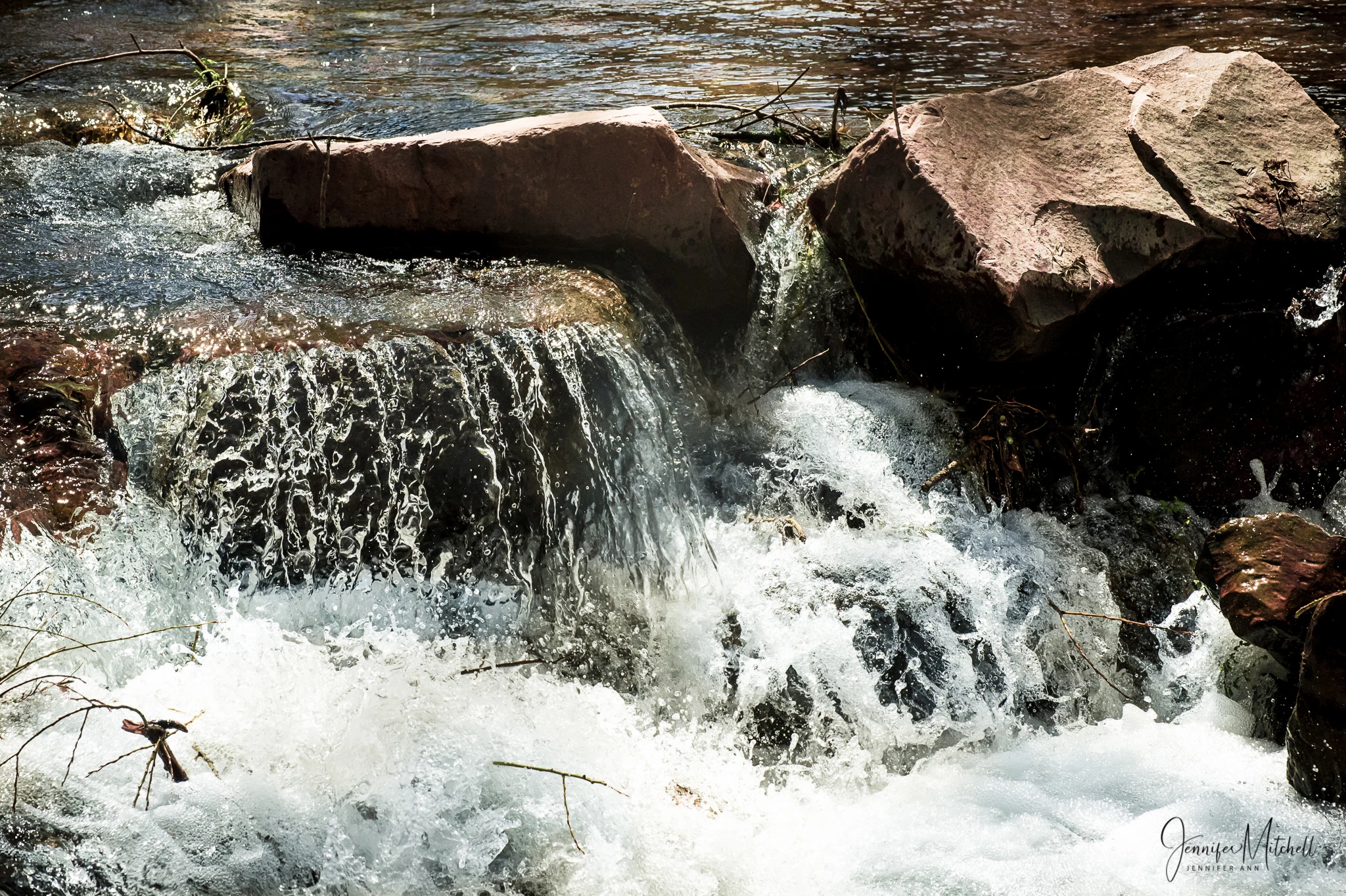
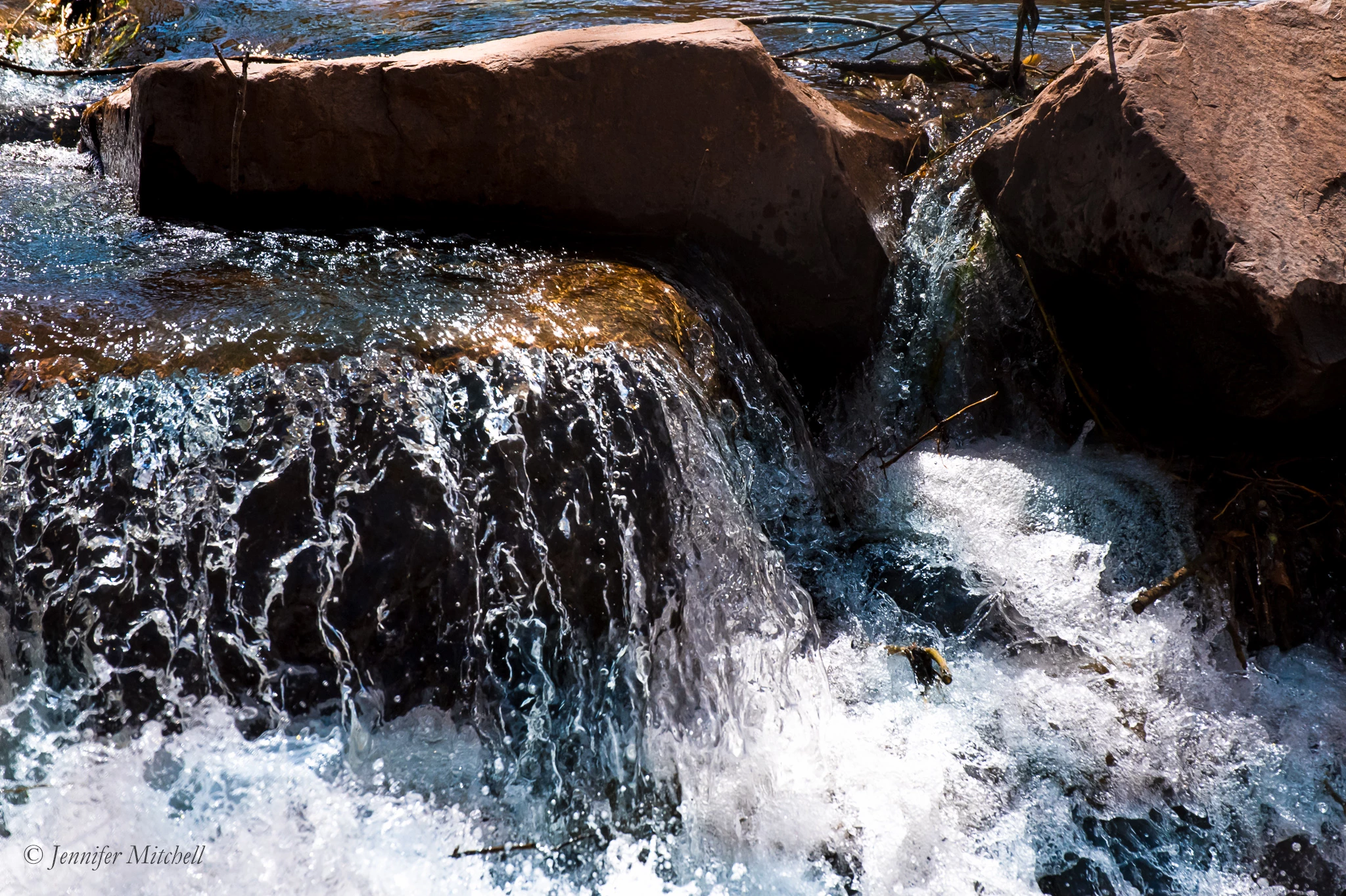
Attached photo rejected for exposure issue, but 2nd similar photo was accepted. ???

Explorer ,
Mar 29, 2019 Mar 29, 2019

Copy link to clipboard

Copied

First photo was rejected, the one below was accepted.  Any idea why???  If anything, the 2nd one accepted was somewhat underexposed, but I liked that contrast.

Note, both of these are smaller versions ... Adobe wouldn't accept the full resolution photos here in the forum.  The ones I submitted did NOT have my logo.

I'm new to Adobe Stock, working through my confusion.  Thanks for any help!

WaterfallManitouSprings-6552.jpg

WaterfallManitouSprings-6557.jpg

TOPICS
Contributor critique

Views

942

Translate

Translate

Report

Report
Community guidelines
Be kind and respectful, give credit to the original source of content, and search for duplicates before posting. Learn more
community guidelines

correct answers 1 Correct answer

Explorer , Apr 04, 2019 Apr 04, 2019

OK, here is my final edit.  I took advice from all of you, and also did a couple other tweaks ... I darkened the water behind the big rock on the right a bit, and then decided to darken the water in the bottom left to help balance the top right corner, and to add detail to the frothing water in that spot.  BTW, I use mainly Lightroom, love it ... occasionally go the PS when I need to do things like cloning, etc.

I don't know if I've ever done this many revisions!  I hope the photo is worth all th

...

Votes

Translate

Translate
Advisor ,
Mar 31, 2019 Mar 31, 2019

Copy link to clipboard

Copied

Hi tea1001 - You have your name on both so both should have been rejected. No signatures or logos are accepted by Adobe. The second signature is smaller than the upper photo here. Best wishes, JH

Votes

Translate

Translate

Report

Report
Community guidelines
Be kind and respectful, give credit to the original source of content, and search for duplicates before posting. Learn more
community guidelines
Explorer ,
Mar 31, 2019 Mar 31, 2019

Copy link to clipboard

Copied

Joanh, as I noted in my post, the full resolution photos I submitted DID NOT HAVE MY LOGO.  The first photo was rejected for exposure.

Votes

Translate

Translate

Report

Report
Community guidelines
Be kind and respectful, give credit to the original source of content, and search for duplicates before posting. Learn more
community guidelines
Advisor ,
Mar 31, 2019 Mar 31, 2019

Copy link to clipboard

Copied

Dear tea1001, What a stupid mistake. Very sorry, I usually read and comprehend better. Up early that day. Thanks for being kind with your statement. I will look deeply into these as you should also. Look at the photos at 200% enlargement and see if there is noise, spots and other after effects. You might spend more time searching these links. I will be back soon. Best, JH

I will ask Abambo to look at these, he is one of our top forum contributors.

Here are some links you can benefit from:

tagproducts_SG_STOCK-CONTRIBUTOR_i18nKeyHelppagetitle  Read up on all the links especially the "Stock Contributor User Guide"

tagproducts_SG_STOCK-CONTRIBUTOR_i18nKeyHelppagetitle Click/tap on each of the links to the left menu; read up on all the relevant topics, and reference links.

Reasons content is rejected at Adobe Stock

And watch this video by Matt. From Shoot to Sale: Part 1 | Adobe Blog

Votes

Translate

Translate

Report

Report
Community guidelines
Be kind and respectful, give credit to the original source of content, and search for duplicates before posting. Learn more
community guidelines
Explorer ,
Mar 31, 2019 Mar 31, 2019

Copy link to clipboard

Copied

Joanh, no problem, not stupid ... just easy to miss details sometimes.  Thanks for the links, I will check out those I haven't already seen.

I looked at 100% and 200%, very minimal noise at 200%, IMO.  But, it was declined for an exposure issue.

Votes

Translate

Translate

Report

Report
Community guidelines
Be kind and respectful, give credit to the original source of content, and search for duplicates before posting. Learn more
community guidelines
Advisor ,
Apr 01, 2019 Apr 01, 2019

Copy link to clipboard

Copied

Hi tea1001, Thank you for your kind reply. Well here it is April 1 and I am fully awake and ready for a new month.

I would like to take a bit of a new look at why one photo was accepted and one was rejected. I know why you might like to have more contrast, however, let's look at the customer's point of view. A buyer will probably be able to add any amount of contrast they desire. The two shots are very near the same except for cropping and a closer view of the water. As a buyer, I would not like the harsh overly dark division between the splash and the black part of the rock. As the buyer, I would take only one rather than buy two of "nearly:" the same shot. The cropped shot got rid of some unnecessary junk - sticks and twigs etc. for me. As a buyer, I am attracted to the golden light of the water running over the upper flat rock. Exposure feels warmer and exciting in the accepted shot. Buyers can build a full-color palette based on that golden color.

So, when you look at these two photos, take the potential buyers point of view. All too often the photographer or artist is not considering the client's concerns - only trying to make their work more pleasing to their creator's eye - trying to fit their work to the buying general public likes.

Please remember, the stock reviewer knows Adobe customers and what they buy. And every buyer has a budget to follow.

Keep up the good work.  Best regards, JH

Votes

Translate

Translate

Report

Report
Community guidelines
Be kind and respectful, give credit to the original source of content, and search for duplicates before posting. Learn more
community guidelines
Explorer ,
Apr 01, 2019 Apr 01, 2019

Copy link to clipboard

Copied

JH, thanks for your input again.  I want to be sure we're talking about the right photo.  You said "Exposure feels warmer and exciting in the accepted shot."  It is the first, the rejected shot, that is warmer ... and I like it better, the composition also.  Please clarify which shot you like better.

Votes

Translate

Translate

Report

Report
Community guidelines
Be kind and respectful, give credit to the original source of content, and search for duplicates before posting. Learn more
community guidelines
Community Expert ,
Apr 01, 2019 Apr 01, 2019

Copy link to clipboard

Copied

Hi teal

Joan is correct. The second, the accepted image, is the warmer image. The other, the first and rejected image, is flat - more lighted, but flat; not enough vibrancy/warmth. It will be accepted once you follow my suggestions, which will add some warmth and light to the dark areas. Also you need to consider who's tastes she suggest you put into consideration. For us photographer, Adobe is our customer. Adobe selects according to their customer's tastes. Therefore no matter how much we like an image, if a fault is highlighted by Adobe, it suits us well to just accept and make the adjustment if we really want the image up, and move on to the next task.

I too have similar experience. A landscape of which I liked the exposure was rejected for exposure. I decided to upload one I considered over exposed of the same location, and that image was accepted without hesitation. I'm still not happy with the outcome, but that's how it is. Our tastes only matters if the customer likes it, and we don't earn from our taste except customers likes it.

Just to let you know, I too like the composition of the rejected image. I hope you'll consider making the adjustments I suggested and re-upload.

Regards

JG

Votes

Translate

Translate

Report

Report
Community guidelines
Be kind and respectful, give credit to the original source of content, and search for duplicates before posting. Learn more
community guidelines
Explorer ,
Apr 01, 2019 Apr 01, 2019

Copy link to clipboard

Copied

You make very good points, and I'm listening.  Thank you!  I will play with the rejected image some more and try submitting again.  I will try to remember to post the result here.

Votes

Translate

Translate

Report

Report
Community guidelines
Be kind and respectful, give credit to the original source of content, and search for duplicates before posting. Learn more
community guidelines
Community Expert ,
Mar 31, 2019 Mar 31, 2019

Copy link to clipboard

Copied

Hi tea

I've noted that sometimes when there's a rejection for exposure, I reduce the black and shadows and that does the trick. Frankly in my opinion both are a bit dark in the shadows and could have been adjusted so that more details of the shadowy arears become visible. However as you said one, the more vibrant was accepted.

Therefore if you have photoshop, try these adjustments. Reduce the black, and shadows. Add some clarity, and vibrance. Up the temperature and reduce the tint a bit (not much). Depending on how it looks when you're through with those adjustment, you may also increase the exposure a bit. The one that was rejected looks really flat.

I hope you find this helpful

Regards

JG

Votes

Translate

Translate

Report

Report
Community guidelines
Be kind and respectful, give credit to the original source of content, and search for duplicates before posting. Learn more
community guidelines
Explorer ,
Apr 01, 2019 Apr 01, 2019

Copy link to clipboard

Copied

Thanks for your input, JG.  I feel the 2nd one (that was accepted) is really verging on too dark.  The 1st one (rejected) is lighter, and I like the composition better.  It that the one you feel is really flat?

Votes

Translate

Translate

Report

Report
Community guidelines
Be kind and respectful, give credit to the original source of content, and search for duplicates before posting. Learn more
community guidelines
Explorer ,
Apr 02, 2019 Apr 02, 2019

Copy link to clipboard

Copied

Here's an edited version of the first (rejected) photo.  Any comments will be appreciated.

Note: the full resolution photo submitted does NOT have my logo on it.

WaterfallManitouSprings-6552-Edit-2.jpg

Votes

Translate

Translate

Report

Report
Community guidelines
Be kind and respectful, give credit to the original source of content, and search for duplicates before posting. Learn more
community guidelines
Advisor ,
Apr 02, 2019 Apr 02, 2019

Copy link to clipboard

Copied

Hi teal001, Well, what a difference. Very nice work. Just a bit more white balance to mute the high-key white and you are ready to resubmit. How does this look to you Abambo ?

Regards, JH

Votes

Translate

Translate

Report

Report
Community guidelines
Be kind and respectful, give credit to the original source of content, and search for duplicates before posting. Learn more
community guidelines
Community Expert ,
Apr 02, 2019 Apr 02, 2019

Copy link to clipboard

Copied

Hi teal

That is much better. However, under the rock is still a bit dark, You should be able to see what's in the shadowy areas. When making corrections, you need to look out for, and/or use the relevant function to highlight clippings and adjust to remove them. Therefore it is important to learn about the editor you use.

In any case the best thing is to have the correct exposure from go. In like manner you need to know the editor you use for post processing, you also need to know your camera, and how to make adjustments for the best pictures - in this case exposure. If you have already re-submitted, let's see what the moderators do.

Regards

JG

Votes

Translate

Translate

Report

Report
Community guidelines
Be kind and respectful, give credit to the original source of content, and search for duplicates before posting. Learn more
community guidelines
Community Expert ,
Apr 03, 2019 Apr 03, 2019

Copy link to clipboard

Copied

It's OK now. Still a little bit greenish. And yes, you still could edit out some of the shadow areas, because I think there is structure there in, without overdoing.
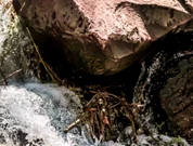
and may be there is a possibility to bring a little of structure in this area, , effectively darkening the top of the rock a little bit.
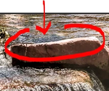
To be honest, I think the only edit that still needs to be done is to take out a little bit of the greenish tone on the water.

ABAMBO | Hard- and Software Engineer | Photographer

Votes

Translate

Translate

Report

Report
Community guidelines
Be kind and respectful, give credit to the original source of content, and search for duplicates before posting. Learn more
community guidelines
Explorer ,
Apr 04, 2019 Apr 04, 2019

Copy link to clipboard

Copied

OK, here is my final edit.  I took advice from all of you, and also did a couple other tweaks ... I darkened the water behind the big rock on the right a bit, and then decided to darken the water in the bottom left to help balance the top right corner, and to add detail to the frothing water in that spot.  BTW, I use mainly Lightroom, love it ... occasionally go the PS when I need to do things like cloning, etc.

I don't know if I've ever done this many revisions!  I hope the photo is worth all the effort.  I'm going to re-submit this now.  Many thanks to all of you for your help!
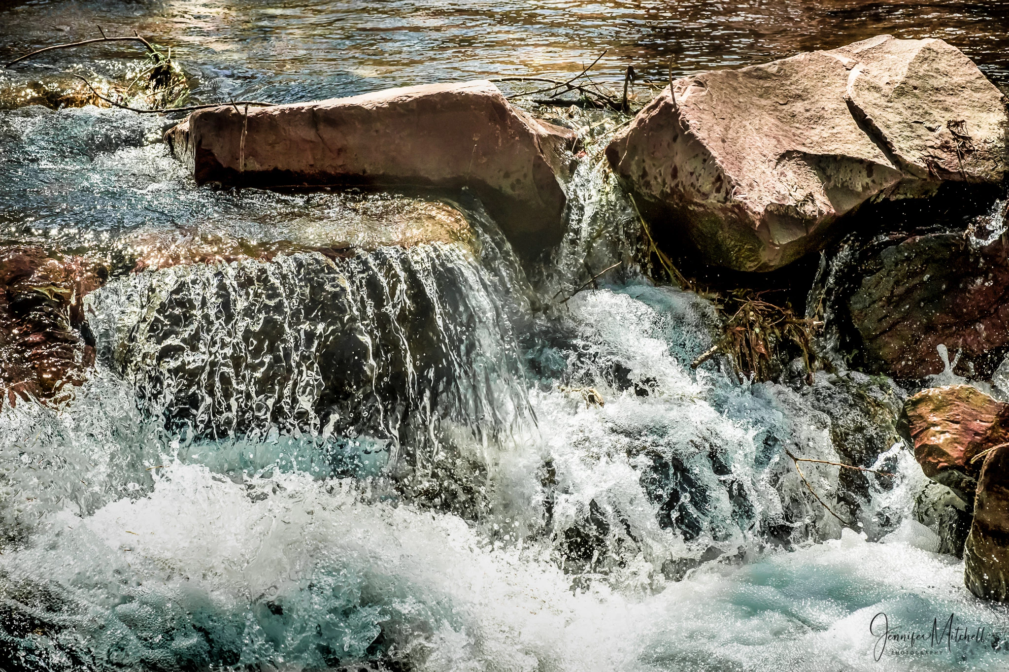
WaterfallManitouSprings-6552-Edit-2.jpg

Votes

Translate

Translate

Report

Report
Community guidelines
Be kind and respectful, give credit to the original source of content, and search for duplicates before posting. Learn more
community guidelines
Explorer ,
Apr 05, 2019 Apr 05, 2019

Copy link to clipboard

Copied

Well, we did it!  This last version was accepted!  I am happy and very grateful for the help from all of you. 

Can I mark all of you as "correct answer"?

Votes

Translate

Translate

Report

Report
Community guidelines
Be kind and respectful, give credit to the original source of content, and search for duplicates before posting. Learn more
community guidelines
Community Expert ,
Apr 05, 2019 Apr 05, 2019

Copy link to clipboard

Copied

Hi teal

Unfortunately there's only one option for correct. However you may mark all helpful post as helpful. If you cannot find a single correct answer you may unmark as question or just simply leave it and a moderator will take care of it.

Regards

JG

Votes

Translate

Translate

Report

Report
Community guidelines
Be kind and respectful, give credit to the original source of content, and search for duplicates before posting. Learn more
community guidelines
Community Expert ,
Apr 07, 2019 Apr 07, 2019

Copy link to clipboard

Copied

LATEST

If you mark helpful answers helpful, that‘s ok. Sometimes there is not a single answer correct, so you may leave it like this and mark the thread „assumed answered“. Or you choose the most helpful answer to your original question.

Congatulations, it‘s a very nice picture.

Or let it be, as Jacquelin suggested and a moderator will take over the task.

Edit: I took the freedom to mark yor answer correct after reading through all the answers. The aim of a correct answer is to give others a feeling on their work, an that is best done with your final edits example.

ABAMBO | Hard- and Software Engineer | Photographer

Votes

Translate

Translate

Report

Report
Community guidelines
Be kind and respectful, give credit to the original source of content, and search for duplicates before posting. Learn more
community guidelines