







『アドビコミュニティフォーラム』に質問/トピックを投稿する方法
A community for Color Management users.
新着順
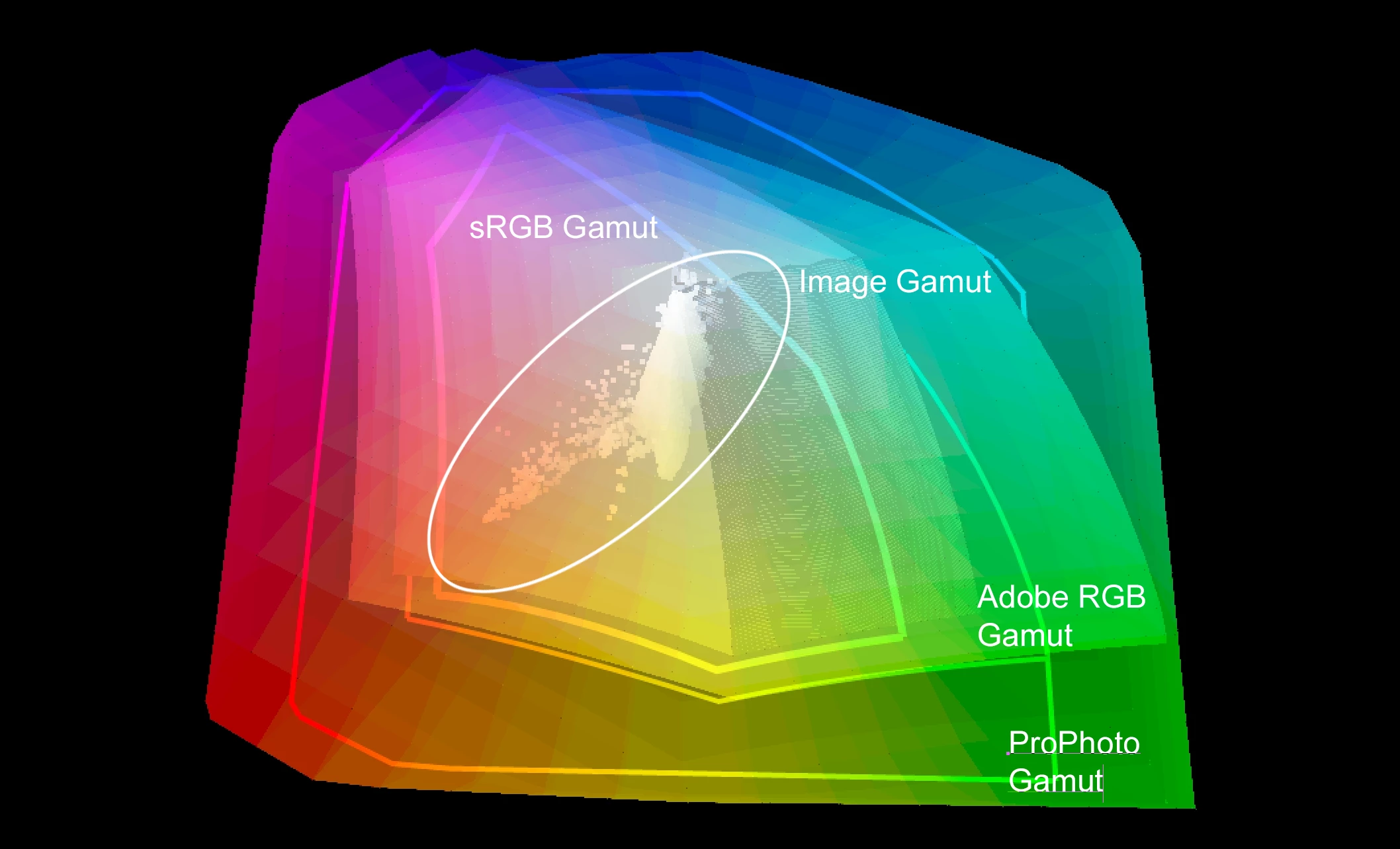
Hey folks!I finally got myself a decent device for editing and started to get into the color management topic. I am quite confused by now and I hope it is alright to ask some questions! So currently I am doing it like this:I take a picture in RAW on my Nikon and load it in my macbook (air M2) into Lightroom classic. I basically understand that Lightroom converts this RAW Information into something? with a ProPhotoRGB color space. Now I do my Lightroom editing and afterwards export it as one JPG with sRGB and one JPG with AdobeRGB. I want to use the sRGB one for the internet (my website, instagram, sending to people) and the AdobeRGB one for showing the picture on my devices. So, I am questioning a lot about this "workflow" by now. Is editing in ProPhotoRGB recommended with my Macbook set to Display P3?I basically want to use all information I have for editing and if I understood this correctly, my Macbook will show me all the colors its possible to represent from the Pro
Hello there After previously working in RGB on Photoshop and being repeatedly dissatisfied with the conversion to CMYK results when printing (the blacks always looking washed out) I decided to work thereafter in CMYK. Now when I recently completed my latest art piece, I also discovered the gamut warning option. In using it, I realised that a lot of my art piece was out of gamut so I made a copy of the art piece and systematically began altering the hues and saturation levels of all the many different elements. And in the end, I managed to correct a decent chunk although there was still a good chunk remaining too which brings me to my next point. In discovering the gamut warning option, I also became aware of sRGB and AdobeRGB. Now for my part both my embedded colour profiles and working spaces are sRGB IEC61966-2.1 and U.S. Web Coated (SWOP) v2 but in reading about AdobeRGB, it became clear that it has a bigger colour gamut than sRGB. So my question
ponThis is a bit of a new one as we have noticed this on multiple computers in our group. We are saving Photoshop files in RGB Mode for Digital Print. The way the Color Management is setup- the Photoshop files were supposed to be RGB, placed into Illustrator CMYK on our dielines/ vectir files and then output using a OEM supplied PDF Output for our printer. Things have been all setup, color management was great, and then all of the sudden, boom, our photos started coming out awful. We just noticed that when we save in Photoshop, there is no longer an ICC Checkbox for AdobeRGB, it now says "sRGB..." Everything only works when Adobe RGB is used- it was always there, automatically, and poof, it gone. As you can see from my attachments, the ICC is in the folder it should be, everything is set in its place- just that one issue of the sRGB showing up instead of AdobeRGB. We dont know why this changed, but, any help on getting it back?
Hi! I've been having this issue where certain Adobe files print with a pink cast and others don't. I've tried so many different color profile setting combinations and I can't figure out it what is causing it to happen or not, it's driving me crazy. So for instance this morning I printed out this indesign file with both a linked illustrator file and a linked photoshop file, and the illustrator one comes out b&w, but the photoshop one has a pink cast. I've tried exporting the photoshop image instead, with lots of different settings, but even with color mode set to greyscale it prints with a pink cast, on its own or through indesign, when the illustrator file on the same page doesn't! Generally anything I print out that went through photoshop seems to come out with a pink cast. With illustrator some files also out with a pink hue, and others don't, eventhough I don't change any settings when making new documents... If anyone has any idea how to fix this I'd be
Hi all. I have an Epson 970 and some Marrutt fine art paper and the colours on the printout outs are too dark and cold. After doing research i downloaded the adobe colour management utility and i am following the you tube videos for PC (windows 10). on the tutorials it says to go into the app and select 'print', then to go into Mode and turn colour management off. I don't see an option for this. I don't have photoshop or any fancy photo apps so that isnt the problem. I am definitly within the utility app. I have attached what the you tube video displays compared to what i am seeing. Hope someone can help 🙂 Thanks
Hallo ,Ich habe einen neuen PC und dementsprechend alles neu installiert. Die Einstellungen habe ich genauso gemacht wie beim vorgänger PC inkl. speziell von Profis erstellten icc und icm Profil.Wenn ich meine Bilder normal öffne ist alles gut , aber wehe ich öffne etwas in Camera RAW . Dort wird mir das Bild in den leuchtensten Magentatönen und viel zu dunkel angezeigt(obwohl alle regler auf null). Ich habe soweit ich konnte die Farbeinstellungen in Br überprüft ,aber kann keinen Fehler entdecken.Habt ihr ne Idee?
I have a question regarding color management in Adobe InDesign on a Windows system. Is it similar to how Adobe Photoshop handles color, or does it depend on the main display settings? In my case, it seems to be dependent on the main display. I believe it should function independently of this. Any insights or suggestions would be greatly appreciated. “I have a wide gamut monitor and therefore have oversaturated colors. Thank you.
The first image I have is on the Photoshop working canvas, and the red is much brighter.And the second image is the screenshot of recent file when opening the photoshop. It is not the problem about saving or exporting the files, is just the screen showing different colours when performing on the canvas.Either is CMYK or RGB files, the colours are different. HELP!
I am attempting to use the ACPU to print a test sheet on my Canon Pixma 100S to send off to create a dedicated icc profile for the paper. When I walk through the instructions on using the Adobe Color Printing Utility the application crashes when I select the Matching Tab - see attached file.I have witnessed this before but never resolved it then either. When the tab is selected the application hangs and I am unable to close the application without quitting via Task Manager. Any guidance would be appreciated. Martin
hello, when closing a file from illustrator to PDF i received this message:version 4 icc converted to version 2 profilewhat it means and what should i do? will it affect the print?
I have found this problem where, after transferring Adobe RGB files from my camera into my hard drive that, the images are being converted into RGB and a colour profile of Display P3. I have no idea why this is happening because I am DEFINITELY shooting in Adobe RGB, yet I still have files convert themselves into RGB after transfer. Why is this? And. How can I fix it? Kind Regards,Adam
CC on a Mac, OS 10.14. How many different places might be used to store ICC Profiles? When I look at the color settings options, or go to select a printer profile in Photoshop, I see many, many items that are not in my Library/ColorSync/Profiiles or username/Library/ColorSync folders. I'd like to get rid of the useless ones.
Adobe Photoshop CC 24.7.0MacOS Ventura 13.5 I opened a PSD file and selected "Don't color manage this document", and I get the following error:"Could not complete the Assign Profile command because the file was not found." If I change it to any colour profile, I get the exact same error. No exceptions.
G’day! When I work in prepress I primarily work for european printers, but recently we have had to provide CMYK-separated images for U.S.-printers. One of the printers had emphasized that they employ G7 and a definitive answer on a target Color Space/ICC Profile was not very easily obtained. Idealliance themselves state that G7 should be combined with ICC Color Management … but I am confused as to what that ultimately means concerning hard proofing (with GMG Color Proof on an Epson in this case). Should a certified proof (SWOP, Gracol, …) be reproducible in print or does G7’s apparant focus (Neutral Print Density Curve) mean that the Lab target for specific CMYK value-combinations may acually be »overridden«, so to speak? Does G7 amount to an additional pillar for Color Management (as set forth by the ICC) or to an ideally parallel but potentially (slightly) conflicting procedure? May my confusion just be the result of a misunderstanding based
I entered the same color code number in illustration and Photoshop, but does HSB have different values? RGB and CMYK have the same value, but HSB is different. Fragmentally, if you enter #80949b into Photoshop, RGB and CMYK are the same values, but HSB is different from 196/17/61 (Photoshop) and 194/17/60 (illustration). Also, if you enter the color code above in the cs6 version, the three values of RGB, CMYK, and HSB are all different. It makes a difference visually, like a completely different color. Can you tell me why? I knew that each program has a different color, but why is there a numerical difference even though it's the same code number?
Hi!I am designing an airless packaging. The manufacturer requested that I picked a color from the Pantone Formula Guide Coated. However, the color I want is not there and so I played with the transparency of a color to get what I want. Just wondering if that is the best practice and how would that work on the printing side?
I am designing a matte airless bottle packaging. So naturally, I took color references from the Pantone Solid Matte Guide. However, there is a color in the CMYK Coated Guide that I like, that is not in the Matte Guide. My question is, can I still use the colors in the CMYK Guide considering it will be used on matte packaging?
Help, pleaseHi, I'd be really exceptionally grateful for your assistance.I nowadays have a very simple photographic workflow. I shoot images in raw, do the basic manipulation on Lightroom for IOS on a IPad Pro 11 inch M2, which you cannot screen calibrate. This is really for the sake of convenience when one os on the move. However, for some of the finer work and image manipulation, Lightroom on IOS is a bit unrefined, so I always save my images from Lightroom on the Cloud as highest res Tiff files, and import them into Photoshop on my MacBook Pro, which has a calibrated monitor.The problem is that my images, while mostly color accurate open between 1 and 1,5 stops darker on Photoshop on the Mac. There are no color management settings on the IOS version of LR, and I just cannot get consistency across my devices. If I look at the same image on my phone, its somewhere in between the iPad Pro, and the MacBook - a tiny bit dark, not as dark as the MacBook, and the colours are a bit less con
I am new to Lightroom and I am having trouble with the color I am getting with my prints. I know that to get the most accurate colors you should calibrate your monitor and mine is certainly not calibrated, but what I am having a problem with is that before I print a photo from Lightroom I see a preview of what it will look like and the colors are different from the ones I see when I soft proof in Lightroom. In this particular case I am using Moab Juniper Baryta paper in a Canon Pro-1000. I am using the color profile for the paper and the printer settings recommended by the maufacturer. In Lightroom the image looks fine, with the paper profile added, but when I go to print it the preview shows a strong green cast to the photo and when it prints out it has that strong green cast. As it is I am having to look at the preview then go back and change the colors then try to print again to check the preview and so on back and forth. Is there something I'm doing wrong? When I used the Can
Have been using LR6 for some time with a Canon Pixma Pro 9000 mark II and occasionally Elements 13 although now up to 22 version.With a test print opened in LR6 and all colour controls off it prints a perfectly coour rendered print so I know the printer is OK.I use Ilford Prestige gloss paper and ICC profiles from them and it has always been a good result.For the past couple of months I am getting a slight pink cast and slightly darker images than seen on screen when correctly set up with Ilford ICC profiles and the Canon driver correctly set and printed via LR6.I have tried soft proofing and printing that way but still the same result.Recently had a Permajet ICC profile created for a matt paper and that still prints with a slight pink cast.I have re-installed the Canon driver a couple of times but still a pink cast printing via LR6.Using Elements 13 and the latest vesion 2022 I get perfect prints!Ant ideas? ThanksJohn A
BackgroundI create books and lesson material for Illustrator, Photoshop, InDesign, and more. I create and combine screenshots from any of these to combine the steps in a Photoshop file, which I then use to output high resolution PNG's.The colours used are brand colours that look the same in CMYK and RGB, and these colours are used in Illustrator, Photoshop, InDesign, Dreamweaver, Office applications because consistency is key.Always worked like a charm. Colour settingsAll applications are synchronised via Bridge to use sRGB for RGB and Fogra39 for CMYK.The screen uses sRGB.I tested this with AppleRGB as well but this doesn't help. Screenshot applicationI used different ones to test this such as Snip & Sketch and FastStone Capture. The result is the same: they show the colours as they are in the Illustrator file. WorkflowI will use creating an Illustrator tutorial as an example.I 'do something' such as selecting an anchor point.I take a screenshot of this.The screensh
Hi, I was told some years ago that the colour space of the development module of Lightroom was "Melissa RGB" (Prophoto with an sRGB "gamma"). According to the Lightroom user manual, it is merely Prophoto (i.e. with a gamma of 1.8). For the Library module it is mentioned as Adobe RGB. I guess the calculations are all made with a linear gamma (= 1).Am I right ? Is Melissa RGB still valid or not ? What are the gamma values of each of those ?Thanks !!
I have a BenQ SW270c which is a hardware calibrated monitor: this means the calibration software (Master Palette Element or MPE) is not running in background in Windows 11: it is just used to create the calibration profile to be stored in the monitor itself. If I set 3: Native (or 1: aRGB) my photos in Lightroom (and in any other color managed software: Photoshop, Chrome, Microsoft Photo, Fast Raw Viewer) look correct WHILE all Windows GUI elements (i.e. icons), the photos' thumbnails in file explorer, Office etc (that is all non color managed software) look overly contrasted. If I set 2: sRGB the non color managed software look good BUT my photos in Lightroom look flat, with strange colors. Am I doing something wrong?
Hi there!! I've got some JPG pictures that mostly have been scanned, and when I print thwm out as transparencies, they look very unsaturated, and washed out! I light them from behind, with 5500K flurencent lamps, and it looks better putting a white piece of paper behind it, and lighting it up from infront of the imagr.I've also lit the transparency from infront of a white background LED TV, and again very washed out.Should I darken the image, or what. Thanks Simon.
When using this display and color space above, is it best to convert a photo taken in the Adobe RGB 1998 space to an image with the profile "Image P3" to match the gamut of the monitor? Or is it best to leave the photo in Adobe RGB and expect to have some "clipping of colors?" I have read that the profile P3-65 represents about 85% of the colors available in Adobe RGB. This appears to especially confusing when I try to print an image.
すでにアカウントをお持ちですか?ログイン
Enter your E-mail address. We'll send you an e-mail with instructions to reset your password.
申し訳ございません。このファイルは、ダウンロードしても安全かどうか、内容を確認中です。数分後にもう一度お試しください。
申し訳ございませんが、当社のウイルススキャナは、このファイルをダウンロードすることは安全ではないと検出しました。