- Home
- After Effects
- Discussions
- Re: Importing vectors from AI creates transparency...
- Re: Importing vectors from AI creates transparency...
Copy link to clipboard
Copied
I am making animated stickers in AE using the Bodymovin extention.
For creating vectors I use Illustrator. Below you an example of a vector I made in AI and want to import in AE.
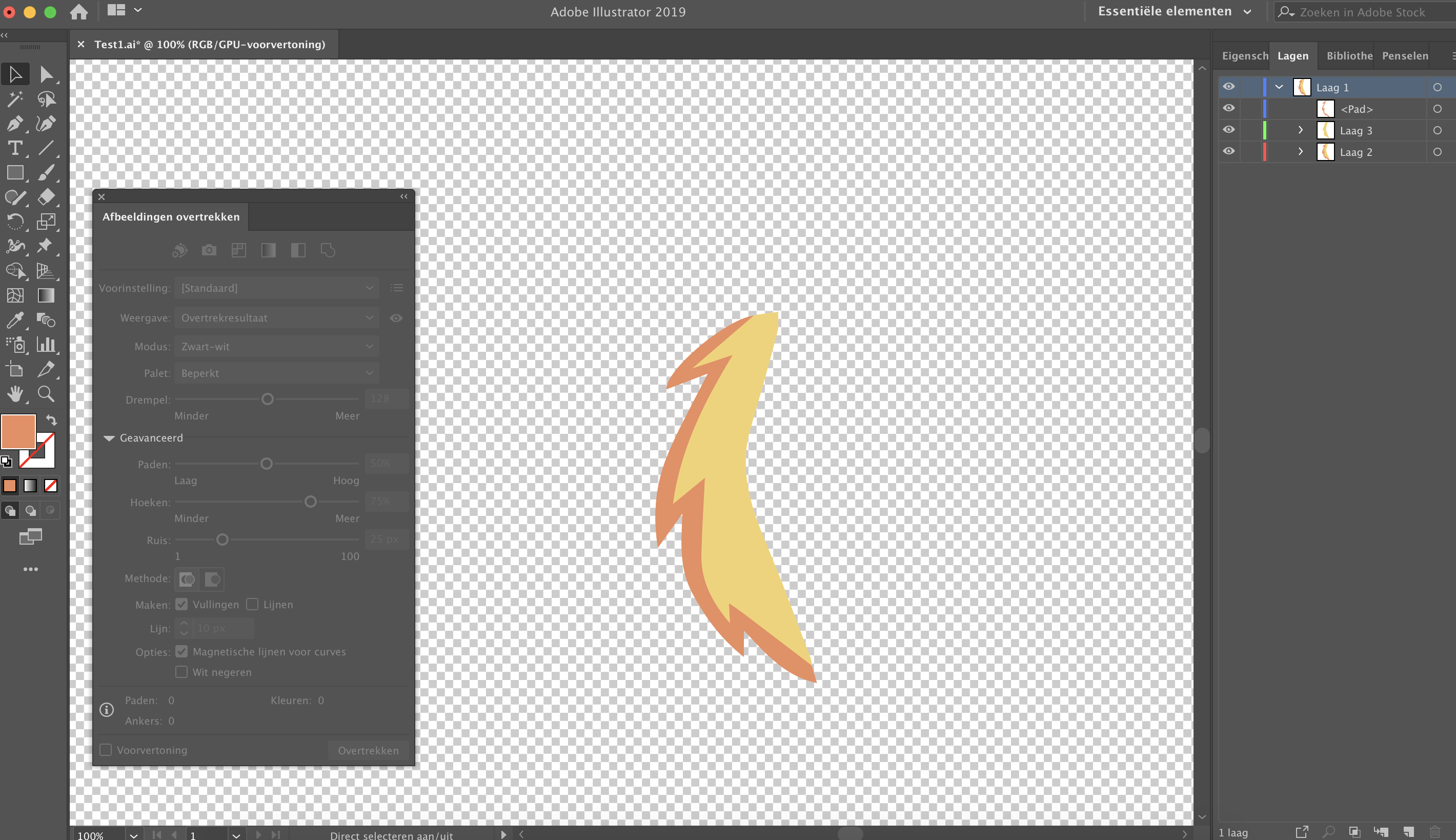
But when I save the vector as AI and import it in AE a very light transparency border is added around every different colored object. It sort of separates both parts of the vector.
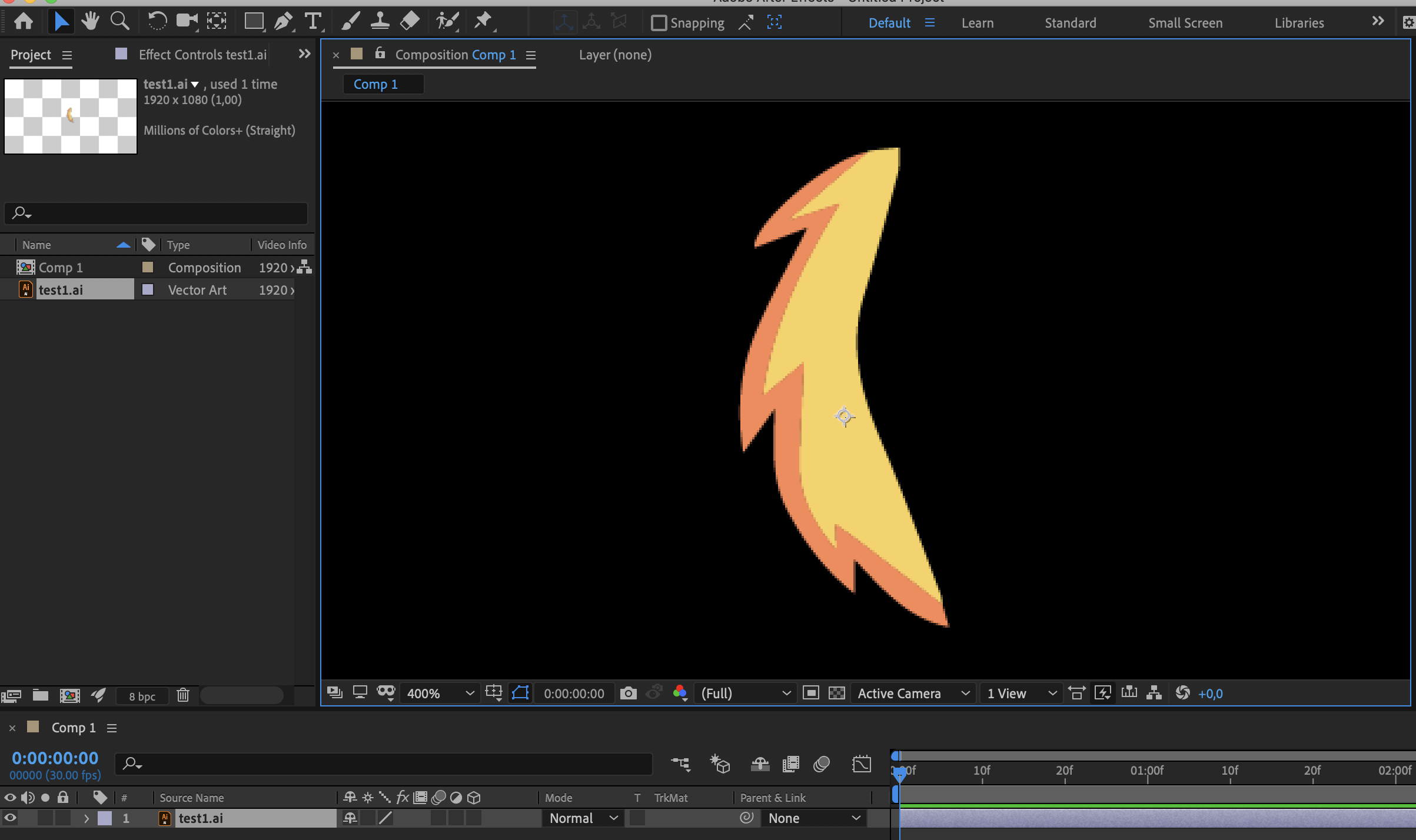
In the image below I changed the color to white so you can see the border (the black background makes the border visible). It should be one object like it shows in Illustrator. I also need to convert the file to a vector shape (because Bodymovin only works with these shape layers) and this only makes it worse.
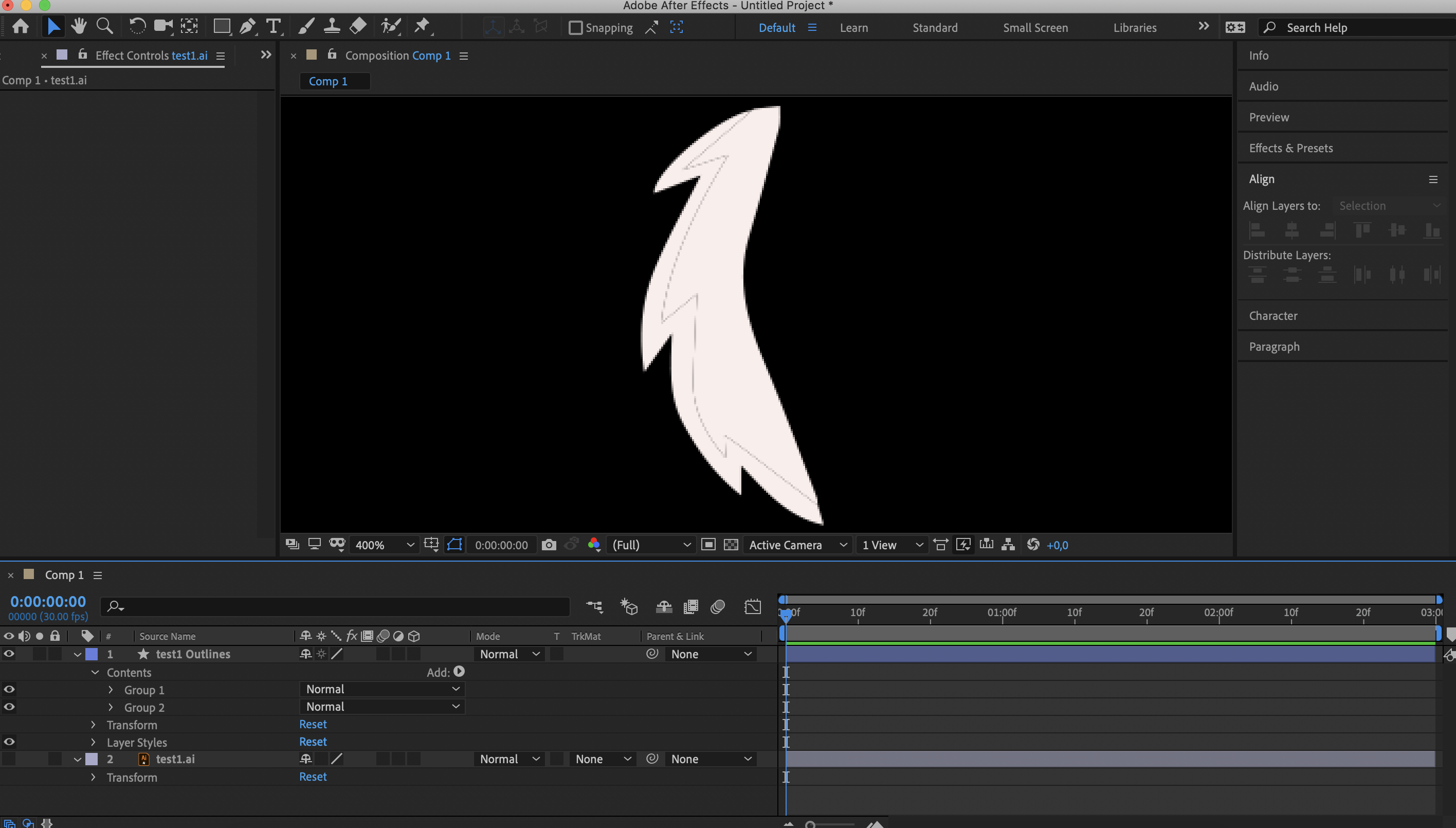
My solution now is to take the outline of the lower layer (in this case yellow) and extend it below the orange in AE to fill in the emptiness between the 2 subjects. But this method is very time consuming.
Another solution which sometimes works is to duplicate every different color layer in AI like multiple times so I got a file with so many layers of the same on top of each other it sort of fills the gaps who appear in AE. But this doesn't always work and also feels like complicated solution.
So my question is can can AE connect these two different colored shapes (who are I think 1 vector right?) without sudden borders between them. Or is there a way in illustrator to combine them in to one shape (like glue them together) so AE can in no way separate them in some way.
 1 Correct answer
See this thread from earlier today:
Help me please, there is a gap between shapes in After Effects, how to fix this?
Your issue is exactly the same - and the same solutions apply.
Copy link to clipboard
Copied
See this thread from earlier today:
Help me please, there is a gap between shapes in After Effects, how to fix this?
Your issue is exactly the same - and the same solutions apply.
Copy link to clipboard
Copied
Thank you! Did not see this thread, but these answers are indeed very helpfull.
Copy link to clipboard
Copied
If you design your vectors such that they overlap rather than cut out, you should be good to go.
So like this...
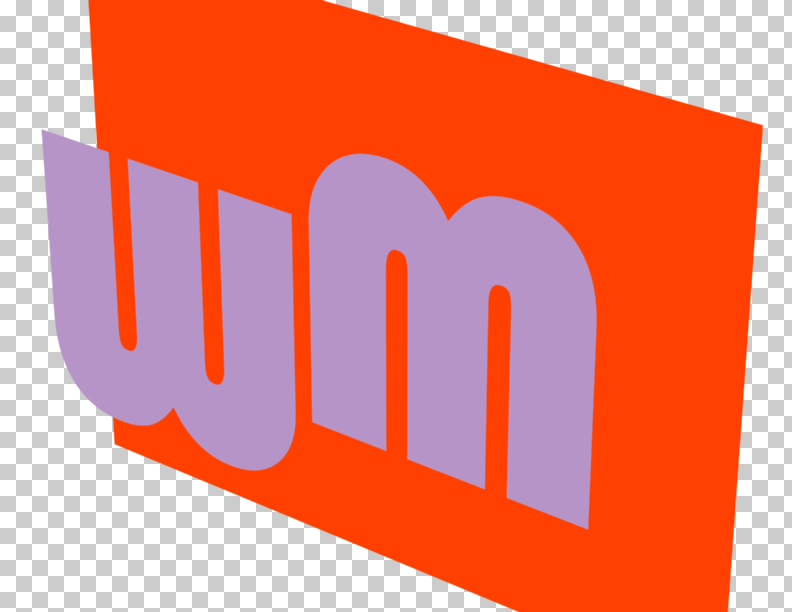
Instead of this...
-Warren
Copy link to clipboard
Copied
Pixel snapping this graphic is very hard up to impossible. Only the anchors can be pixel perfect, but not the beezer curve between them.
Solution of Warren Heaton is a bit bad explained but right: just overlap the lower layer - pull the anchors outwards quick and dirty - and the edge will be gone.
I'm dealing with characters a lot and doing this all the time.
*Martin
